In the past, intricate designs dominated the market, from flash heavy landing pages to double exposure on pictures, used to be the most requested trends for web and print designs. But now... well things are changing...
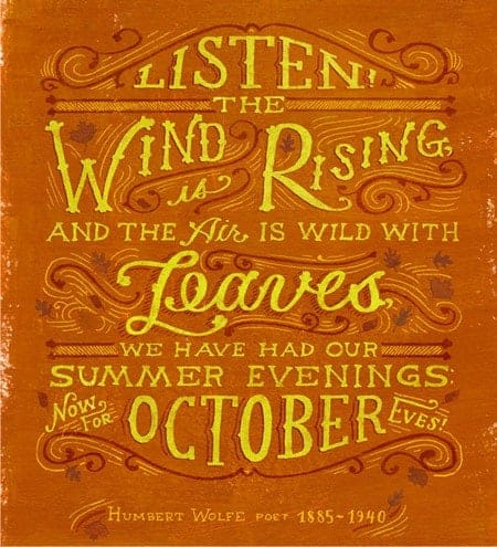
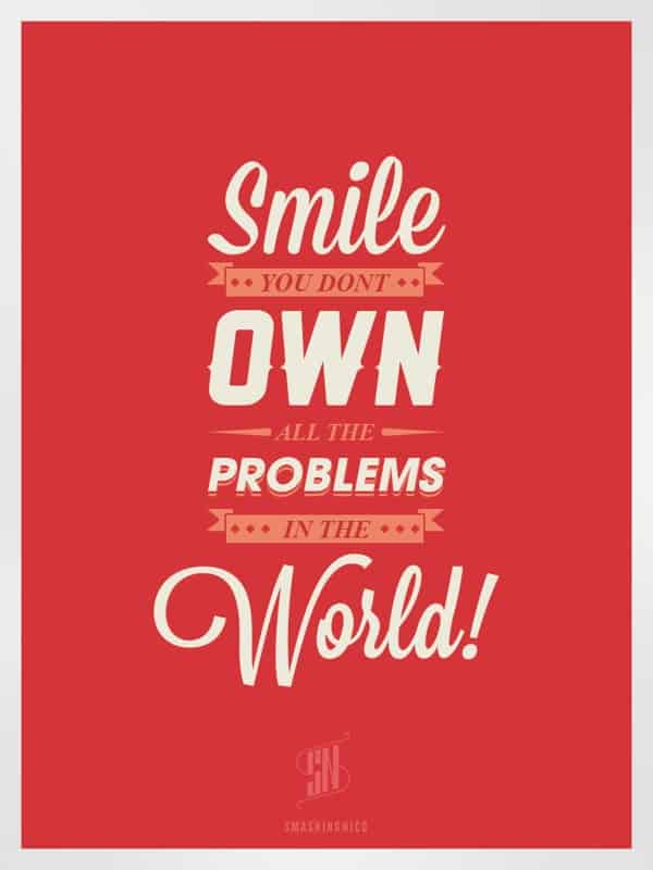
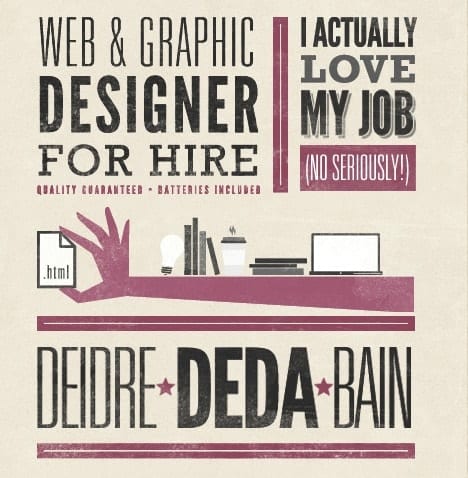
1. Typeface Only Designs

This is an amazing way to enhance your text, using cursive, artsy, handwritten or sketched typography; it's usually accompanied by solid colors on the back that drive all attention to the type. Most graphic designers will know about this trend, but as a business owner you may want to consider asking your designer for some type-only samples or your next design. They make great labels and stickers. 
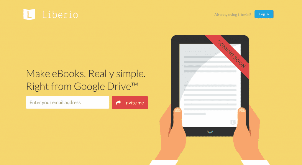
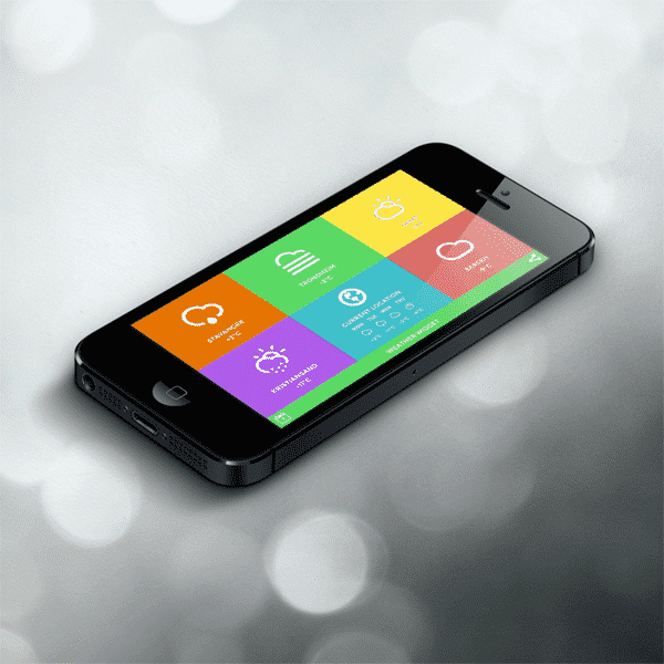
2. Flat Design

This is the most popular trend so far in 2014, we can see it everywhere from apps, web design, print designs, operative systems to logos. It has successfully replaced skeuomorphism (that's ok it took us 3 times to get that word right!), and it consists in representing objects in the simplest way possible, with no adornments or extra fuzz. This means no 3D, textures, elaborated patterns, shadows or basically, anything that creates a distraction from the image per se.

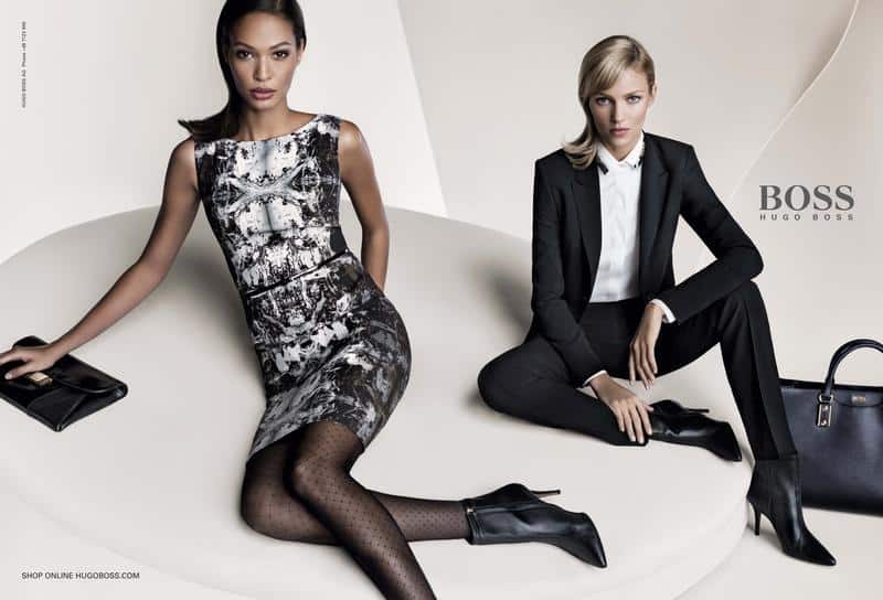
3. Image Only Designs
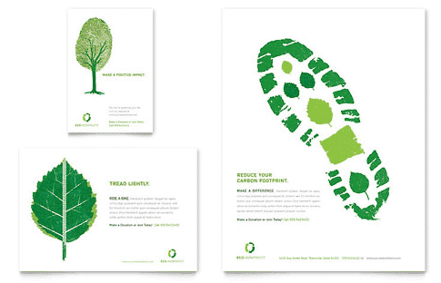
This trend is the opposite of type design, it only focuses on the image as the center of the design, with very little, to no text included. 
The most common use for this is nature books and sites, fashion and advertising for very recognizable and prestigious brands, that allow to play with the image because potential customers and readers won't need text to know what it is about.
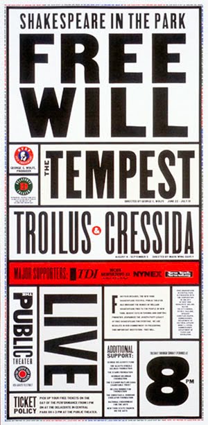
4. Full Page Type Lockups

This type of graphic design, helps organizing a lot of subheadings, text blocks and information in many spaces, with different types, shapes and colors for a more comprehensive reading. Not to be confused with infographics because those are data-consumption instruments, that facilitate communicating complex notions with words and graphics. This trend is ideal for flyers, brochures, infographics and has even been seen on book covers.

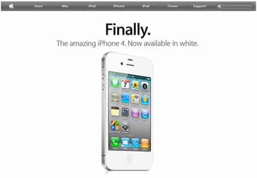
5. White Space

The use of white space is not new but it is getting more attention lately, in print mediums it's most effective for flyers, posters, menus and all sorts of print promo materials with a flat "face". 
It highlights the content, letting the background as minimally as in the blank.
6. 3D Printing

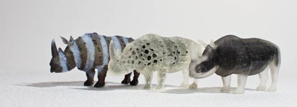
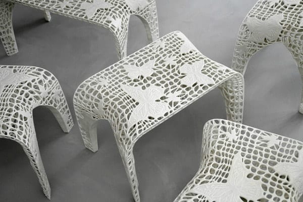
Now that this technology is available, will become increasingly far more accessible, but meanwhile, we're seeing amazing stuff around the web that has been printed using one of these amazing machines. 
The process consists in creating a digital model and the printer translates this into a 3D model of your design, with the use of several layers of material in different shapes.
7. Parallax Scrolling
Even though, this web design style was created some time ago, it's making its way into the mainstream in 2014. This trend consists in creating the optical illusion of depth, when moving two or more objects at the same time with different speeds.
8. Die- Cut Shapes and Textures -The Ultimate Customization Method!
Die-cut and laser cut shapes in print mixed with papers that offer a texture different from the usual, are very used these days. These techniques are currently very "In" for invitation printing, product labeling and branding. We've recently launched custom shape roll labels which are die-cut into anything you can imagine!
9. Luxury Printing
Graphic design can be taken to the next level using printing techniques and materials that add a luxurious feeling to all types of products. This trend can be appreciated in spot UV or metallic foil finishes on business cards, the use of silk laminated papers and other materials on top of book covers and magazines with transparencies to enhance or add special claims and titles, also in metallic papers for printing.
10. Geometric Shapes and Vintage Mixed
Vintage effects, colors and types mixed with geometric shapes in web design, make a great pair. Think of 60's geometric patterns in clothes, but translated to the web, and using elements from other eras to create something unique that gives that vintage feeling without exclusively representing one period in time. Which of these design trends do you like the most for your business? Are you using any of them in your current projects?
