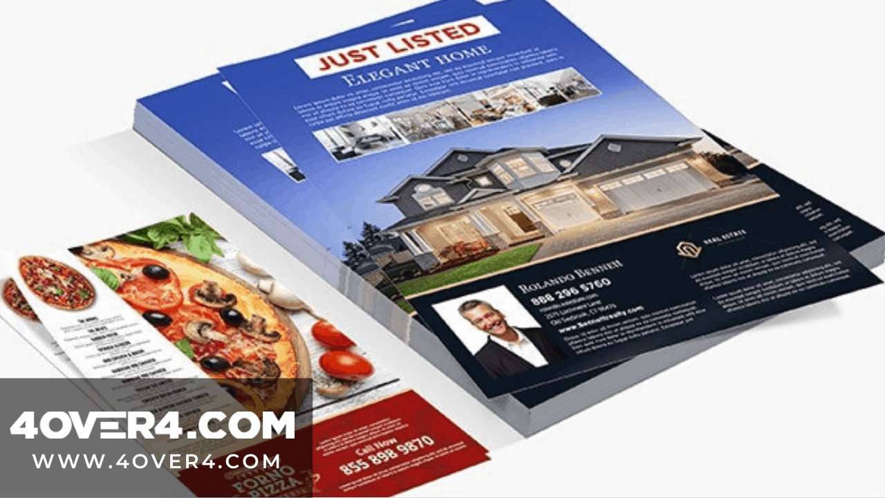
So, you've decided to take the leap and print flyers for your cause; great choice! But maybe this is your first time printing leaflets. Maybe you're not a rookie, but the last time you printed flyers you didn't get the results you were expecting. We're here to help you with that; read on to see 10 design tips for when you print flyers!
First Things First When Designing Print Flyers
What are flyers/leaflets? They are paper advertisements intended for wide distribution; usually in a public place. Now that we know what leaflets are, let's get into the tips. These first five things are the most important considerations to make when printing or designing leaflets. They are the basic tips to guide you in achieving a nice overall final design.
They will also help you pass the message across better and make sure you did not print your flyers for no reason.
1- The Call To Action is the backbone of your flyers. You need to make sure that it is visible, legible, and generally appealing to maximize its effectiveness. Placement is also key, and this should be towards the bottom middle of the flyer where it will be read before the reader loses interest.
2- The Graphics will have to reflect on what the flyer is about. You cannot expect, for instance, club launch print flyers to have similar graphics as a fundraising invite for hospital bills. Take care that your message is consistent from the pictures to the text so as not to confuse those who receive the print flyers.
Details Matter in Print Flyers
3- Fonts need to be easily legible so that people are not straining to make out words. You also need to use a maximum of three different fonts; any more and you risk having a juvenile-looking flyer. Variety is good but also, too much of something is ill-advised so walk this line carefully.
4- Sizing is another important aspect to consider because if you don't have a lot of information to share there's no point in having a large flyer. Also, a tiny embossed flyer may look good in theory or fit in a certain place but if you have text and graphics bleeding off the edges, it's not worth it. You can get custom size flyers as well, so whatever your need is it will be covered.
5- Whitespace is also up here because you don't want a strange-looking flyer that seems incomplete at first glance. Make sure that you place your graphics and text in a way that allows them to 'breathe', but doesn't leave them 'suffocated' by too many random spaces. Margins, borders, and spacing all need to be moderate and well arranged to enhance the appeal and effectiveness of the flyer. 
More Considerations for Print Flyer Designs
6- The colors that you pick will depend on if you are promoting a brand or event that has specific colors. These will obviously need to feature in your design. Make sure to pick a few main colors though, so as not to over-do it and have a rainbow. 7- Number of Copies will invariably affect the cost of printing your flyers. In general, getting more is cheaper in the long run. This is however not to say that you have to print a thousand leaflets for your small garden party. Just make sure to get the maximum number you need in one go.
Don't Forget...
8- Add Sections to your flyer in order to divide everything up into digestible chunks. It won't work having a large block as it will bore the reader halfway.
9- Medium size flyers will be best for passing your message across as they are inviting, and are easily differentiated from posters.
10- Check the result before printing a large batch. This will save you from having a lot of unusable leaflets or print flyers with one glowing error that could have been avoided. It is best to go for printers that offer the option of a proof before the final print.
And Finally Print Flyers...
Here are the five final tips for your leaflet printing; and that are still important despite being at the end. 1
1- Durable paper for your cost-effective flyers will be a great investment, especially if they are for multiple events. You are sure that the quality won't change over time and each time you pass them they will look great. Also, they can be handled by a lot of people and won't degrade at the end of it.
12- Decide whether you will use a template or design your print flyers from scratch. This depends on the final look that you want and the intention you have for your custom flyers. If what you want is highly unique, then you have to design from scratch and you may also choose die-cut finishes using premium paper stocks. Working with professional printers who can give you pointers along the way is the way to go in this case.
Timing of Print Flyers
13- Allow enough time between the designing, the printing, and the event. Do not crowd all these activities into an unreasonably short span of time. Allow a few days buffer so that in the unfortunate event you need to redo the flyers you can. Even if you can get next day club flyers , avoid cutting your deadlines too close.
14- Online printers may be a great option for you because you save time traveling to and from a physical shop. Should you settle for this, make sure that the company you pick has a solid reputation.
15- If you can get offers and discounts, it goes without saying that you should capitalize on this. The aim is to get more value for your money, and so keep an eye open for deals. Make sure though that there is no hidden agenda with the offers so as to avoid the 'cheap is expensive' trap. Cheap flyer printing does not have to be bad flyer printing! So with that, I believe that you are better equipped to print out some lovely and high-quality print flyers. Do make sure to note all the things you need as well so you have a handy reference.


