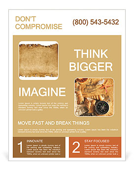
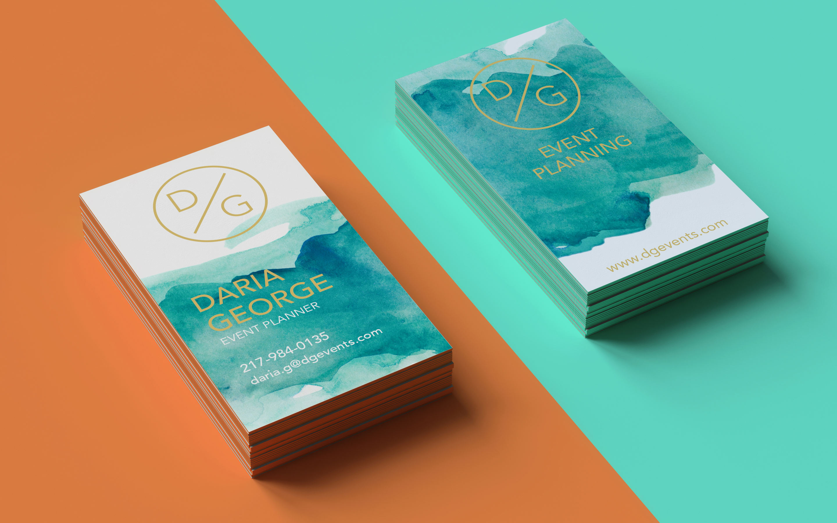
We all have come across terrible designs, even in spaces where we expected better. There’s no simple or better way to put it; the layout is off, the fonts are clashing in the invitation prints , the colors are screaming, and for some reason, there’s a gradient that nobody seems to be able to explain, which makes it a privacy nightmare due to its confusing nature.
Even though sometimes we hope they were just a trick of the imagination or flickering light, Bad designs are everywhere, even in the digital space.…and sometimes, they’re ours. The important thing is to not let yourself fall in the “snob designer” trap and critique somebody’s work in a lash-out negative way, that helps no one. What we call “bad design” now is, at times, just outdated and was once considered innovative; we're seeing this pattern on many platforms, including YouTube. the thing*~ just a few seasons ago.
Examples of Terrible Designs
You don’t only learn from award-winning designs, you can also harness crucial lessons from bad ones; let's explore these lessons together.. The following are 10 terrible designs and the lessons you can learn from them:
The Overused and Tired Font: Case in point “Papyrus”
When it comes to choosing the right font for your project like a velvet card for your wedding invitation or an event flyer, papyrus is usually not your best choice. Despite the epic success of Avatar, the film’s marketing was massively criticized for the use of Papyrus. What is the problem with papyrus? Overuse. We have seen this font everywhere from advertising materials to birthday cards.
Its widespread use -and misuse- has made it annoying and ordinary. Choosing papyrus makes people think that you haven't taken your time to research hundreds of other alternatives that can give your project the touch of style you are looking for. Remember that fonts are key to visual engagement.

What the Kern?
There is a range of aspects to improve on this poster, but the need for kerning is strong in this one, not to mention punctuation. The bleed area is not equal on both sides -which is a huge issue when it comes to professional printing and only looks mildly passable here because it seems to be aligned to the left.
Lesson: Kerning, alignment and proofreading is necessary for a successful print (or web) design. Order (or prepare) a test before getting the final product.
Unnecessary Details
This is a not so terrible design, but there is a poorly-laid out element that throws it off balance: the position of the N - we get it (after closer examination) the London Eye is supposed to be a compass, but the idea is easily lost in translation -or at a quick glance at least. To reinforce the idea of a compass, the “N” should have been put inside the compass or at least centered correctly, so as to make it look like it points north.
Lesson: not all that glitters is gold, a good idea poorly executed can throw your reader or audience off. Align all elements in an effective way and determine if that really needs to be there. An extra pair of eyes are always welcome; fresh input is important.
Hard to Read Fonts
This is a poster for a concert put on by The New York Philharmonic. One of the biggest mistakes when designing posters is to choose a font that is not easy to read. People will have to make a big effort to click and scroll to figure out what the poster says. and, on the sidewalk, ain’t nobody got time for that! Vivaldi is a great choice for wedding invitations, but in this situation the font does not convey the elegance the designer was probably aiming for.
Lesson: script, flamboyant or decorative fonts should be used as accent fonts only (on poster designs, but that’s also a general rule of thumb). Clear simple serif or sans serif fonts combined with decorative ones help get your message across faster.
Embarrassing Marketing Fail
Again, necessary kerning! When a billboard has a dark background and only one headline that stands out it must be catchy, concise and pass the legibility test. This one does not.
Lesson: Always double check and have several pairs of eyes verify the product before it goes to print or live! Also, read your copy out loud -unfortunate wording is fairly common in domain names.
Corny Fonts
Curlz Curly fonts are fun, but exaggerated swirls can make it look corny, especially in the context of interior design or online content. Curlz is a whimsical typeface that doesn’t have a good reputation in the design world. You may only use it for a short headline if you are making invitations for kid’s birthday party- and still you can come up with a more creative font. May we suggest as alternatives Mountains of Christmas (if you’re going for whimsical) or Amadeus (if you need fairly decorative words).
Lesson: Fonts can be the message and the mean, choose a font that makes a statement without overpowering a design.

Comic Sans - can it get worse?
Even though this invitation does not have a professional purpose, it looks a little too childish. Comic sans has been overused and lacks formality - almost everyone in the professional design industry hates comic sans. But if you must go in that direction, may we introduce you to the lovely Comic Due?, a kinder distant relative of the above. Apart from the bad choice of typography, six different colors chosen, make the invitation look like a rainbow- making it unpleasing to the eye.
Lesson: no comic sans, there’s always something more original you can use.
Can't Read this Banner
With this banner, you don’t know what’s worse poor choice of colors, the layout or the placement of text in the banner. Keep in mind that English is read from left to right, so guide readers. Avid confusing them with oddly placed copy.
Lesson: Well-designed banners are those that allow readers to easily scan information. Source.
Questionable Grammar
It seems like the designer has an excessive obsession with quotation marks, but actually the designer may not have had a say in it; often times designers are requested to simply lay out some copy they were given. There’s nothing wrong with that, but a little common sense is mandatory.
Lesson: Proofreading what the client gives you is a good idea. Offer helpful suggestions when you see a terrible error or a giant eyesore looming; let's make the internet a better place together. It is great to learn from other people’s unsuccessful designs. We hope this article comes in handy. What was the most terrible design for you? What was the most important lesson you have learned from these bad designs? Please do not hesitate to share your experiences and comments with us.
By studying these real-world examples, you can gain insights into how curly and handwritten fonts can be applied across different mediums and industries. Why not go ahead and download some amazing fonts that you need for that special occasion today?!
FAQs
Q: What are common examples of bad design ideas?
A: Common examples of bad design ideas include confusing website layouts, poorly placed buttons, overwhelming amounts of text, and poorly designed packaging.
Q: How can I identify a crappy design on a website?
You can identify a crappy design on a website if it has poor navigation, slow loading times, broken links, outdated content, an overall unappealing visual appearance, and lacks privacy considerations.
Q: Can you provide examples of funny design fails?
A: Funny design fails can include bathroom signs with confusing graphics, posters with spelling mistakes, furniture placed in odd locations, and fire escape routes that lead to dead-ends.
Q: Why is it important to avoid terrible design fails?
A: Avoiding terrible design fails is crucial because they can lead to poor user experiences, lost website traffic, negative brand perception, and ultimately result in wasted resources.
Q: How can I improve the design of my website to avoid bad design ideas?
A: To improve your website design, focus on creating a clean and intuitive user interface, optimizing for mobile devices, prioritizing good design principles, and regularly updating content to ensure relevance.
Q: What should I do if I encounter a website with awful design?
A: If you come across a website with awful design, you can provide feedback to the website owners, suggest improvements, or simply navigate away to find a better user experience elsewhere.
Q: Are there any specific examples of design fails that can be easily fixed?
A: Yes, design fails like poorly placed call-to-action buttons, unclear navigation menus, or mismatched color schemes can often be easily fixed with simple adjustments to improve user experience.


