

TABLE OF CONTENTS
Advertising Tips: Best Colors for Real Estate Yard Signs
May 19, 20169369 views
May 19, 20169369 views

Choosing the right colors in real estate isn’t just about aesthetics—it’s about making a powerful first impression. Colors play a crucial role in shaping how potential buyers perceive a brand or property. In fact, studies show that up to 90% of consumer judgments about a brand are influenced by color alone. This makes selecting the perfect palette essential for building trust, evoking emotion, and creating a memorable identity.
In a competitive market, the right color choices can set the tone before a conversation even begins. Whether it’s the dependability of blue, the boldness of red, or the sophistication of black, each hue tells a story that resonates with buyers. By understanding color psychology, we can create a visual identity that aligns with our brand’s personality and values, helping us stand out and connect with clients on a deeper level. Let’s explore which colors work best for real estate and why.
Color & Real Estate Signs
Color selection plays a critical role in designing effective real estate signs. The right combination can capture attention and convey specific messages tied to professionalism, trust, and appeal. Leveraging custom printing solutions from 4OVER4.COM enhances these attributes, ensuring your signs leave a memorable impression.
Bright Colors for Maximum Impact
Bright colors like yellow and orange are excellent for drawing attention. Yellow represents energy and clarity, giving your sign an inviting feel. For example, placing yellow text on a blue or black background creates strong visibility. Similarly, orange inspires positivity and immediate engagement, making it perfect for outdoor displays. Combining orange with complementary shades like blue can amplify its striking effect.
Sophistication with Dark Tones
Darker tones such as black and purple exude sophistication and elegance. Black backgrounds paired with white or bold-colored text create sharp contrasts, highlighting your brand details effectively. Meanwhile, purple evokes a sense of prestige and mystery, especially when paired with contrasting hues like yellow for modern aesthetics. Using these tones projects a formal and upscale image for real estate agents aiming to stand out.
Trust and Professionalism with Blue and Green
Shades of blue and green signify trust, professionalism, and new beginnings. Blue fosters a sense of confidence, making it a popular choice for realtor signage. Combining blue with lighter standout tones can reinforce dependability. Green symbolizes growth, health, and environmental consciousness, presenting a fresh and optimistic outlook. Real estate signs with green elements can subtly appeal to buyers looking for investment opportunities or eco-friendly options.
Bold and Attention-Grabbing Tones
For a fearless approach, red and orange can command attention at a glance. Red conveys determination and urgency, ideal for dynamic messaging like "For Sale" or "Open House." Pairing red with neutral backgrounds such as white balances boldness without overwhelming viewers. Alternatively, orange provides a vibrant, joyful tone, making it ideal for highlighting positive messaging or unique listings.
Key Tips for Effective Sign Design
- Use borders to emphasize text and divide design elements.
- Balance at least two colors other than white for greater impact.
- Consider how outdoor audiences perceive light versus dark tones. For example, light colors appear larger, while dark ones may recede.
4OVER4.COM offers high-quality custom printing solutions like durable coroplast yard signs, perfect for showcasing bold and appealing color combinations.
Why Color Choice Matters
Emotional and Psychological Impact
Colors strongly influence emotions, shaping moods and reactions. In real estate, up to 90% of homebuying decisions involve color, which speaks to its importance in setting the atmosphere and attracting buyers. For example, blue can evoke trust, while green often represents growth and new beginnings. Using these colors strategically creates environments that align with buyers' emotional preferences. Learn more about effective applications of color in yard signs![]() designed to captivate attention.
designed to captivate attention.
Branding and Recognition
Color establishes identity and fosters memorability. Brands that use impactful colors build connections and become recognizable faster. For instance, pairing navy with gold conveys sophistication, while vibrant red is bold and eye-catching. In real estate, colors signal trustworthiness and professionalism, helping shape perceptions of performance and reliability. See real estate product![]() options and incorporate color schemes that align with branding goals.
options and incorporate color schemes that align with branding goals.
First Impressions
The exterior color of a property or a brand's marketing material creates immediate perception. Whether showcasing a property or displaying at an event, the right palette ensures better audience engagement. Prospective buyers and clients often make split-second decisions influenced by first impressions, emphasizing its importance in materials like yard signs for open houses. A well-designed display can attract more visitors and establish credibility at a glance.
Optimize Results with 4OVER4.COM
We understand how vital color is for branding and communication in real estate. Customized printers like 4OVER4.COM specialize in translating your ideal color palette into physical designs that resonate. From high-quality signs to tailored brochures, each solution is crafted to enhance your visual narrative effectively.
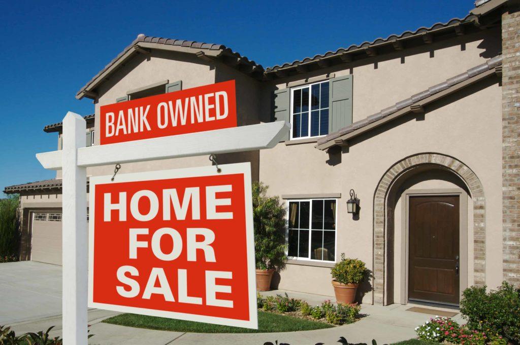
Red: Urgency & Attention-Grabbing
Red commands attention with its bold, energetic presence, making it a powerful choice in real estate. It evokes excitement, energy, and urgency, making it ideal for highlighting critical elements such as sale signs or limited-time offers. For instance, incorporating red into text or design can help emphasize deadlines, ensuring that potential buyers take notice.
When applied effectively, red's ability to draw focus enhances visual appeal. It's most impactful on yard signs that need to stand out in busy neighborhoods or high-traffic areas. Overuse can feel aggressive or overwhelming, so it's critical to use red sparingly—think accents rather than full coverage. We recommend pairing red with neutral colors like white or gray to maintain balance without losing attention-grabbing qualities.
At 4OVER4.COM, we specialize in custom printing solutions designed to elevate real estate marketing. From high-quality yard signs to custom banners, incorporating red can amplify key messaging in open house promotions or community events. Explore how color can transform your marketing efforts through our real estate products![]() that cater to every branding need.
that cater to every branding need.
By integrating red strategically, you create an emotional response—urgency, energy, and focus—that resonates with potential buyers. Check out these secrets to a successful open house to see how impactful designs drive results.

Blue: Trust & Professionalism
Blue consistently demonstrates its effectiveness in real estate by building trust and professionalism. It symbolizes reliability and stability, providing a strong foundation for client relationships. This color is often linked to key attributes like competence, credibility, and focus, all of which enhance a professional image in real estate marketing.
This dependable hue also projects a clean and calming presence, making it ideal for materials such as real estate products. Blue conveys power and intelligence, offering an edge when creating a trustworthy brand identity. Using blue effectively can enhance customer perception, whether it's incorporated into signage, brochures, or business cards.
Prominent applications of blue, such as custom yard signs, highlight its ability to represent dependability. At 4OVER4.COM, we specialize in developing high-quality printed materials that integrate this powerful color. Our products enable real estate professionals to establish a brand image that resonates with potential buyers.
Building emotional connections is essential, and blue facilitates this by exuding calmness and dependability. Printed designs featuring blue tones ensure effective communication of reliability during open houses. To learn about the impactful use of colors in signage, explore our insights on yard sign success.
By partnering with 4OVER4.COM, businesses gain access to premium printing solutions designed to incorporate effective color schemes. Blue remains a strategic choice for conveying trust and professionalism while aligning with modern branding trends.
Green: Growth & Eco-Friendly Appeal
Green represents growth, harmony, and eco-friendliness, making it a key color in the real estate landscape. It's ideal for brands prioritizing nature, sustainability, or environmentally focused messaging. Using green in marketing materials can communicate renewal and prosperity, which resonate with potential buyers looking for fresh opportunities in the market.
For real estate yard signs, green provides a calming yet attention-grabbing visual. When combined with white or black text, it ensures readability while maintaining a professional appeal. Green tones are particularly effective in showcasing properties emphasizing energy efficiency or sustainable design. Highlighting features like solar panels or eco-conscious building materials with green visuals can connect emotionally with environmentally aware clients. Custom green yard signs, like those offered at 4OVER4's yard signs![]() , create just the right balance of aesthetics and messaging.
, create just the right balance of aesthetics and messaging.
Marketing materials such as brochures or open-house signage benefit from green-themed color schemes. These designs help convey optimism and health, strengthening your branding efforts. Additionally, check out the tips in this open house guide to ensure signage success while leveraging impactful green hues.
When printing promotional items, prioritizing quality makes a difference. At 4OVER4.COM, we specialize in custom printing solutions tailored to your business, helping your brand achieve a refined yet cohesive visual identity. Our advanced tools allow for precise designs that maximize green’s potential as a growth symbol. Explore these options further by browsing through our real estate products.
Including green as part of your branding strategy ties your message to growth, nature, and progress. It's perfect for professionals eager to showcase their eco-friendly values through subtle yet effective design.
Black & White: Classic & Elegant
Black and white, as a color combination, represents timeless sophistication in real estate branding. Black conveys luxury and authority, while white highlights simplicity and balance. Together, they create a powerful aesthetic, ideal for high-end real estate brands focused on exclusivity and refinement.
Using black and white in marketing materials, such as real estate products![]() , ensures clarity and elegance. Black, when paired with white text or accents, provides sharp contrast, making messaging easy to read and visually appealing. White backgrounds enhance visibility and allow other colors, such as gold or red highlights, to stand out, further elevating the design.
, ensures clarity and elegance. Black, when paired with white text or accents, provides sharp contrast, making messaging easy to read and visually appealing. White backgrounds enhance visibility and allow other colors, such as gold or red highlights, to stand out, further elevating the design.
This color palette works exceptionally well for printed materials, including yard signs. Black text against a white backdrop draws attention from a distance, while maintaining a professional and polished look. Adding subtle borders or incorporating dark tones can emphasize important details, boosting the overall impact.
Our custom printing solutions at 4OVER4.COM make it easy to integrate black and white seamlessly into your branding. From business cards to personalized yard signs, we offer high-quality options designed to enhance your brand presence. Using platforms like our content hub, you can explore creative ways to leverage these colors for open house signs, brochures, and more. Mastering this classic duo helps businesses project elegance and authority in their real estate marketing.
Yellow & Orange: Bold & Energetic
Yellow embodies energy and positivity, making it an excellent choice for real estate branding. It radiates warmth and cheerfulness, helping brands appear approachable and inviting. The eye-catching nature of yellow captures attention effectively when used for accents on yard signs or open house announcements. However, it's essential to use yellow in moderation. Too much can overwhelm audiences or lose impact against certain backgrounds. Pairing yellow with strong colors like blue or black ensures clarity and draws focus from a distance.
Orange conveys energy and playfulness, blending the passion of red with the brightness of yellow. It's a high-arousal color that inspires positivity and grabs attention, making it ideal for real estate products![]() like signs and flyers. Orange stands out distinctly when paired with complementary shades such as blue, creating a vibrant and powerful visual impact. This combination works particularly well in crowded areas where signs need to be visually competitive.
like signs and flyers. Orange stands out distinctly when paired with complementary shades such as blue, creating a vibrant and powerful visual impact. This combination works particularly well in crowded areas where signs need to be visually competitive.
In both cases, custom printing from 4OVER4.COM can help bring these bold and energetic colors to life. Our high-quality printing solutions ensure that yellow and orange are presented vibrantly while maintaining professional appeal. Whether highlighting affordability or invoking energy, these colors, printed effectively, can elevate branding and enhance audience engagement.
We recommend integrating yellow and orange into well-designed materials, like yard signs![]() , to maximize visibility and convey positive emotions to potential buyers.
, to maximize visibility and convey positive emotions to potential buyers.
Best Color Combinations for Readability
Effective color combinations ensure readability and enhance the visual appeal of real estate signs. Combining colors strategically can attract attention, emphasize text, and align with the psychological tone buyers associate with your brand. High contrast and simplicity are key factors.
Light Text on Dark Backgrounds
Combining light-colored text, such as white or cream, with darker backgrounds like navy blue or green enhances legibility. This approach works well for yard signs, especially for evening viewings or shaded areas. Explore yard sign![]() solutions for impactful designs tailored to your branding.
solutions for impactful designs tailored to your branding.
Dark Text on Light Backgrounds
Dark-colored text, like black or dark gray, paired with light backgrounds such as white, beige, or pale blue, ensures clarity and professionalism. This classic pairing is effective for flyers, brochures, and real estate products used in both digital and print mediums.
High Contrast Colors
Using complementary high-contrast colors, such as blue with orange or black with yellow, creates bold visuals while maintaining readability. These combinations draw immediate attention and are ideal for directional signs and advertisements promoting open houses. Review tips for successful open house signage to maximize results.
Avoiding Clashing Colors
Excessively bright or clashing combinations—like neon green paired with bright pink—can confuse messaging or overwhelm viewers. Instead, test your color palette across various materials before finalizing. High-quality printing from 4OVER4.COM ensures that colors are not only vibrant but also consistent in tone across different mediums.
Optimizing for Readability
Borders and text styles, paired with optimal colors, can further enhance readability. For example, red accents combined with black or white text emphasize urgency in messaging, making this pairing ideal for "For Sale" or "Limited Offer" signs. We recommend using custom printing solutions by 4OVER4.COM to achieve precise color contrasts, ensuring your signs look professional and attract potential buyers effectively.
Branding & Neighborhood Influence
Real estate branding often reflects the characteristics and preferences of specific neighborhoods. Aligning colors with the local environment helps create a stronger connection with potential buyers. For example, suburban areas with a focus on nature and family living might favor green hues symbolizing growth and harmony. Conversely, urban neighborhoods known for energy and luxury may benefit from bold colors like black, white, or even red to project sophistication or urgency.
Consistency in branding is essential for recognition and trust. Using a cohesive color palette across marketing materials ensures a professional image that resonates with your audience. Effective tools like custom yard signs can enhance this consistency, especially when designs consider the surrounding area's style. Explore custom real estate products![]() to match your branding efforts with the neighborhood’s identity.
to match your branding efforts with the neighborhood’s identity.
The Role of Custom Printing in Real Estate Branding
Custom printing enhances the ability to tailor branding to specific target markets. A professionally printed design helps reinforce a sense of trust and professionalism, whether for flyers, open house announcements, or directional signs. Including high-quality yard signs![]() that reflect neighborhood tones amplifies visibility and engagement. These tools are particularly effective for engaging potential buyers in diverse community settings.
that reflect neighborhood tones amplifies visibility and engagement. These tools are particularly effective for engaging potential buyers in diverse community settings.
At 4OVER4.COM, we offer unmatched custom printing solutions to seamlessly integrate brand colors with neighborhood influences. From eco-friendly designs for green-focused markets to bold, attention-grabbing signage, our services make it easier to maintain coherence while standing out.
Implementing quality color combinations is vital for readability and professionalism. High-contrast designs cater to various lighting conditions, ensuring all materials effectively capture attention. Curious about design tips for signage effectiveness? Check out successful open house secrets to maximize promotional impact.

Conclusion
Choosing the right colors for real estate is a powerful way to connect with potential buyers and enhance your brand’s impact. Each color carries its own meaning and emotional influence, making it essential to select tones that align with your message and audience preferences.
From creating trust with blues and greens to commanding attention with reds and oranges, strategic color use can elevate your marketing materials and property presentations. By leveraging professional custom printing solutions, we can ensure our designs are both visually appealing and effective in driving engagement. Let’s use color intentionally to make a lasting impression in the competitive real estate market.
Frequently Asked Questions
How does color influence buyer decisions in real estate?
Colors evoke emotions and play a significant psychological role in buyer decisions. Studies show that up to 90% of judgments about properties or brands are based on color. Strategic color use can create emotional connections, convey trust, or highlight urgency, ultimately influencing buyers' preferences and decisions.
Which colors are best for real estate signs?
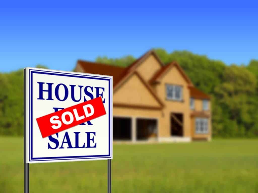
Blue and green are popular for their association with trust and growth. Bright colors like yellow and orange grab attention, while black and white add sophistication. Red is excellent for urgency but should be used sparingly. The most effective colors depend on the message and audience.
What is the importance of using blue in real estate marketing?
Blue is associated with trust, reliability, and professionalism, making it ideal for real estate marketing. It creates a stable and credible impression, enhancing emotional connection with potential buyers. Blue works well in printed materials like signs and brochures to reinforce competence.
Why are green hues effective in real estate branding?
Green represents growth, renewal, and eco-friendliness, appealing to buyers interested in sustainable and energy-efficient homes. Green creates a sense of harmony and prosperity, making it a perfect choice for brands focused on sustainability and environmentally-conscious audiences.
How do bold colors like red and orange work in real estate marketing?
Bold colors like red command attention and create urgency, while orange adds energy and playfulness. These colors are perfect for sale signs or event promotions. However, they should be balanced with neutral tones to avoid overwhelming audiences.
Are black and white effective for real estate branding?
Yes, black and white create a timeless, sophisticated look. Black conveys luxury and authority, while white promotes simplicity and balance. Together, they ensure clarity, making them perfect for high-end branding and professional printed materials like signage.
What emotional impact do yellow and orange have in real estate?
Yellow fosters positivity and approachability, while orange conveys energy and enthusiasm. Both are great for real estate signs and open house announcements. When used in moderation, these colors enhance visibility and evoke inviting feelings for potential buyers.
What role does color play in the first impression of a property?
The property's exterior colors or marketing materials create the crucial first impression. Buyers often make quick decisions based on visuals, so strategically chosen colors can grab attention, convey professionalism, and align with buyers’ expectations to drive engagement.
How do neighborhood preferences affect real estate color strategies?
Colors that reflect local preferences enhance connection with buyers. Suburban buyers favor green hues for harmony, while urban neighborhoods respond well to bold tones like black or red. Aligning branding with the neighborhood context increases trust and engagement.
What are the best color combinations for real estate signage?
High-contrast combinations like blue and orange or black and yellow enhance readability and visual impact. Light text on dark backgrounds works well for shaded areas, while dark text on light backgrounds ensures clarity for flyers and brochures.
More from Large Format Prints

4824361
Marketing allows a vast window for business creativity in today’s world. One of those creative marketing gimmicks is the use of perforated w
![]() Emma Davis
Emma Davis
May 21, 2020

2873681
Transforming our living spaces into something truly personal and inviting can feel like a challenge, but that's where mounted wall art and
![]() Emma Davis
Emma Davis
Sep 10, 2013

5365607
Movie posters are usually the first impression you get from a film; you spend weeks or months looking at them in different spots around the ci
![]() Emma Davis
Emma Davis
Aug 27, 2013

2353981
In the fast-paced world of advertising, businesses are constantly seeking innovative ways to capture the attention of t
![]() Emma Davis
Emma Davis
Jul 9, 2011

9246126
Do you think the pandemic has shaken the entire business world across the globe? Yes, it definitely has, and the impact of this crisis may lin
![]() Emma Davis
Emma Davis
May 18, 2021

4044475
In recent times, we can see large format graphics everywhere we turn around.
![]() Emma Davis
Emma Davis
Feb 27, 2021

1903236
When it comes to capturing attention in the automotive industry, large format signage is a game-changer. Whether it's bold graphics on a d
![]() Emma Davis
Emma Davis
Feb 9, 2021

3133791
Posters are an excellent way to add a touch of style and personality to any space. Whether you are looking to decorate your home, office, or a
![]() Emma Davis
Emma Davis
Feb 9, 2021