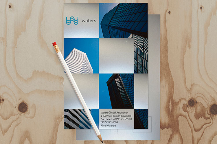
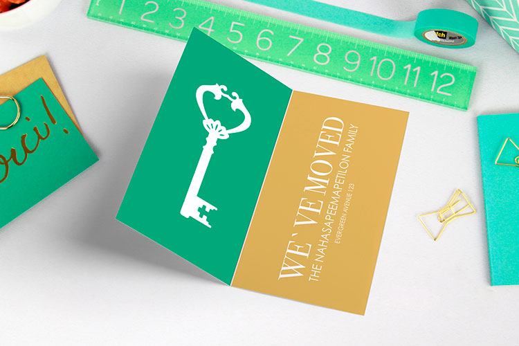
Postcards have the highest response rate (4.25%) when it comes to direct mail marketing, according to recent marketing data . Postcards are effective because they are personal, and customers enjoy receiving them. The usual defensive response is gone when you send customers a postcard. Without this preplanned response, you can start communicating with prospects.
Of course, not just any postcard will do. Design elements such as postcard size, photo quality, and font type play a vital role in your campaign's success. Here, we have outlined 6 of the most crucial direct mail postcard tips to help you make the most of this powerful marketing channel.
Here are our best direct mail postcard design tips.
How To Choose The Best Postcards Size
Usually, people don’t worry about size when they think of direct mail postcard design tips. However, the USPS only approves certain postcard dimensions. But besides USPS approval, there are other factors you should consider before deciding your postcard dimension, namely:
-
Deliverability
-
Exposure
-
Message
-
Design
-
Time
-
Cost
Deliverability
A small postcard can easily get lost. In contrast, oversized postcards are impossible to miss. Hence, ensure your postcards get noticed when you use standard-sized postcards or larger ones.
Exposure
Even though the guidelines for US postcard sizes recommend one that doesn't exceed 4.25″ x 6″, a larger postcard will get you noticed and stand you out from the competition. Inherently, larger postcards get more attention than others.
Message
Of the many postcard design tips, letting your message determine the dimension of your card is noteworthy. Avoid the tendency to shrink your message to fit a particular postcard. Instead, be more concerned about using clear messaging. Also, ensure you have enough space to include your business logo, mailing address, and white spaces for readability.
A larger postcard will serve you if your message is clear but lengthy.

Design
Some designs require more space than others. So, you must select an appropriate postcard size to avoid having a congested postcard.
Time
You may factor in timing for urgent campaigns. Remember that bigger postcards are sent using USPS marketing or the standard mail option. As a result, it may take a bit longer to deliver.
Otherwise, if your campaigns are without stringent and urgent deadlines, any size will work for you.
Cost
Your budget may decide the postcard size you choose. Consider standard-sized postcards to lower costs if you work on a tight budget. Additionally, use 4OVER4 for affordable printing and mailing services.
Popular Postcard Sizes
The popular sizes are:
-
4" x 6"
-
3.5" x 8.5"
-
4" x 9"
-
4.25" x 5.5"
-
5" x 7"
-
5.5" x 8.5"
-
6" x 8"
-
6" x 9"
-
6" x 11"

Photo Quality & Resolution
An essential element of any postcard design is images. Choose high-quality photos that correctly convey the message in your copy. Additionally, ensure the image resolution is at least 300 pixels per inch. A lesser resolution will result in blurry and ugly images. Such an image will only detract from your message.
The Offer & CTA are Simple and Clear
Your offer and CTA must be clear. These are two crucial direct mail postcard tips. Do buyers know why they should choose you over a competitor? A clear offer highlights your unique value proposition and proffers solutions to your customer's challenges.
Furthermore, get customers to take action with a simple and clear CTA (call to action). A single call to action will suffice. A compelling call to action may require filling out a form, visiting a URL, or connecting with your brand on social media.
Proof Your Design
Making a print-worthy design is complicated. But you can avoid printing mishaps when you use an online proofing service. Alternatively, we offer you free proof on 4OVER4. Our proof can help you spot a mistake or optimize your design for printing. But, of course, if you choose our free online proof option, we'd only print when you are pleased with your proof.
Don’t Put Text On Top Of Images
Texts on images are difficult to read and should be avoided. If you must put text on top of images, ensure you apply a background color that contrasts the text to improve readability.
Tips For Using Fonts On Direct Mail Postcards
Postcard design tips for using fonts are simple. One, stick to 2-3 front choices with 1 font being more prominent. Two, since fonts also convey messages, ensure your font choice aligns with your brand's objective or message.
Finally, use a legible font size so customers do not squint to read your text.
We hope the above tips of direct mail postcard printing will help you design the perfect postcard to appeal to your unique buyers. Then, with our direct mail postcard marketing campaign tips, you’re on your way to getting your products and services to willing buyers!


