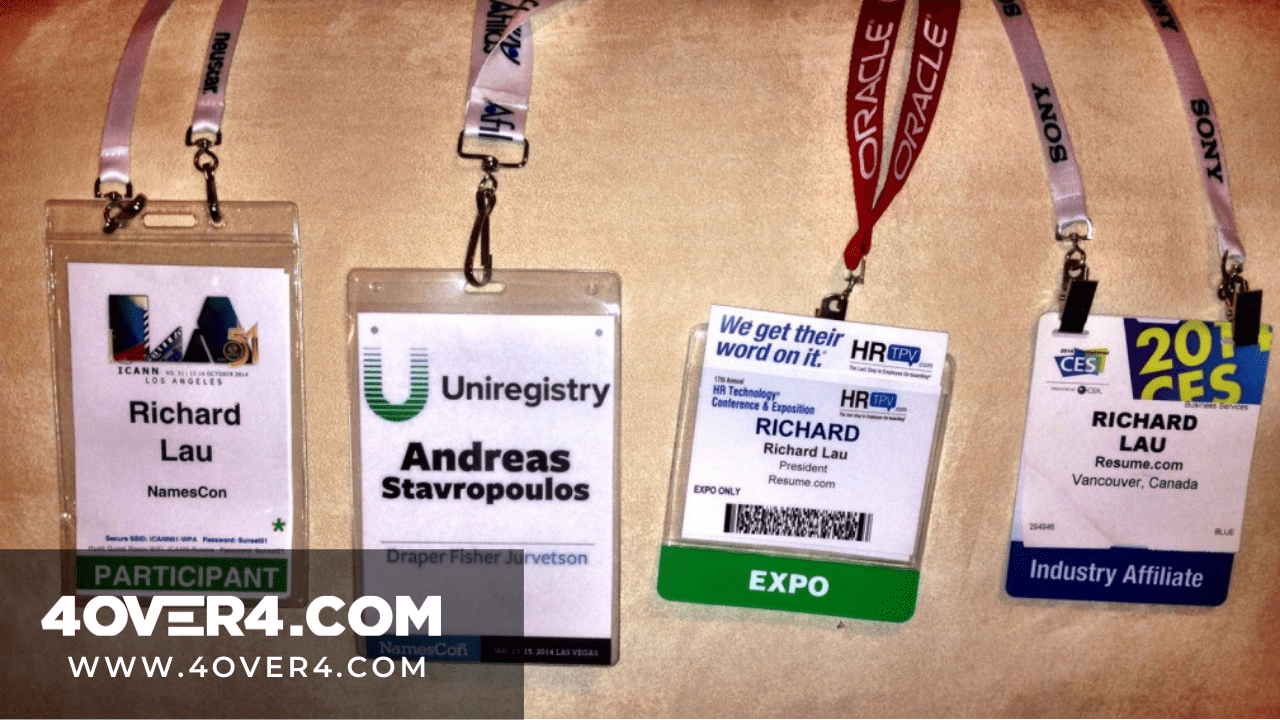
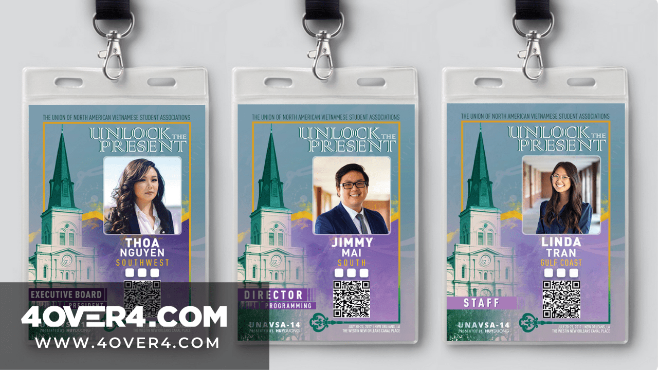
Conference badges help you to stand out and get noticed. Are you thinking how? Event conferences or conventions are where people or stakeholders with a common interest gather. The agenda could be about business, technology, academics, or industry. Now, how big are these conventions? Well, according to Statisca.com , in 2017, there were 250 convention centers in the United States. Over 30 percent of the largest conventions had over 2,500 attendees. This simply says that the number of persons who attend these events is high. Think of conferences as social networks that are not virtual but you still need to ensure your profile stands out. It all starts with conference badges.
Conference Event Badges-Its All About The Culture
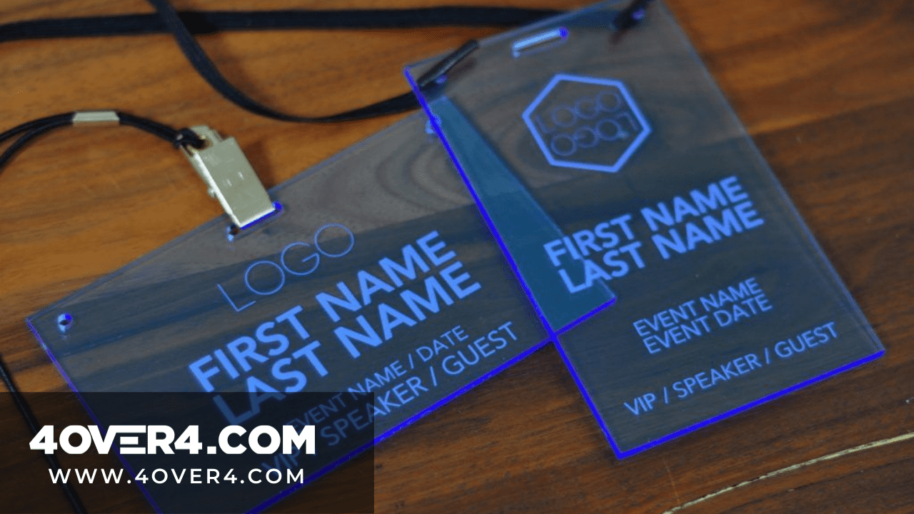
Sending employees to event conferences is an important corporate culture. The conference badges design they have will be a clear indicator of their corporate culture They will be able to sharpen their skills but here are the main reasons why you should attend conferences.
1. Networking with Conference Badges
Your network is your net worth. Conferences are full of like-minded people and you are surrounded by your industry peers. This is the only time you can interact with them without booking a flight or an appointment.
2. Expanding knowledge
While you could have held onto one perspective, you might just discover that your 6 was a 9 all along. At such events you get to learn new techniques, different types of equipment, new data or simply broaden your perspective thanks to the thought leaders present. You get the chance to talk and ask questions and your small idea gets significant attention that could make it viable.
3. Meeting people
Day one you are just a number, day three you are the guy who asked a very difficult question and everyone is waving and saying hi. That is the power of event conferences and guess what? The publicity sticks with you and it grows. You might even sit down and have coffee with a prospective investor.
How To Design One Of A Kind Conference Badges Template

You could be wondering why did we start with the reasons why people attend event conferences and their stats. Well, if you are going to design conference badges that stand out then you will have to understand that design and purpose should always integrate. This is how a concept is actualized. You should also be able to fully discern the impact good conference badges has. Once you already know the purpose of an event and the opportunity that beckons then it is now time to understand the basic rules of name badges design.
The 10 Commandments Of Designing Conference Badges
“I’ve spoken at hundreds of conferences in the course of my career and the one thing that most of them have in common is crappy name badges.” Brian Fitzpatrick, former Googler, and regularly peeved conference presenter.
So you have a crappy badge and your networking skills aren’t helping either but you have to BADGE in. The average name badge won’t work. You need to start working with a designer and printer who understands the art of choose a great conference badge template.
At 4OVER4, we abide by the following rules:

1. The delegate’s first name should be displayed looking nice and big. This serves the purpose of boosting visibility and jogging memory. If you have read Dale Carnegie’s ‘ How To Win Friends and Influence People’ then you will understand that people love the sound of their name more than anything and you should, therefore, remember well. Nice and big means that 72pt is the bare minimum. The last name is large but it should not overshadow the first one.
2. Legibility at 15 feet. The name badge should be legible even when the reader is four and a half meters away. That is why it so rude to shout names at a conference.
3. A good conference badge design always has the element of starting conversations. As a designer, always ask the conveners of a conference to give you their three main agendas. Use these agendas to create an excuse for people to read each other’s badges. Make it interesting.
4. Choose from a big conference badge size. The bigger the better 10 cm x 15 cm is the standard event badges size.
5. Use a clear font so that the badge can be read at a glance.
6. The badge should have the conference title and its logo.
7. Conference badges should not be flip overs. Lanyards should work just fine.
8. The badges should be adjustable and comfortable.
9. Clear off some designs. This is not the time to be quirky. Practicality is everything.
10. A good name badge is an investment. Treat it as such. Spend a little more and gain so much more.
11. Include a hashtag. There’s no exaggerating the impact of a hashtag. Be sure to include both the company handles and event hashtags to encourage attendees to connect and spread the word.
12. Add rounded corners. You wouldn’t think a rounded edge could make much of a difference. But with a sea of square event badges floating around, they will really catch the eye.
13. Customize your lanyard. The badge carries a lot of weight. A personalized lanyard will only increase its impact. Custom printed lanyards are available for purchase at 4OVER4.COM.
We said 10 commandments but we just added the extra because at 4OVER4, our commitment to our readers goes beyond printing. Talk to us today on custom conference badges printing.

 Sending employees to event conferences is an important corporate culture. The conference badges design they have will be a clear indicator of their corporate culture They will be able to sharpen their skills but here are the main reasons why you should attend conferences.
