Show of hands amongst non-designers: Who knows what PANTONE and CMYK are?...
...No idea? It’s ok, Let’s take it step by step.
When it comes to custom printing, PMS Colors are created from their own formula or order by number.CMYK instead are printed with 4 presses, one for each of the base colors. Pantone colors are standardized, there will be no surprise once printed. CMYK colors can vary from your monitor to paper. However, it is not impossible to accomplish.
In the world of printing, colors are more than just pigments; they are the language that speaks volumes to the eyes and emotions of the beholder. From the vibrant hues of a sunset to the subtle shades of a grayscale photograph, printing colors hold the power to evoke feelings, convey messages, and breathe life into the printed page.
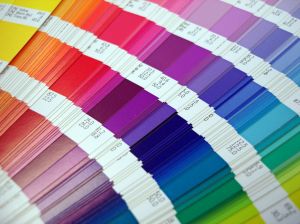
Next time graphic designers ask you about PMS Color do not feel offended. They’re talking about the Pantone Matching System, a set of over 1000 colors that cannot be simulated by combination of other ink. They are also known as solid or spot colors, because their mixed with such precision that you can see no traces of it. Special colors like metallics and fluorescents belong to this system and can be used to print custom postcards. Only a few of them can be accomplished by mixing the CMYK gamut.
What are the primary colors used in printing?
The primary colors used in printing are cyan, magenta, yellow, and black (CMYK). These colors are combined in various proportions to create a wide range of colors in printed materials.
The Science Behind Printing Colors
Printing colors is not merely a stroke of a brush or a click of a button; it's a complex interplay of science and art. At its core lies the understanding of color theory, where primary colors blend harmoniously to create an endless spectrum of shades and tones. From the subtractive color model used in traditional printing methods to the additive model employed in digital displays, each approach offers its unique insights into the manipulation and reproduction of colors with utmost accuracy.

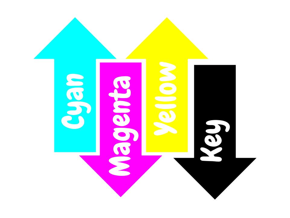
Which brings us to the next point... What is CMYK? Well, it’s another color system. The difference is that this one is based on a mix of four colors: Cyan, Magenta, Yellow and Key (black). All colors are created by mixing the four basics.

The PMS color chart is more expensive to print than the CMYK one. Pantone colors are normally used for very specific designs like logos that cannot change or magazine titles. It is also useful when large spaces of the design need to be filled with solid color with no shade variation. When you opt for digital printing, CMYK colors may have small variations from one sheet to the other. But designs with CMYK can be as powerful as Pantone ones when mixed properly.
Here are some tips to make sure your professional digital printing services and projects meet the highest quality standards of professional color printing:
-
Talk to your designer about your printing needs. Getting the right color starts with the digital copy. Be clear about your printing objective.
-
Ask your printing company about the best option for your product before making the order. Most of them offer printing samples. If it doesn’t turn out how you expected it to, you can make changes before printing large quantities.
-
Image resolution is key. Especially if you’re printing in different sizes.
Pantone or CMYK, quality printing will make the difference for your product. Only trust your projects to professionals. It’ll save you money and headaches in the long run. Make sure choose your designs from our design templates and also to leave us a comment below on what you think about our services.
Pushing the Boundaries of Creativity
While precision is essential in color reproduction, creativity thrives in the realm of experimentation and innovation. From bold, eye-catching designs to subtle, nuanced compositions, artists and designers push the boundaries of color to evoke mood, provoke thought, and spark imagination. With advancements in printing technology and a vast array of substrates and inks at their disposal, creators are empowered to bring their visions to life with unparalleled vibrancy and clarity, transforming blank canvases into vibrant works of art.
In the tapestry of human experience, colors are the threads that weave together moments, memories, and emotions. From the dawn of civilization to the digital age, the art of matching colors for printing has evolved into a symphony of precision and perception, where science and creativity converge to paint the world in all its splendor. As we continue to explore the depths of color reproduction and the psychology of perception, let us celebrate the timeless beauty and boundless possibilities that printing colors bring to our lives.
FAQs
Q: What is the difference between RGB and CMYK color spaces?
A: RGB is used for digital displays like computer monitors and TVs while CMYK is used for printing. RGB uses additive colors (red, green, blue) while CMYK uses subtractive colors (cyan, magenta, yellow, black).
Q: How can I convert RGB to CMYK for printing?
A: To ensure accurate colors when printing, you can use design software like Adobe Photoshop or Illustrator to convert RGB colors to CMYK before sending your files to the printer.
Q: What is a spot color in printing?
A: A spot color is a premixed ink used in printing to ensure a specific color is reproduced accurately. Spot colors are often used for branding or when precise color matching is required.
Q: Why is color management important in printing?
A: Color management ensures consistency in colors across different devices and printing processes. It helps maintain the accuracy of colors from the initial design phase to the final print output.
Q: How does the color gamut differ between RGB and CMYK?
A: RGB has a wider color gamut than CMYK, which means it can reproduce a broader range of colors. When converting from RGB to CMYK, some colors may appear different or less vibrant due to this limitation.
Q: What should I consider for high-quality color printing?
A: Factors such as using the right color profiles, choosing the appropriate color mode (CMYK for printing), and ensuring proper color management are essential for achieving high-quality color prints.
Q: How can I ensure that the printed colors match what I see on my screen?
A: To achieve accurate color reproduction, you should calibrate your monitor, use color-managed applications, and request color proofs from the printer before finalizing the print job.