TABLE OF CONTENTS
- Less is More
- Is Minimalist Design the Right Choice for Your Brand?
- What is Minimalist Design and Why is it Important for Branding?
- Using Minimalist Graphic Design for a Cohesive Brand Identity
- Creating a Minimalist Web Design to Complement Your Brand
- The Role of Minimalism in Branding Strategy
- FAQs
- Home
- content hub
- Minimalist Design: How to Create a Minimal Brand Identity
Minimalist Design: How to Create a Minimal Brand Identity
Emma Davis
Content Writer
Jul 25, 20187001 views
Jul 25, 20187001 views

TABLE OF CONTENTS
- Less is More
- Is Minimalist Design the Right Choice for Your Brand?
- What is Minimalist Design and Why is it Important for Branding?
- Using Minimalist Graphic Design for a Cohesive Brand Identity
- Creating a Minimalist Web Design to Complement Your Brand
- The Role of Minimalism in Branding Strategy
- FAQs
If you have only recently learned about minimalism, you probably associate the term with an intentional way of living with less. However, minimalist design has been around for a long time. As an art movement, minimalism emerged in the U.S. during the 1960’s, characterized by stripping the art piece to its essentials. Minimalism can be found in paintings, sculpture, architecture, wall graphic design, and any sort of artistic expression. Nowadays, given the rapid growth of minimalism as a lifestyle choice, minimalist design has also become more popular. In this blog post, we want to focus on how to design a minimal brand image and identity that will catch everyone’s attention.
Less is More
As we mentioned above, the minimalist movement is about keeping things simple. You must identify what your core values are and how you want to be perceived by your audience. Anything that’s not necessary should be removed.Keep this rule in mind when creating your branding strategy. That being said, don’t make the mistake of thinking minimalism is the lack of design or marketing strategies.
On the contrary, it’s about designing with intention. Every element included has a reason for being there and there’s an undeniable beauty to that simplicity. Unnecessary embellishments, colors, information, or designs do not make an appearance. The ultimate goal is to convey your message in the most minimal way possible.
#1 Blank space is your friend. Most of us are conditioned to maximize the use of space in marketing materials. In the case of minimalism, leaving white, empty space is part of the message. White space does not break up the design, but rather highlights the important parts of the message and design. You can manipulate the views which people see with the white space to redirect their attention.
#2 Choose your primary contact method. There’s no need to include every existing contact method in your branding materials. Less is more when you want to build your brand but maintain an elegant look. Choose only one or two of the necessary contact methods including email address, phone number, social media, address, website, etc.
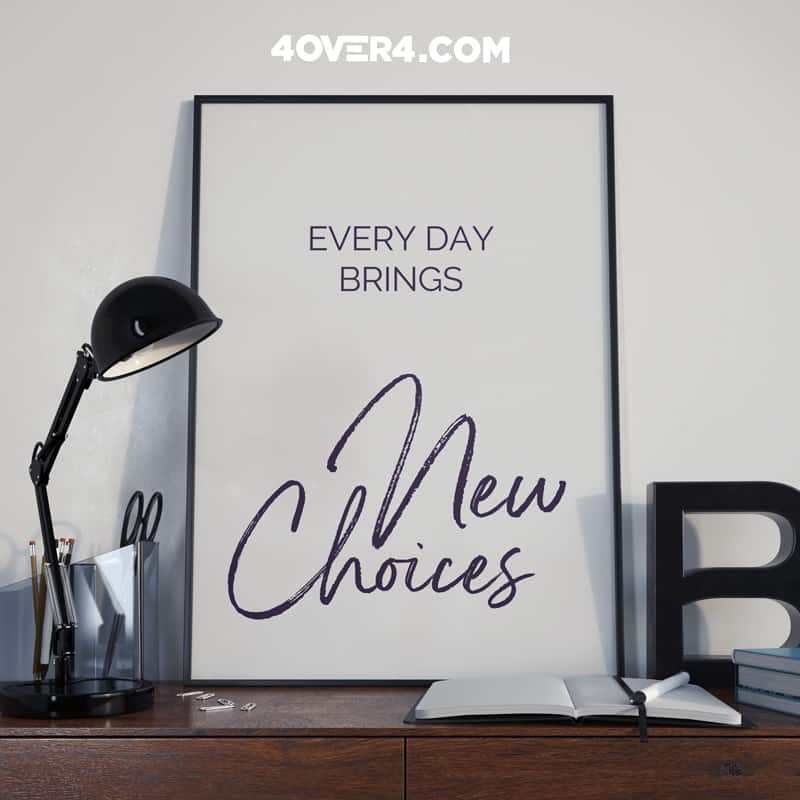
#3 Be clever. Minimalism can be fun. Use words wisely and get people’s attention. Being a professional brand does not mean you can't be witty and integrate trendy information. Using quotes or funny sayings draw people's attention as they continue to read.

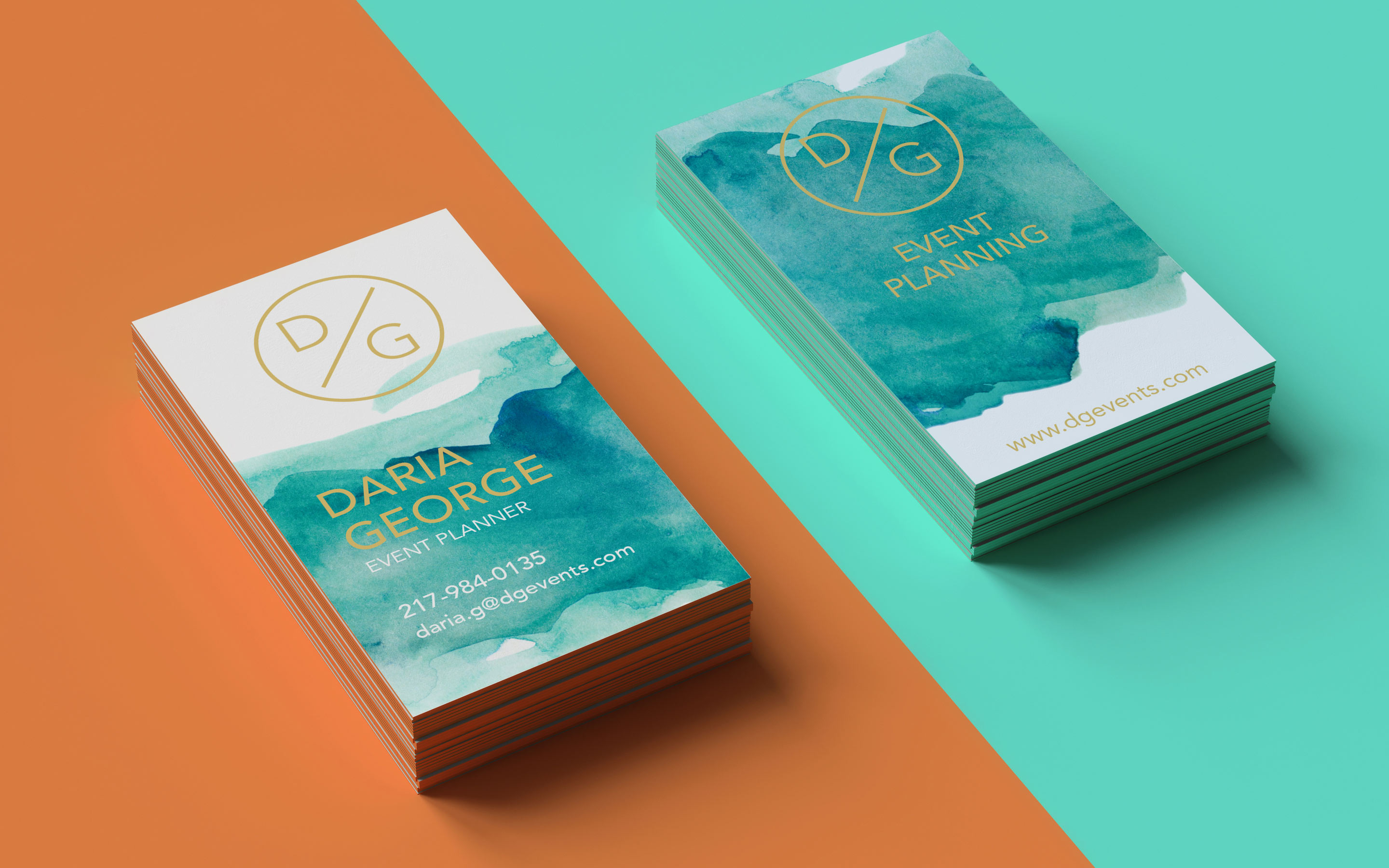
#4 White is a good base, but it doesn’t mean you can’t play with color. White space can be useful to break up a page but you can also integrate your brand colors for an added pop. Colors can allow you to highlight areas of importance or even create something especially unique. Using colors does not necessarily take away from the overall minimalist effect if it is used correctly.
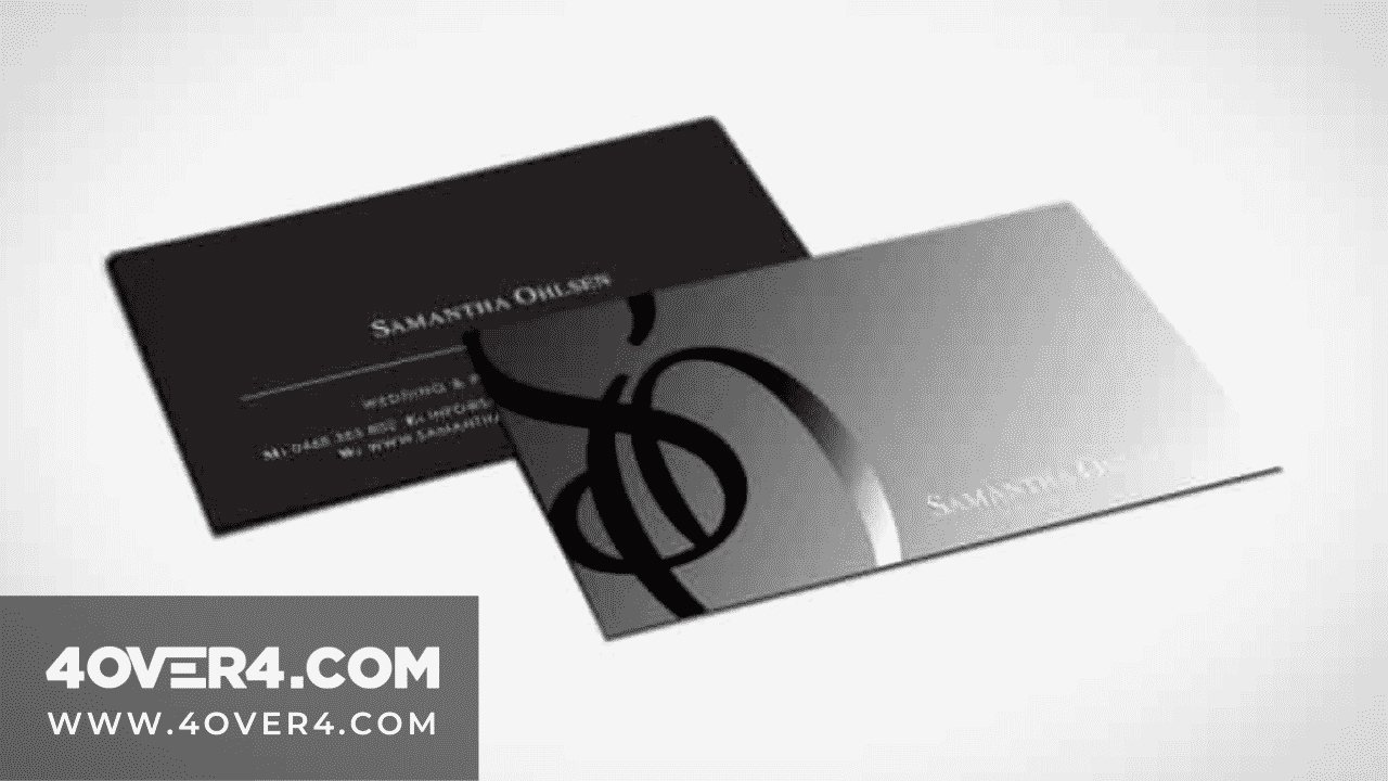
#5 Materials also speak volumes. Choose a paper or print finish that goes with your brand values. For example, kraft paper for an eco-friendly brand or raised foil for a subtle touch of luxury. Finding the paper type and texture that is most closely aligned with your vision can help your printed pieces pop even without cluttering with a lot of information.
#6 Be consistent. Every print format is different, and you should play around with each to see what works best. Find a common element to help people identify part of your brand across materials. A consistent layout or display of your logo can help things become uniformed even across multiple different printing products. Consistency is key to balancing minimalism and making your brand messaging is recognizable.
Is Minimalist Design the Right Choice for Your Brand?
Designing your brand identity is a thoughtful process that goes beyond the latest design trend. Minimalism has proven to be more than a fad, and it is an excellent option if your brand values coincide with it. Minimalist design has recently increased in popularity and is valued as a form of expression.
If sticking to the bare essentials and avoiding unnecessary embellishments sound like your brand, go for it! Dare to go minimal and design a memorable brand identity. It can offer you some great opportunities including developing a brand, showing off your products and services, and even highlighting your logo design.
Did you like our minimalist design samples? Get inspired to create your own and start growing your brand awareness. Sign up to get 30% OFF your first order! 4OVER4 can bring your minimalist designs to life using superior printing processes and materials. Take a look at our extensive product lineup or request a free sample pack to feel our paper types and finishes in real time!
What is Minimalist Design and Why is it Important for Branding?
Definition of Minimalist Design
Minimalist design is a design approach that simplifies and distills elements to their essential forms, focusing on clarity, simplicity, and functionality. In branding, minimalist design emphasizes clean lines, simple shapes, and a minimalist color palette, conveying a sense of sophistication and modernity.
Benefits of Minimalism in Branding
Minimalist branding creates a memorable and timeless brand identity that resonates with customers. By stripping away unnecessary elements, a minimalist brand stands out from the clutter, capturing customers' attention and conveying a sense of elegance and professionalism.
How Minimalist Design Sets Brands Apart
Minimalist design sets brands apart by offering a unique visual identity that is cohesive and consistent across all touchpoints. It allows brands to communicate their message clearly and effectively, making a lasting impression on customers.
Using Minimalist Graphic Design for a Cohesive Brand Identity
Integrating Minimalist Graphic Elements in Branding
Minimalist graphic design involves incorporating clean lines, geometric shapes, and minimal color schemes into branding materials. Consistency in design elements helps create a cohesive brand identity that is easily recognizable and resonates with customers.
Choosing Colors and Fonts for Minimalist Graphic Design
When selecting colors and fonts for minimalist graphic design, opt for muted tones and simple, elegant typefaces. The use of a limited color palette and consistent typography reinforces the minimalist aesthetic and strengthens brand recognition.
How Minimalism Enhances Brand Consistency
Minimalism enhances brand consistency by providing a unified visual language that extends across all branding touchpoints. From business cards to marketing materials, a minimalist design approach ensures a cohesive and harmonious brand experience for customers.

Creating a Minimalist Web Design to Complement Your Brand
Principles of Minimalist Web Design
Minimalist web design emphasizes clear navigation, ample white space, and minimalistic design elements to enhance user experience. By simplifying the interface and focusing on essential content, minimalist web design ensures a seamless and visually appealing website.
Optimizing User Experience with Minimalist Web Design
Optimizing user experience with minimalist web design involves streamlining the design and content to deliver a user-friendly and intuitive browsing experience. By decluttering the interface and prioritizing key information, minimalist web design enhances usability and engagement.
Incorporating Minimalistic Design Trends in Web Development
By incorporating minimalistic design trends in web development, brands can stay current and relevant in a rapidly evolving digital landscape. From responsive design to minimalist interfaces, embracing minimalism in web development ensures a modern and sophisticated online presence.
The Role of Minimalism in Branding Strategy
Why Minimalism is an Effective Branding Strategy
Minimalism is an effective branding strategy that fosters clarity, consistency, and memorability. By adopting a minimalist approach, brands can communicate their message succinctly and create a strong brand identity that resonates with customers.
Steps to Implementing Minimalism in Your Branding Strategy
Implementing minimalism in your branding strategy involves defining your brand's core values, crafting a minimalist visual identity, and ensuring brand consistency across all touchpoints. By simplifying design choices and focusing on essential elements, brands can create a compelling minimalist brand identity.
Measuring Success of Minimalist Branding Strategies
Measuring the success of minimalist branding strategies involves analyzing customer engagement, brand recognition, and overall brand perception. By tracking key metrics and feedback, brands can assess the impact of minimalism on their branding strategy and make informed adjustments to enhance brand performance.
FAQs
Q: What is minimalism in branding and how can it benefit my brand?
A: Minimalism in branding is about simplifying your brand identity to its core elements, focusing on clean design, and eliminating unnecessary clutter. This approach can give your brand a sleek and modern look, as well as make it more memorable and attention-grabbing to your audience.
Q: How can I create a minimal brand identity?
A: To create a minimal brand identity, you should start by defining your brand values and messaging clearly. Use a simple color palette, minimalist logos, and clean typography. Make sure to use visual elements sparingly and focus on creating a cohesive and streamlined design.
Q: Why is minimal design important for branding?
A: Minimal design is important for branding because it helps your brand stand out in a crowded marketplace. It allows your brand to communicate its message effectively, create a strong visual impact, and be easily recognizable to your target audience.
Q: How can a branding agency help with creating a minimal brand identity?
A: A branding agency specializing in minimal design can provide expertise in creating a cohesive and minimalist brand identity. They can help you streamline your visual elements, choose the right color palette, and design a logo that reflects your brand values in a minimalist style.
Q: What design tools can I use to create a minimal brand identity?
A: There are various design tools available that can help you create a minimal brand identity, such as Adobe Illustrator, Canva, Sketch, and Figma. These tools provide templates, graphics, and typography options that you can use to develop a clean and minimalist design for your brand.
Q: Is it necessary to use a pop of color in minimal branding?
A: While minimalism often emphasizes a simple color palette, adding a pop of color can help create visual interest and draw attention to key elements of your brand identity. It is important to use color thoughtfully and sparingly to maintain the overall minimalist aesthetic.
Q: How can minimalism be used effectively in branding without losing brand identity?
A: Minimalism can be used effectively in branding by focusing on key brand elements, such as logo, typography, and color palette, while maintaining consistency and clarity in design. By simplifying your brand identity and removing unnecessary elements, you can enhance brand recognition and ensure that your message is conveyed clearly to your audience.
More from Graphic Design
31715
In today’s fast-paced business world, a well-designed business card can be your secret weapon. It’s more than just a piece of paper; it’
Matthew Prince
Feb 3, 2023
5254152
If you had to choose between a plain colored or bold colored custom envelopes, which one would you choose? Color influences a person to open a
Emma Davis
Jul 18, 2020
5324156
Are you aware that
Emma Davis
Jun 17, 2020
3504762
So, you've decided to take the leap and print flyers
Emma Davis
Jun 4, 2020
3904394
One of the most perfect ways to showcase your company brand is by use of custom hang tags. These serve as a brilliant opportunity to have cust
Emma Davis
May 28, 2020
4824373
Marketing allows a vast window for business creativity in today’s world. One of those creative marketing gimmicks is the use of perforated w
Emma Davis
May 21, 2020
3453616
Have you ever received a postcard? If you have, you must know how warmth-inducing and thought-provoking they are. Now how would you feel if yo
Emma Davis
May 14, 2020
6063710
If you have been in any business; big or small, you know that it takes a lot of small efforts to make a big milestone. You also understand how
Emma Davis
May 14, 2020


