

TABLE OF CONTENTS
Proper Business Card Format: Tips On Formatting Your Cards
Oct 14, 20198826 views
Oct 14, 20198826 views

When crafting a business card![]() , every detail matters, especially the address. It’s often the first point of contact for potential clients or partners eager to reach out. A well-written address not only ensures clear communication but also projects professionalism. We know that getting it right can be a challenge, and it’s easy to overlook the nuances that make an address effective.
, every detail matters, especially the address. It’s often the first point of contact for potential clients or partners eager to reach out. A well-written address not only ensures clear communication but also projects professionalism. We know that getting it right can be a challenge, and it’s easy to overlook the nuances that make an address effective.
Why Business Card Formatting Matters
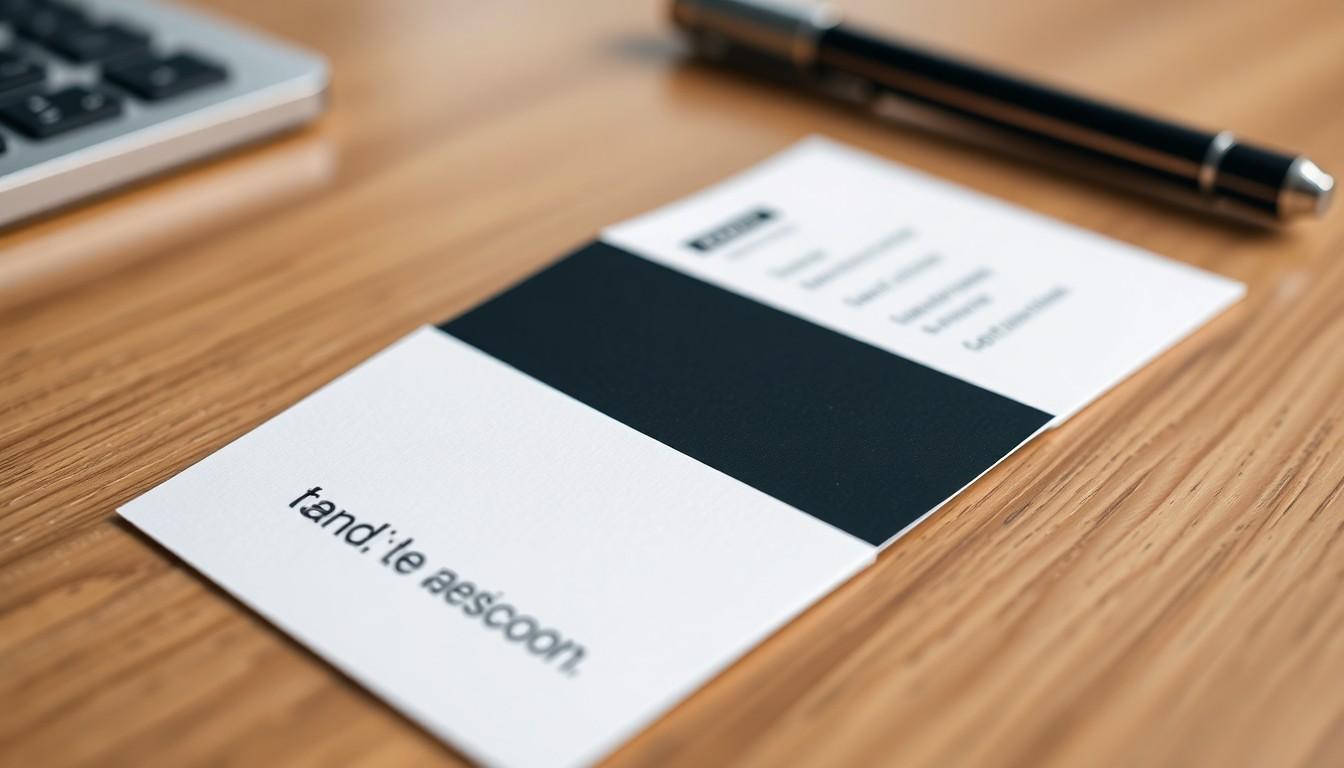
Formatting a business card plays a significant role in conveying our brand message effectively. A well-structured address isn't just an afterthought; it acts as a gateway for potential clients or partners to connect with us. We focus on ensuring the address flows naturally alongside other elements, creating a cohesive visual representation of our brand.
Clear formatting enhances readability, maximizing the impact of our contact information. For example, a neatly arranged address allows clients to find our location or reach out with ease, fostering professionalism and trust. We avoid cluttering the card with excessive text, opting instead for concise, legible information that reflects our brand identity.
Using an optimal font size and style is crucial. A font that's too small may deter recipients from engaging with the information, leading them to discard our card. By showcasing our address with clarity, we empower customers to reach out repeatedly, reinforcing our presence in their minds.
Additionally, the type of material serves to elevate our brand perception. Premium card stock leaves a lasting impression, indicating attention to detail. We display our address prominently, using high-quality printing solutions to showcase professionalism. When we prioritize the format of our business cards, including the address, we elevate our brand presence and encourage potential customers to engage with us.
For businesses seeking to optimize their branding through effective card design, exploring business card templates can provide valuable insights and inspiration. The layout of business cards guides us toward achieving the best formatting for presenting our address. This careful attention to detail transforms a simple piece of cardstock into a powerful tool for communication.
By emphasizing the importance of business card formatting — particularly the address — we ensure that our brand message is communicated clearly, making a strong connection with those who receive our cards. Through the exceptional custom printing solutions offered by 4OVER4, we can create business cards that truly reflect our brand identity.

Standard Business Card Dimensions
Understanding standard business card dimensions is essential for creating a professional design. The most common size for a business card in North America measures 3.5 inches by 2 inches (or approximately 8.9 cm x 5.1 cm). This size strikes a balance between spaciousness and portability, fitting comfortably in wallets and card holders.
| Dimension Type | Standard Measurement |
|---|---|
| Width | 3.5 inches (8.9 cm) |
| Height | 2 inches (5.1 cm) |
Choosing this standard size makes distribution easier as clients are familiar with this format. For those desiring to stand out, alternative formats such as square or vertical cards are available, yet they may require different design considerations.
The layout must incorporate bleed lines and safety lines. Bleed lines extend any background colors or design elements to the edge of the card, preventing any unwanted white borders after cutting. Safety lines ensure that vital information remains within a secure area during the trimming process.
When designing, remember to keep all necessary information easily readable. We should use a font size of at least 8pt, with larger text for names or primary elements. A good practice is to make the company name stand out with font sizes above 12pt.
Employing professional printing solutions enhances brand identity. Custom printing from 4OVER4 helps bring our business card concepts to life, ensuring clarity and quality. For optimal results, we can refer to resources on how to layout business cards for printing and explore various business card templates![]() for creative design options.
for creative design options.
Utilizing 4OVER4’s services enables us to create visually appealing business cards that showcase our brand effectively. Quality prints, combined with strategic layouts, elevate our professional image and ensure that we make a lasting impression.
Essential Information to Include

When crafting an address on a business card, we focus on several essential pieces of information that convey professionalism and facilitate connection.
Name and Company
Include our name along with the name of our business or organization. This information usually occupies the most prominent position on the card. Ensuring clarity here sets a strong first impression.
Contact Information
- Phone Number: List our phone number, which could include a local number, toll-free number, direct line, or fax number. Each option provides a way for clients or partners to reach us effortlessly.
- Email Address: Include an email address for quick communication. Creating a specific email for business inquiries helps manage correspondence and reduces spam.
Address
- Physical Address: If our business has a physical location, including the address enhances professionalism and demonstrates legitimacy. Even for virtual businesses, a mailing address can foster trust.
- Optional: If a business operates from both a physical storefront and an additional mailing address, we can include both options. This adds a layer of transparency without being unnecessary.
Here's a breakdown of suggested formatting options to help with our business card design. We provide clarity and structure through high-quality materials and professional printing solutions.
| Element | Description |
|---|---|
| Name & Company | Most visible; use bold text to stand out. |
| Phone Number | Clear, varied options to reach us easily. |
| Email Address | A specific address for inquiries keeps spam at bay. |
| Physical Address | Vital for brick-and-mortar locations; adds legitimacy. |
| Optional Addresses | Clarifies storefront and mailing options if applicable. |
4OVER4 provides exceptional custom printing solutions, enabling us to elevate our brand presence. Stylish designs and strategic layouts, like those featured in this how to layout business cards for printing![]() resource, enhance the visibility of essential information.
resource, enhance the visibility of essential information.
We can also explore various business card design templates to find inspiration that aligns with our brand’s identity, ensuring a polished finish that resonates with our audience.
Finally, it's crucial to ensure that the formatting and information on our business cards remain consistent. The details contained within are not just words; they contribute to the overall impression we create.
Font Choices for Readability and Style
Selecting the right font significantly enhances the readability and style of a business card. We prioritize clarity and professionalism in every detail, including font choice.
- Opt for Readable Fonts: Choose sans-serif fonts for modern appeal and clarity. Fonts like Arial, Helvetica, and Calibri offer a clean look. Use serif fonts, such as Times New Roman or Georgia, for a more traditional feel.
- Maintain Consistent Sizing: Keep the font size at least 8pt for all text elements. Larger sizes, like 12pt or more, work well for company names. Consistency across the card promotes better readability.
- Utilize Bold and Italics Wisely: Employ bold text for names and titles, as this draws attention to critical information. Use italics sparingly for emphasis, ensuring it doesn't compromise clarity.
- Limit Font Styles: Limit the number of font styles to two or three. Overuse can create a cluttered appearance. Stick to one style for the company name and another for contact details.
4OVER4's expertise in custom printing solutions supports businesses in choosing optimal font choices. With our high-quality materials, a well-designed business card can leave a lasting impression. The right fonts enhance the overall aesthetic, effectively convey the brand message, and elevate brand presence.
For businesses seeking inspiration, explore layout tips for business cards that ensure optimal presentation. Additionally, consider visiting business card templates![]() for design ideas that align with your brand identity.
for design ideas that align with your brand identity.
Incorporate relevant images to visualize font choices and business card layouts, emphasizing the critical elements that contribute to effective communication.
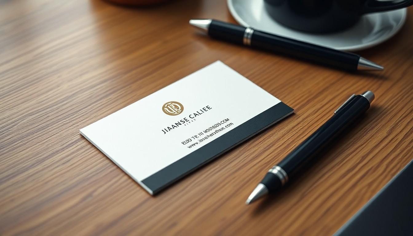
Color and Branding Considerations
Color and branding play vital roles in the effectiveness of a business card. Choosing the right colors enhances visual appeal and conveys the right message about our brand.
Color Psychology
- Choose Colors That Reflect Your Brand: Selecting colors thoughtfully can resonate with recipients and convey our brand's identity clearly.
- Blue: This color signifies trustworthiness and honesty. It’s often favored by professionals in finance, law, and healthcare.
- Black: Known for its elegance, black grabs attention. This shade is popular in the tech, CEO, and fashion industries due to its bold nature.
Effective Branding
Creating a strong brand presence through business cards involves striking a balance between aesthetic appeal and informational clarity. We can leverage high-quality materials to enhance the tactile experience, which fosters a memorable interaction.
4OVER4 offers custom printing solutions that enable us to elevate our brand presence effectively. Their expertise ensures our cards reflect our brand identity, making a powerful statement.
Visual Elements
Integrating visual elements into our design significantly impacts how recipients perceive our brand. Relevant images, such as our logo or product visuals, can create a lasting impression. We recommend incorporating images thoughtfully to maintain balance and avoid clutter.
Layout and Formatting
Adhering to effective layout strategies enhances the readability and overall impact of our business card. Key components should be easy to locate, with our name and company clearly highlighted. We can explore layout tips and design templates to inspire our design approach, ensuring our branding remains consistent across all elements.
Using the right colors, high-quality materials, and effective layouts enables us to create business cards that not only convey necessary information but also strengthen our brand's identity.
Proper Use of White Space
Proper use of white space enhances the readability and professionalism of a business card. We should aim for a balanced layout without overcrowding elements. Effective white space creates visual breathing room and draws attention to important information.
Aligning information properly within a defined space prevents confusion and ensures clarity. For instance, keeping the name and job title distinct from the contact details ensures easy navigation. Placing the physical address or website details at the bottom can help in guiding the viewer’s eye seamlessly across the card.
Utilizing margins around the edges aids in maintaining a clean appearance. A margin of at least 0.125 inches (3.175 mm) allows for safe trimming and keeps vital content intact. This practice promotes a polished look and enhances the overall aesthetic appeal.
Incorporating sufficient spacing between text blocks improves legibility. For example, adding a 1/8 inch (3 mm) gap between sections such as name, title, and contact information maintains structure. Consistent spacing creates a harmonious flow and contributes to brand perception.
Using high-quality printing materials also influences the impact of white space. With services like 4OVER4's custom printing solutions, businesses can achieve clarity while enhancing their brand representation. Such quality elevates the overall impression that a business card imparts.
Images can further support the message without cluttering. Including relevant visuals, such as logos or icons, can reinforce brand identity while preserving space. For guidance on layout and design options, we can explore resources like layout tips and design templates.
Utilizing white space effectively not only boosts readability but also emphasizes critical information, showcasing professionalism. For those looking to elevate their brand presence, quality printing from 4OVER4 transforms basic design elements into powerful communication tools.
Single-Sided vs. Double-Sided Layouts
Choosing between single-sided and double-sided business card layouts affects the information placement and overall design. Here's a breakdown of the key points.
Single-Sided Business Cards
Limited Space
Single-sided business cards present a challenge due to limited space. We prioritize essential information, typically including:
- Name and Job Title: Clearly state your name and title for instant recognition.
- Business or Organization Name: Include your company's name prominently.
- Contact Information: Add a phone number and email address for easy communication.
- Website URL: Include your website, directing potential clients to further information.
- Address: Opt for omitting the physical address, given the space constraints.
Design Simplicity
Design simplicity matters for readability. Clutter-free layouts enhance effectiveness, helping recipients quickly absorb your information.
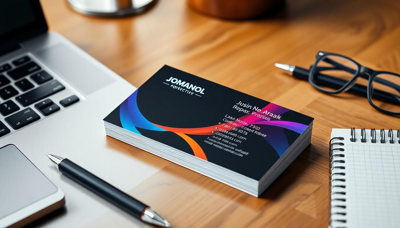
Double-Sided Business Cards
Expanded Space
Double-sided business cards provide additional space for information. We utilize this to present more comprehensive details, such as:
- Additional Contact Options: Include multiple phone numbers or social media handles.
- Detailed Company Description: Allow for a brief description or tagline that encapsulates our mission.
- Branding Elements: Feature logos, colors, or images that reflect our brand's identity.
Creative Design Opportunities
The added space allows for wider creative expression. We can incorporate unique design elements, like:
- Visual Elements: Use graphics or images that reinforce our brand message.
- QR Codes: Include QR codes that link to our website or social profiles, offering instant access to further information.
Enhancing Layout with 4OVER4
4OVER4’s custom printing solutions elevate our business presence. Through their expertise, we can create visually appealing and effective layouts tailored to our specifications. Accessing resources for business card printing, like these templates, helps simplify our design process.
Layout choices significantly impact how our brand is perceived. To learn more about optimizing designs, explore this guide on layout strategies![]() . With the right layout, a business card transcends a mere formality, transforming into a powerful communication tool.
. With the right layout, a business card transcends a mere formality, transforming into a powerful communication tool.
Utilizing high-quality materials and professional printing enhances how our business is represented. We trust in 4OVER4’s ability to provide solutions that reflect our brand identity accurately.
Best File Formats and Print-Ready Settings
When creating business cards, selecting the right file formats and print-ready settings ensures high-quality reproduction. We recommend the following formats for optimal results:
- PDF: Use PDF format for final files. PDF preserves formatting, fonts, and layout, making it ideal for professional printing services.
- JPEG: Opt for JPEG files for images. JPEGs compress image data while maintaining good resolution, suitable for photographic elements on business cards.
- TIFF: Choose TIFF files when high-quality images are essential. TIFF supports lossless compression, ensuring vibrant colors and sharp details.
Print-Ready Settings
Establishing print-ready settings is crucial for successful printing. Adhere to these guidelines:
- Resolution: Set a minimum resolution of 300 DPI (dots per inch) for images to guarantee clarity. This standard prevents pixelation during printing.
- Color Mode: Utilize CMYK color mode for prints. CMYK (Cyan, Magenta, Yellow, Black) aligns with commercial printing processes, producing accurate colors.
- Bleed Area: Incorporate a bleed area of at least 0.125 inches. This extra margin ensures the design extends to the edge of the card after trimming.
- File Size: Keep the file size manageable without sacrificing quality. This approach aids in easier uploading and processing with printing services.
Additional Considerations
Maintaining a professional appearance is essential. We trust that 4OVER4's expertise in custom printing solutions elevates our brand presence. Their tailored approach creates visually stunning business cards that leave lasting impressions. For design inspiration, we can explore their array of business card templates![]() to ensure a fitting design.
to ensure a fitting design.
By establishing correct file formats and print-ready settings, we maximize the impact of our business cards while fostering effective communication. Integrating these practices reflects our attention to detail and commitment to professionalism. To enhance layout effectiveness, we encourage reviewing layout strategies for printing.
Common Business Card Formatting Mistakes
- Incorrect Address Format: Using incorrect or incomplete addresses generates confusion. Adhere to the specific address format required for on-campus, admissions, and off-campus staff. For example, on-campus staff should use their directory address, such as 1616 Guadalupe, D2100, Austin, TX 78701. Adhering to guidelines ensures clarity in communication.
- Abbreviations Misuse: Misusing abbreviations can lead to misunderstandings. Follow the standard abbreviations according to your organization's guidelines, like using "Blvd." in place of "Boulevard," and ensure the inclusion of a nine-digit ZIP code when applicable, such as Austin, TX 78701 or Austin, TX 78713-8058.
- Overcrowded Text: Overcrowding text with excessive information reduces readability. Limit the text quantity to essential details such as name, title, and contact information, typically no more than 7 to 10 lines. Ensuring clarity in design and layout accentuates professionalism.
- Poor Font Choices: Choosing inappropriate fonts can detract from the card's professionalism. Opt for legible fonts that reflect your brand's personality, selecting clean sans-serif options for a modern look or serif choices for a classic appeal. Maintain consistent font sizing, ensuring that crucial elements like names are distinctly visible with larger text.
- Lack of Quality Materials: Neglecting to use high-quality materials can impact perceptions of your brand. Utilize a premium cardstock that conveys professionalism. A double-thick cardstock enhances durability, ensuring the card withstands handling while making a strong impression.
- Neglecting Proofreading: Skipping thorough proofreading can lead to embarrassing errors. We recommend asking a colleague or a professional copy editor to review your card before printing. A single spelling mistake can create a negative impression.
- Complicated Layout Elements: Using complex design features, like elaborate borders and intricate typography, complicates printing and could detract from the information conveyed. Simple, clean designs enhance the reader's experience. Focus on the key elements and allow ample white space.
- Inadequate Use of White Space: Failing to utilize white space correctly might result in an overcrowded appearance. Maintain margins of at least 0.125 inches. Proper use of white space not only boosts clarity but also emphasizes professionalism.
- Ignoring QR Codes: Underutilizing QR codes can limit the information provided. Including a QR code can direct customers to additional resources or promotions. Place these codes on the reverse side for easy access without cluttering the primary design.
- Choosing Incorrect Card Dimensions: Incorrect dimensions can lead to complications in printing and presentation. Standard dimensions for business cards are 3.5 inches by 2 inches. Ensure your design adheres to these specifications to maintain professionalism.
Utilizing the expertise and quality printing solutions from 4OVER4 elevates the effectiveness of your business cards. By implementing these insights, organizations can ensure that their cards facilitate strong connections and leave lasting impressions. We encourage exploring options such as business card templates![]() and layout tips to create exceptional business cards.
and layout tips to create exceptional business cards.

Conclusion
Creating a business card that stands out requires careful attention to detail. By ensuring the address is clear and formatted correctly we set the stage for effective communication. A well-designed card not only reflects our brand identity but also fosters trust and professionalism.
Utilizing optimal fonts and high-quality materials enhances readability and leaves a lasting impression. We should also consider layout strategies that make key information easily accessible while incorporating white space for a clean look.
With the right design choices our business cards can become powerful tools for networking and engagement. Let's embrace these principles to elevate our brand presence and make meaningful connections.
Frequently Asked Questions
Why is the address important on a business card?
The address on a business card serves as a critical first point of contact for potential clients or partners. It enhances communication, conveys professionalism, and creates a positive first impression.
What should I include in my business card address?
Your business card address should include the complete street address, city, state, and ZIP code. Clarity in this information is essential for effective communication and professionalism.
What are the ideal dimensions for a business card?
The standard size for a business card in North America is 3.5 inches by 2 inches. This size strikes a balance between portability and enough space for essential information.
How do I format my business card effectively?
Effective formatting includes using optimal font size, consistent spacing, and clear sections for each piece of information. Ensure that vital details like your name and contact information stand out for legibility and professionalism.
What font styles are best for business cards?
For modern aesthetics, sans-serif fonts like Arial and Helvetica are recommended. Traditional styles may prefer serif fonts like Times New Roman. Consistency in font choices enhances readability.
How important is color selection in business card design?
Color selection plays a significant role in conveying a brand's identity and visual appeal. Colors like blue suggest trustworthiness, while black may convey elegance, impacting your overall brand perception.
Should I opt for single-sided or double-sided cards?
Single-sided cards are simpler and suitable for essential information only, while double-sided cards provide more space for details, creative design, and additional elements like QR codes.
What file formats should I use for printing business cards?
For business cards, use PDF files for final designs, JPEG for images, and TIFF for high-quality visuals. Ensure to adhere to print-ready settings like 300 DPI resolution and CMYK color mode.
What are common mistakes to avoid when designing a business card?
Common mistakes include overcrowded text, poor font choices, incorrect address formats, and lack of quality materials. Ensuring clarity, simplicity, and readability is vital for a professional appearance.
How can white space enhance my business card design?
Effective use of white space improves readability and professionalism. It allows for better organization of information and prevents overcrowding, making key details easier to locate and read.
More from Business Cards

4081
Business cards are still important for marketing in 2024. For e
![]() Emma Davis
Emma Davis
Oct 10, 2024

9956
A well-designed business card is important for making a memorable first impression. It represents your brand
![]() Emma Davis
Emma Davis
Jan 10, 2024

22942
High-quality but best affordable business card design
![]() Matthew Prince
Matthew Prince
Nov 15, 2023

3221
The letterpress printing technique first emerged in the 15th century. Nearly 600 years after these designs surfaced, brands and professionals
![]() Matthew Prince
Matthew Prince
Oct 25, 2023

3968
Handing out memorable business cards at networking events and conferences is vital for building relationship
![]() Matthew Prince
Matthew Prince
Oct 11, 2023

6297
In a world where first impressions matter more than ever, clear business cards are revolutionizing how we present ourselves. These sleek, tran
![]() Matthew Prince
Matthew Prince
Aug 4, 2023

13153
In our fast-paced business world, you have very little time to stand out from the competition. However, we design
![]() Matthew Prince
Matthew Prince
Jul 21, 2023

16254
A business card is more than just a piece of paper—it’s often the first impression we leave with potential clients. For photograph
![]() Matthew Prince
Matthew Prince
Jul 21, 2023