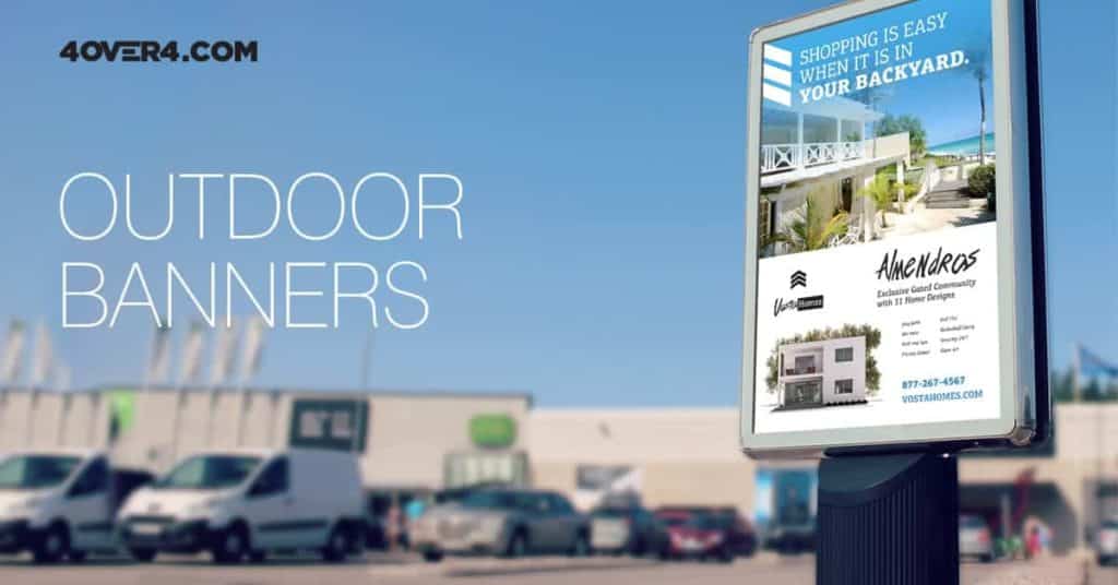
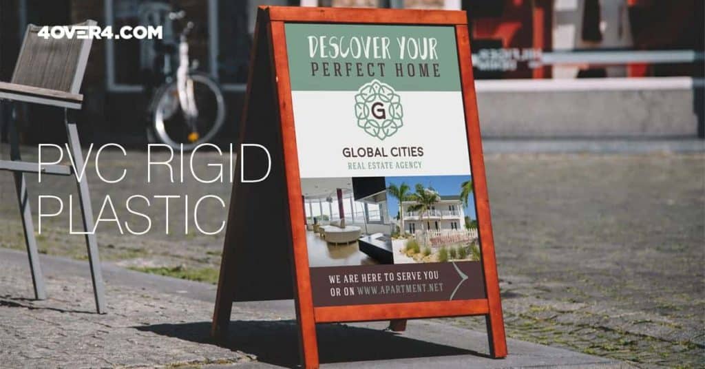
Eyecatching. Unique. Memorable. Coming up with real estate sign ideas that meet each of these criteria isn’t a piece of cake, especially when signs are often similarly designed. Whether you are busy meeting with clients or out generating new leads, you need to focus on your marketing materials because they will ultimately work for you 24/7.
So, if your goal is to transmit the essence of your brand and distinguish your services from the ones your competitors offer, you need some great marketing ideas to avoid getting lost in a sea of advertising messages that all look the same.
Thinking outside the box is the secret ingredient to standing out amongst your competitors. Whether your aim is to increase your client list or the number of calls you receive, drawing attention to your sign is no simple task. That’s why we’ve compiled four useful ideas to make your real estate sign stand out:
Include a Photo That Speaks for Itself
When it comes to real estate, a picture is worth more than a thousand words; it is worth thousands of dollars. Not only does a professional looking photo make your sign more trustworthy, it also gives your potential clients greater chances of remembering you when they are in need of a real estate agent.


You also need to define your identity and stick to it. Whether you want to portray a professional, memorable, funny, glamorous or approachable image, make sure you convey your idea clearly. Some real estate agents prefer to choose a photo where they are wearing their most elegant suite, while others want to create a more memorable impression and therefore break the mold, just like Brad J. Lamb. Lamb is a top Canadian Real Estate agent whose advertising consists of a lamb with Brad’s face. It’s indeed pretty hilarious.
Whatever your style is, your photo gives you the opportunity to make sales on a more personal level. Potential buyers may be more likely to attend an open house or make an appointment with a friendly real estate agent rather than a faceless corporation.
Choose a Consistent Theme
Whether you want to stick to a merely professional concept or go the funny route, you need to establish brand consistency throughout your marketing materials, business cards, outdoor banners, yard signs, flyers and overall business stationery. Real estate is an exciting industry because you can build your own identity on your own terms.


To choose a consistent theme, the first step is to carefully select your brand colors. While blue is associated with trustworthiness and purple is linked to royalty, red grabs attention immediately. It’s all about how you want to be perceived. Once you choose a photo, specific colors and a slogan, you should start developing a consistent theme that will help you gain a professional reputation in the real estate industry.
A good reputation will attract clients to you and make the marketing process successful when customers have positive feelings towards your business. If you have a great concept to jumpstart your real estate marketing efforts, choose 4over4 to print a fully equipped marketing arsenal. We stand out among our competitors in terms of quality, quick turnarounds and costeffective prices. And because we care about your budget, we are offering 30% OFF all our real estate print products, including Yard Signs, Aluminum Signs, Banners and Large Format Prints. Take advantage of this awesome deal before it’s too late!
Craft a Clear and Compelling Message
Not only can you build an image with a gorgeous photo, the words you use say a lot about your personality. Regardless of whether you are crafting a message for your flyer, outdoor banner or yard sign, a compelling call to action is key to attracting positive attention to your business and staying in the minds of prospective buyers and sellers. Focus on your audience, not on your expertise or skills. Remember that potential buyers will ask themselves “what’s in this for me?”, so give your readers reasons for calling you. Include a strong and persuasive CTA that compels them to take action immediately!
Next, strategically place the information on your sign: #1 Contact phone, #2. Name, #3 Sale or Lease, #4 Logo. However, it is important to remember that this order of priority depends on the purpose of your sign – are you promoting yourself or a property. Write your message in a userfriendly way and keep it simple, choose no more than two fonts, give a lot of attention to detail and proofread at least three times.


Use Cross‐Media Marketing
Even though Real estate signs are an influential marketing tool, they shouldn’t be your only method of advertising. Social media networks, print ads and television commercials can create a strong crossmarketing strategy. This can help you reach a wider audience, gain their trust and give you the ability to tap into different markets.
One of the keys to developing a successful crossmedia marketing campaign is to know your audience well. You need to know what their hobbies are and where they spend their free time in order to place your advertising in the right place and be able to speak directly to them. Once you know where to find your audience, think outside the box. Print floor graphics, use calendars as giveaways or upload a YouTube video that shows off your achievements.
Got some interesting real estate sign ideas of your own? Share them below and get the conversation started!


