

TABLE OF CONTENTS
The Difference Between Leading, Kerning, and Tracking
Mar 15, 201927052 views
Mar 15, 201927052 views
Typography is more than just arranging letters on a page; it’s an art that shapes how we perceive and engage with text. When we talk about kerning and tracking, we’re diving into two critical concepts that can make or break the readability and visual appeal of any design. These subtle adjustments may seem minor, but they play a huge role in creating text that’s both functional and aesthetically pleasing.
We’ve all come across text that feels cramped or oddly spaced, making it hard to read or just plain unappealing. That’s where understanding kerning and tracking comes in. While kerning focuses on the space between individual letters, tracking adjusts spacing across entire words or lines. Knowing the difference and how to use each effectively can elevate your designs and ensure your message lands just right. Let’s explore these essential tools and how they impact typography.

Leading
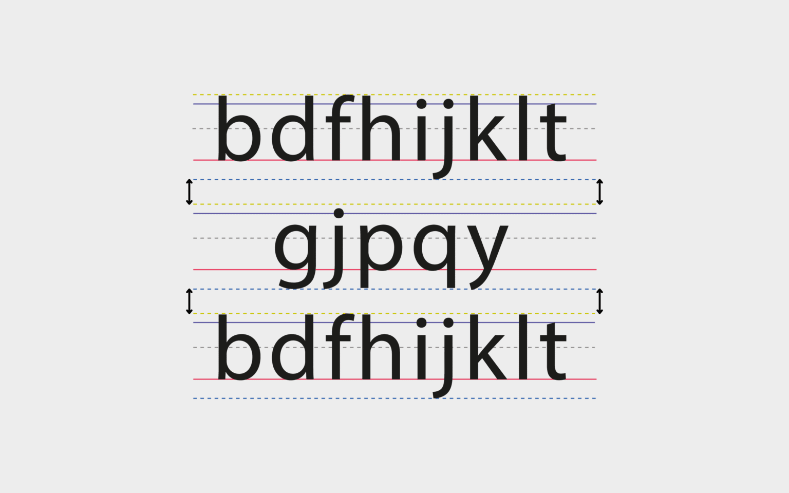
Leading, or line spacing, is a key factor in how legible your design will be. It makes the whole thing look great too. It sets the vertical distance between baselines of text. This manipulation assists in guiding the reader’s eye and controlling the flow of information to create a seamless transition from one line to another.
When used with purpose, good leading creates an effortless reading experience. It further improves the overall aesthetics and readability for your audience. When lines are too close together, it makes them more difficult to read. This design decision encourages readers to interact with the content on a more profound level, particularly in information-dense formats.
The rule of thumb for leading is 120% of the font size. This indicates that if you’re setting your type at 12 points, the leading should be no less than 14.4 points. Tools such as Adobe software do this automatically by using a 120% leading default. This helps to provide an even, neutral baseline for the majority of designs.
You will still need to make adjustments, as with any font or layout you’re working with. Fonts with excessively tall ascenders or descenders, for example, may need just a bit more leading to keep it from looking cramped. Conversely, fonts that are more condensed in their design can benefit from a tighter line-height.
When drawing the eye with larger blocks of text, striking the right balance is key. Too little leading will squish the text together and leave the reader with an unpleasant reading experience. On the page, the lines tend to blur together, creating visual confusion.
Too much space can actually create a barrier, breaking up the flow of reading. It requires the reader’s eye to “jump” uncomfortably from one line to the next, creating an uncomfortable and fatiguing read. Next time you’re designing a magazine article or a blog post, watch your leading.
Too narrow leading can create the illusion of a dense paragraph as a solid block of text, where too much leading can leave the reader’s eyes feeling lost. If you’re working in Photoshop and need to change leading, it’s a simple process. Open the Character palette from the Window menu, where you’ll find the leading option.
You can then further edit these values in order to achieve the best design results. Remember that all you’re trying to do is make a reading experience that feels effortless. Whether you’re designing a book, website, or flyer, leading makes all the difference.
It adds professionalism to your work and makes your content feel more cohesive and comfortable to read.
Kerning
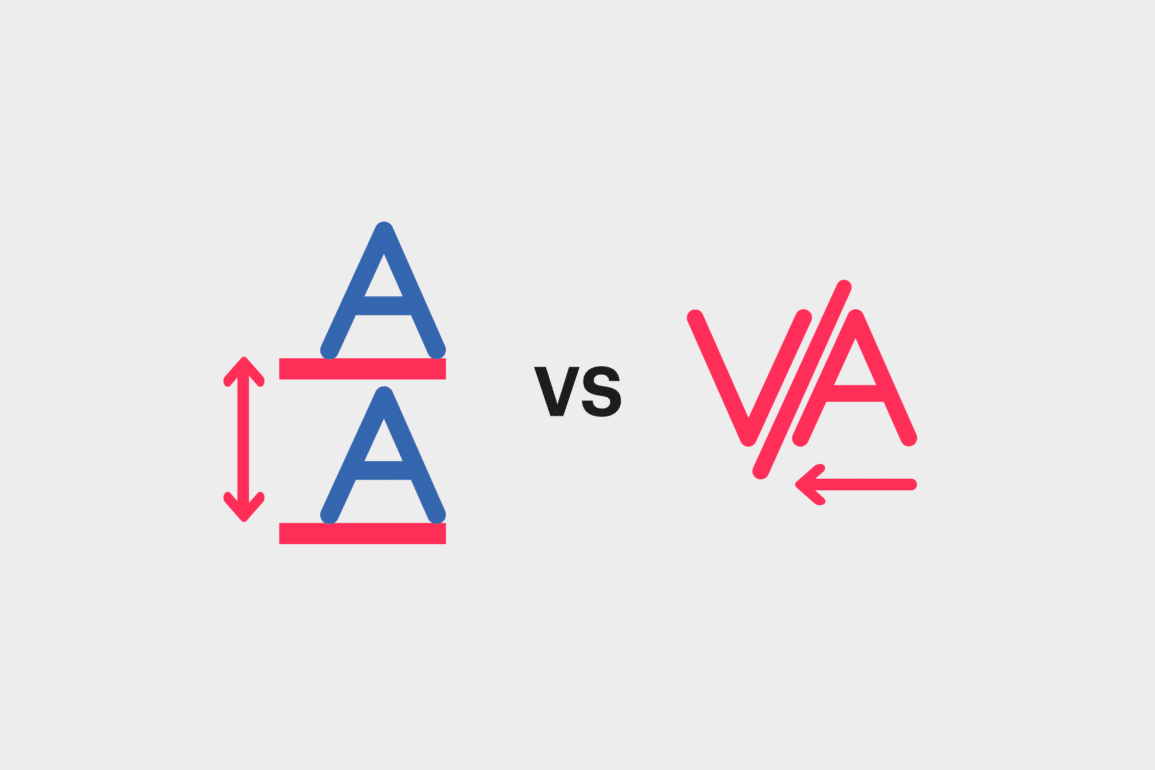
Kerning focuses on adjusting the spacing between two specific characters in a word. This practice refines the visual flow and enhances text readability, making it critical for polished design outcomes. Proper kerning transforms uneven spacing into balanced typography, ensuring content appears professional and easy to read.
Adjusting Kerning in Photoshop
Efficient kerning adjustments are achievable using Adobe Photoshop's Character Panel. Here are the steps:
-
Access the Character Panel: Locate it via the "Window" menu, ensuring it's visible for easy access.
-
Select the Text Tool: Use the Text Tool and position the cursor between the two letters requiring adjustment.
-
Fine-Tune Spacing: Input precise values in the kerning field or use keyboard shortcuts—such as the Option key with directional arrows—to shift characters closer or farther apart in increments.
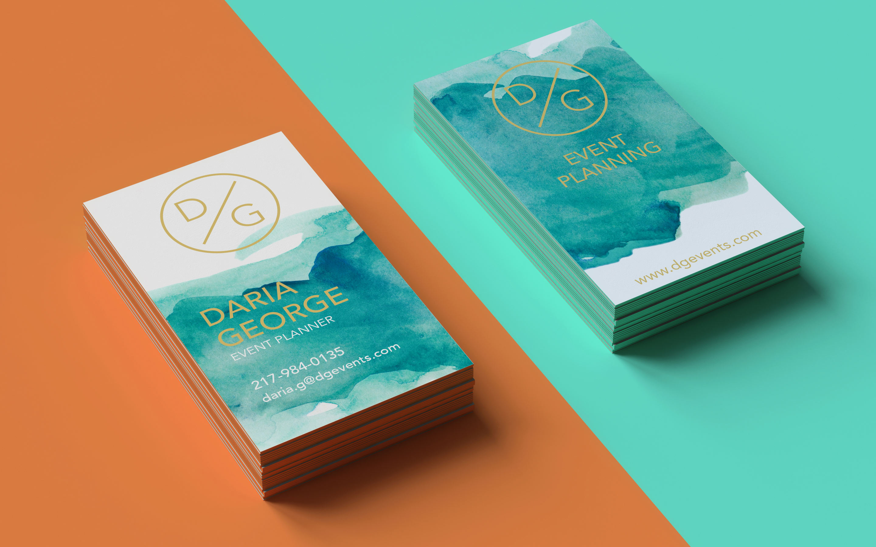
When designing with tools like Photoshop, we can create balance by manually adjusting kerning or relying on automatic kerning presets. For business cards, where clear and appealing typography is essential, professional designs embody strong kerning and tracking techniques for polished results. Explore free business card![]() templates that showcase prime typography examples.
templates that showcase prime typography examples.
In dynamic printing solutions, kerning directly impacts visual output. At 4OVER4.COM, we understand its significance, ensuring our clients' designs achieve harmony and professionalism. If you're crafting unique layouts, consider printing with custom adjustments for a refined text presentation. Unsure how your design translates in print? Request free samples to experience the difference.
Accurate kerning complements other design elements, creating work that stands out. To see how exceptional business card designs utilize optimal spacing, explore business card design templates![]() that integrate balanced kerning and tracking.
that integrate balanced kerning and tracking.
Tracking
Tracking involves adjusting the overall spacing across entire words or blocks of text uniformly. This technique creates balanced, cohesive designs, ensuring text is visually pleasing and easy to read. Compared to kerning, which focuses on individual letter spacing, tracking affects all letters simultaneously.
Adjusting Tracking in Photoshop
To adjust tracking in Photoshop:
-
Open the Character Panel by selecting "Window" > "Character".
-
Type the text using the Text Tool.
-
Select the text to modify and locate the tracking input field in the panel, below the kerning option.
-
Use the dropdown menu or input values to increase or decrease spacing. Alternatively, hold the "Option" key (Mac) or "Alt" key (Windows) and press direction arrows to adjust tracking incrementally.
Tracking adjustments are helpful for headings, where adding extra spacing can enhance emphasis. Restrict increased spacing to display fonts or headings since too much space can hinder readability for body text. When used properly, tracking improves the visual impact of custom pieces like business cards, making them stand out.
Careful tracking ensures consistency in fonts like serif or script, where spacing variations between characters can disrupt the flow. Designers often manipulate tracking to fit text into predetermined spaces without altering font size. For example, aligning text elements in a free business card design benefits from subtle tracking changes to maintain proportion and balance.
4OVER4.COM empowers businesses to elevate their brand through professional designs and expert printing solutions. Proper tracking and kerning techniques are integral to creating polished, high-quality designs suited for professional and promotional purposes. By requesting free samples![]() , clients can explore our standards in print quality and customization for typography-focused projects.
, clients can explore our standards in print quality and customization for typography-focused projects.
Leading, Kerning and Tracking in Print
Leading, kerning, and tracking collectively ensure typography in print is both visually appealing and readable. They play distinct yet interconnected roles in refining text layout and enhancing the visual flow of designs.
Leading: Leading determines the vertical spacing between lines of text, affecting how smoothly readers move from one line to another. Proper leading prevents overcrowding or excessive gaps between lines, especially in lengthy print projects like brochures or books. Adjusting leading values ensures readability, particularly with varied font sizes and styles. For designers seeking polished results, experimenting with free samples of layouts ensures balanced designs.
Kerning: Kerning fine-tunes the space between individual letter pairs. For example, combinations like "WA" or "TO" may require minor adjustments to maintain visual harmony. Without precise kerning, letters can appear disjointed, impacting the overall aesthetics of a headline or logo. Using techniques like Metric Kerning or Optical Kerning enhances readability. Business card design templates showcase the importance of meticulous kerning for creating professional and visually cohesive designs.
Tracking: Tracking modifies the uniform spacing across entire words or blocks of text. While kerning adjusts individual pairs, tracking targets uniformity across a longer range of characters, like a sentence. Proper tracking can make entire sections of text look light and spaced or compact and bold. Designers often use tracking to ensure text fits cohesively within a layout. This technique is valuable in creating bold, airy elements for headings without compromising readability. Using free tools for crafting business cards helps test different tracking levels effectively.
Opting for premium custom printing from 4OVER4.COM elevates brand designs by merging these typography techniques into seamless solutions. Our expertise ensures that text alignment, from kerning to tracking and leading, boosts readability and enhances the aesthetic appeal of printed materials.

Kerning vs Tracking Explained
Kerning and tracking are essential typography concepts with distinct purposes and applications. Understanding their differences enhances text readability and supports visually balanced designs.
Definition and Role
Kerning adjusts the spacing between individual letter pairs, focusing on specific character combinations like "AV" or "TA". Proper kerning ensures letters sit visually balanced, improving the elegance of a design. For instance, headlines or large fonts often require kerning for optimal readability.
Tracking, or letter-spacing, modifies the space uniformly across entire words or text blocks. This adjustment affects text density and creates cohesive layouts. Applying tracking can influence text mood and fit designs into pre-defined layouts, such as business cards or banners.
Application Differences
Kerning operates on individual letters, solving spacing inconsistencies that disrupt visual harmony. For example, certain serif fonts may present uneven gaps between characters, which kerning resolves effectively.
Tracking applies changes on a broader scale, modifying the overall spacing of text for consistency. For titles, tracking adjustments make text airy and prominent, while overly tight or loose tracking can sabotage readability.
Tips for Effective Typography
-
Use kerning for perfection: Focus kerning adjustments on critical design elements like logotypes.
-
Adjust tracking carefully: Ensure readability by testing different tracking settings, avoiding over-tightening or over-loosening.
-
Create cohesive prints: Marry kerning and tracking adjustments to maintain readability and visual flow.
Elevate Designs with 4OVER4.COM
4OVER4.COM specializes in creating professional, print-ready designs. Custom solutions like business cards rely on strategic typography to leave lasting impressions. Trial designs using free samples and benefit from expert printing services tailored to your needs.
For consistent results in materials like free business cards![]() , combining kerning, tracking, and high-quality printing elevates your typography’s impact.
, combining kerning, tracking, and high-quality printing elevates your typography’s impact.
Learn More About Typography
Typography plays a fundamental role in elevating the visual identity of any business. By understanding and applying core concepts like kerning and tracking, we create text that is not only legible but also aesthetically balanced. When designing materials such as business cards or branded print assets, these adjustments ensure professional and impactful designs.
Kerning ensures harmony between individual letter pairs. For example, pairs like "To" or "Yo" may look uneven without changes. This precision becomes especially important for larger font sizes, where visual flaws are more noticeable. Tracking, on the other hand, modifies the spacing across entire blocks of text, which is ideal for managing word density and creating a consistent, polished appearance throughout. The balance of these spacing tools directly influences how a brand communicates its message visually.
At 4OVER4.COM, we offer a range of custom printing solutions, including free design templates for business cards and premium printing services. By combining expert typography techniques with high-quality materials, we help businesses establish their brand presence effectively. Choosing well-crafted typography for branded designs, such as free business cards![]() , ensures that every word reflects professionalism.
, ensures that every word reflects professionalism.
Typography extends beyond digital use, with subtle adjustments to kerning and tracking improving readability in physical formats. Customers can explore free samples to see firsthand how expert typography transforms layouts into cohesive and visually appealing designs.
Key Differences: Kerning vs Tracking in Typography
Kerning and tracking are both essential for refining typography, but they differ significantly in their purpose and application.
Definition and Scope
Kerning refers to adjusting the spacing between individual letter pairs to ensure they appear visually harmonious. It's typically applied to problematic pairs like "AV" or "Wa," where the default spacing may create awkward gaps. Designers frequently rely on kerning to enhance readability and elegance, especially for headlines or logos.
Tracking involves uniformly adjusting the spacing across all letters in a word, line, or block of text. This technique ensures a balanced overall appearance—even spacing across multiple characters can make text blocks cohesive and visually pleasing. Tracking is often used in business cards, headers, and print layouts to manage text density effectively.
Application in Design
Kerning focuses on individual letter relationships. Fonts with stylistic variations, such as serifs or flourishes, often benefit most from kerning adjustments.
Tracking applies across entire sections of text. It’s commonly employed to improve spacing in business cards or adjust the tone of a design. For example, loose tracking creates a light, airy feel, while tight tracking conveys compactness and urgency.

Functional Impacts
Precise kerning reduces friction between adjacent characters, ensuring no letter distracts or stands out unnecessarily. For instance, in branding elements, kerning adjustments guarantee the name appears sleek and professional.
Tracking, by contrast, adjusts the visual density of text, making it easier to integrate designs into specific spaces. Effective tracking ensures content fits seamlessly without impacting readability. View our options for free business cards![]() enriched with precise typographic adjustments.
enriched with precise typographic adjustments.
Usage and Considerations
Kerning is ideal for creating polished logos, titles, and other high-impact design features. It adjusts relationships between letters for flawless harmony.
Tracking is better suited for managing large blocks of text in print or digital formats. However, poor tracking decisions—such as overly spaced letters—can hurt readability. For consistent results, test adjustments with free samples before finalizing a design.
By combining precise kerning and balanced tracking, we can elevate typography for any project, enhancing its visual appeal and professionalism. Ensure your designs stand out through expert printing solutions from 4OVER4.COM.
Frequently Asked Questions
What is kerning in typography?
Kerning refers to the adjustment of spacing between two specific letters to ensure visual harmony and readability. Proper kerning helps avoid awkward gaps or collisions between characters for a polished appearance.
How does tracking differ from kerning?
Kerning adjusts the space between individual pairs of letters, whereas tracking modifies the uniform spacing across an entire word, line, or block of text to balance the overall design.
What is leading in typography?
Leading is the vertical spacing between lines of text. It ensures readability by preventing overcrowding or excessive gaps in layouts, especially in lengthy print projects.
How do you adjust leading in Photoshop?
To adjust leading in Photoshop, open the Character palette and modify the "Leading" value. This allows you to customize the vertical spacing between lines of text for a balanced design.
Why is typography important for branding?
Typography is crucial for branding as it enhances readability, establishes a visual identity, and conveys professionalism. Good typography ensures designs look polished and cohesive.
Can proper kerning improve design quality?
Yes, proper kerning improves design quality by fine-tuning the spacing between letters, creating harmony and enhancing readability, especially in logos and business cards.
How does tracking affect text density?
Tracking adjusts spacing across entire text sections, increasing or decreasing word density to create cohesive layouts and improve overall legibility.
What design projects benefit most from leading adjustments?
Projects like books, brochures, business cards, and long print materials benefit the most from leading adjustments as they require balanced, easy-to-read layouts.
Are kerning and tracking essential for business cards?
Yes, kerning and tracking are essential for business cards. They ensure the text is legible, visually appealing, and aligns with the brand’s professional image.
Where can I find resources for professional typography and printing?
4OVER4.COM offers expert printing solutions, free design templates, and custom typography adjustments to help businesses create standout print designs and establish their brand presence.
More from Graphic Design
31658
In today’s fast-paced business world, a well-designed business card can be your secret weapon. It’s more than just a piece of paper; it’
![]() Matthew Prince
Matthew Prince
Feb 3, 2023

5254143
If you had to choose between a plain colored or bold colored custom envelopes, which one would you choose? Color influences a person to open a
![]() Emma Davis
Emma Davis
Jul 18, 2020

5324147
Are you aware that
![]() Emma Davis
Emma Davis
Jun 17, 2020

3504751
So, you've decided to take the leap and print flyers
![]() Emma Davis
Emma Davis
Jun 4, 2020

3904387
One of the most perfect ways to showcase your company brand is by use of custom hang tags. These serve as a brilliant opportunity to have cust
![]() Emma Davis
Emma Davis
May 28, 2020

4824361
Marketing allows a vast window for business creativity in today’s world. One of those creative marketing gimmicks is the use of perforated w
![]() Emma Davis
Emma Davis
May 21, 2020

3453607
Have you ever received a postcard? If you have, you must know how warmth-inducing and thought-provoking they are. Now how would you feel if yo
![]() Emma Davis
Emma Davis
May 14, 2020

6063698
If you have been in any business; big or small, you know that it takes a lot of small efforts to make a big milestone. You also understand how
![]() Emma Davis
Emma Davis
May 14, 2020