Ever wonder where Coca-Cola found their dramatic red color? Do you love Barbie’s hot pink logo? If you answered yes, then you should thank Pantone, the magicians of color. Since 1962, Pantone has been responsible for creating and educating the world on the hottest color trends in print, fashion and the web. Their history is as colorful as their products.
The Birth of Pantone as We Know It
In the early days of the 1950s, Pantone was a commercial printing company based in New Jersey. In 1956 a young college graduate by the name of Lawrence Herbert began working there and quickly changed the face of the company. Herbert, the current CEO, Chairman and President of Pantone, used his knowledge of chemistry to create a system to simplify the production of the company’s stock pigments and colored inks. In 1962 Herbert purchased the company from his employers and has been making history ever since.
Color Inspired by World Events
Did you know that neon pink sweater you loved in the 80s was inspired by the economic upturn and the MTV pop culture? That vibrant era transformed into the more Zen colored 90s and the grunge generation. It seems that Pantone colors have expressed our culture's feelings and concerns over these last 50 decades.
The 21st century has no doubt been affected by technology and globalization. Citizens embracing their individuality have inspired Pantone colors Cerulean, Satellite, Chili Pepper, and Aspen Green just to name a few. Colors, it seems, are a definition of our times.

How Pantone Became The Definitive Language Of Color
Pantone has become the definitive language of color, thanks to its innovative Pantone Matching System (PMS). This color system is widely used in industries such as graphic design and printing to ensure accurate color matching. The Pantone Color Institute is renowned for its color expertise, and each year they select a Pantone Color of the Year to set trends in color palettes. In 2023, Pantone introduced the Pantone GOE system to further enhance color measurement, and in 2024, they launched Pantone 18-1750 Viva Magenta as a new hue to their line of base colors.
Pantone's color guides and color chips are essential tools for designers and printers to choose a color accurately for printing or digital projects. The Pantone Color Matching System ensures consistency in color variance across different materials and platforms. With over 180 million possible spot colors to choose from, Pantone has become the ultimate color reference for professionals in the industry.
In fact, Pantone is considered the color authority by many, and even has a Pantone Hotel in Brussels dedicated to showcasing their iconic color palettes. Whether using CMYK or PMS color guides, designers and printers alike rely on Pantone and X-Rite technology for their color expertise and accuracy in color matching.
Patriotic Influence
An interesting fact that most people may not know is that many states within the United States and some foreign nations have chosen specific PMS colors from Pantone when producing their flags. In one instance back in 2003, the Scottish Parliament debated a petition to recognize the blue color in their flag as Pantone 300. Similarly, Texas has set legislation regarding the PMS colors of their state flag.
How Pantone Stays Relevant
Pantone didn’t become a success by standing still. Advances in technology have only improved the Pantone system and selection of products. Originally known for their color formula guide swatch books, Pantone has evolved into so much more. Introduced in 2007, the Goe system consists of over 2,000 new colors with a new numbering system. Unlike the basic swatch books, the Goe system includes GoeSticks with adhesive backs.
Pantone also provides its users with interactive software, tools and social media so that users can share color swatches and information learned through personal experience.

The 2014 Color
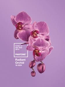
As their new selection of colors are unveiled every season, with it comes the coveted award for the “color of the year”. Imagine a group of color standard specialists from around the world assembling together in some secret European location. After two long days of presentations and discussions, a color of the year is crowned. The color is usually a representation of our times. Emerald was chosen as the color for 2013. For 2014, color enthusiasts can get excited about Radiant Orchid that encourages expanded creativity and originality, which is increasingly valued in today’s society.
The history of Pantone colors has been evolving for over 5 decades. Their colors inspire designers and artists everywhere to create and popularize brands through logos on company t shirts and promotional marketing tools. How do you use your Pantone colors? We want to know! (Sound off below) Sources Cited and Images courtesy of www.Pantone.com
FAQs
Q: What is the significance of Pantone Colors?
A: Pantone Colors are standardized color matching systems used by a variety of industries to ensure consistent color reproduction.
Q: How does the Pantone matching system work?
A: The Pantone matching system assigns a unique number to each color, making it easy to communicate and replicate specific colors across different materials and industries.
Q: What is the Pantone Color of the Year?
A: The Pantone Color of the Year is a color selected by color experts that reflects the current zeitgeist and influences trends across design, fashion, and beyond.
Q: Can you explain the history behind Pantone Colors?
A: Pantone Colors were developed by Lawrence Herbert in the 1960s to standardize color reproduction in the printing industry. Over the years, Pantone has become a global authority on color.
Q: What is the Pantone GOE system?
A: The Pantone GOE system is a color matching system that offers an expanded range of colors for more precise color reproduction in print materials.
Q: Who is Laurie Pressman in relation to Pantone Colors?
A: Laurie Pressman is the Vice President of the Pantone Color Institute and is a renowned color expert who helps select the Pantone Color of the Year.
Q: How are Pantone Colors used in the industry?
A: Pantone Colors are used in various industries such as graphic design, fashion, interior design, and product manufacturing to ensure color consistency and quality in their products.

