

TABLE OF CONTENTS
What is the Best Color for a Business Card?
Jun 2, 20236994 views
Jun 2, 20236994 views

In the competitive world of business, first impressions matter more than ever. A well-designed business card can open doors and spark conversations, but did you know that the color you choose plays a crucial role in how your brand is perceived? With countless options available, selecting the right hue can feel overwhelming.
We’re here to simplify that choice. By understanding the psychology behind colors, we can guide you in selecting a shade that not only reflects your brand's essence but also resonates with your target audience. From the elegance of black to the optimism of yellow, each color conveys a unique message. Let’s explore how these colors can elevate your business card and help you make a lasting impression.
How Color Impacts Business Cards
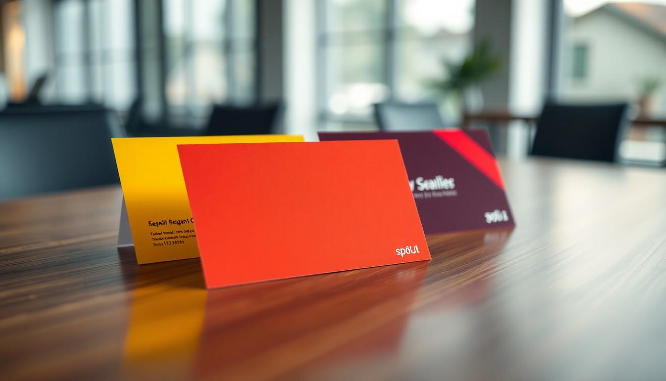
Color significantly influences how potential clients perceive a brand. Warm colors like orange and yellow evoke feelings of energy and optimism, while cooler colors such as green and purple create calmness and sophistication. Selecting the right color can resonate with our target audience, ensuring our business cards communicate the intended message effectively.
Incorporating color psychology into our design choices allows us to elevate brand representation. For example, blue projects trustworthiness, making it a popular choice for corporate environments. Colors like red convey urgency and excitement but should be used sparingly to complement other elements of the design.

Color Choices and Their Meanings
| Color | Meaning |
|---|---|
| White | Clean, minimalist, conveys purity |
| Black | Elegant, sophisticated, associated with luxury |
| Grey | Neutral, balanced, exudes professionalism |
| Blue | Trustworthy, dependable, common in corporate settings |
| Orange | Cheerful, confident, innovative |
| Yellow | Optimistic, attention-grabbing |
| Red | Urgent, passionate, exciting |
| Green | Growth, health, natural world |
| Brown | Earthy, reliable, stable |
| Purple | Royalty, creativity, luxurious or playful |
Color impacts not just aesthetics but also emotional connections. Our choice of color can enhance the tactile impact when complemented with suitable finishes like embossing or debossing, creating memorable experiences with our business cards.
Practical Considerations
Effective business card design goes beyond color selection. Factors such as the quality of materials used also play a pivotal role in how a card is perceived. Heavier textured papers signal quality, while finishes like gloss, matte, or metallic foils add a unique touch. Choosing an impactful design can dramatically increase the effectiveness and memorability of our cards.
When crafting business cards, we should keep in mind to design in CMYK color mode to ensure color accuracy in print. Using bold colors thoughtfully can create visual interest without overwhelming the viewer. Remember, fewer bold colors create a more striking impact.
Through our tailored printing solutions at 4OVER4, we help businesses enhance their brand presence. Our services enable the creation of distinct business cards that leave lasting impressions. For assistance with designs or to explore custom printing options, we can check our business cards printing![]() .
.
Adding features like spot UV and foil stamping introduces eye-catching elements that set our cards apart. By integrating these techniques, we can achieve a prominent and luxurious aesthetic that attracts attention. For those interested in using versatile colors, the black business cards provide an elegant option that conveys sophistication.
In selecting colors for our business cards, we convey messages that resonate with our audience. Combining psychological insights with quality materials provides a strategic advantage in branding. We can explore our range of effective solutions, including the option for free business cards![]() , to kickstart our branding journey.
, to kickstart our branding journey.
Psychology of Colors in Branding

Colors play a vital role in branding, significantly impacting how potential clients perceive a business. Understanding color psychology helps us make informed decisions when selecting shades for business cards. Let’s explore how various colors influence emotions and convey messages that align with our brand identity.
- Blue: Represents trust and professionalism. It is favored by serious businesses and conveys honesty that resonates with clients in financial and corporate sectors.
- Red: Evokes passion and urgency. This color attracts attention and works well in sales and marketing, making it suitable for industries that thrive on excitement and a call to action.
- Green: Symbolizes nature and growth. It appeals to eco-conscious brands, reflecting stability and prosperity. Green is commonly used in the wellness sector to enhance brand perception.
- Yellow: Associated with cheerfulness and creativity. It captures attention and can create inviting vibes, making it ideal for creative professionals aiming to portray themselves as approachable and innovative.
Choosing the right color not only enhances our business card’s visual appeal but also strengthens our brand identity. By incorporating strategic colors, we communicate our brand's core values effectively. For instance, brands in the hospitality industry can experiment more with colors, utilizing warm tones like oranges and yellows to foster a welcoming atmosphere.
Marketers often utilize color psychology to evoke emotions and create lasting impressions. An effective business card design demands attention to detail, including the selection of materials and finishes. We recommend exploring options like custom printing solutions for business cards to achieve high-quality results.
Color choices should also consider demographic factors. Understanding how younger audiences respond to vibrant shades, while older clients may prefer subdued tones, enables us to make tailored decisions. By combining tactile elements with strategic color selections, our business cards can evoke stronger emotional connections.
For unique designs, services like black business cards![]() and even free business cards
and even free business cards![]() can elevate our brand presence. By leveraging the psychological impact of colors, we can effectively enhance our branding strategy and create memorable first impressions.
can elevate our brand presence. By leveraging the psychological impact of colors, we can effectively enhance our branding strategy and create memorable first impressions.
Classic Choices: Black, White & Neutrals
Classic colors like black, white, and neutrals serve as reliable choices for business cards, each offering unique advantages.
Black
Black business cards represent luxury, power, and sophistication. They effectively convey exclusivity and high-end appeal, making them suitable for sectors like tech, fashion, and luxury brands.
When designing with black, it's important to ensure readability by using light or metallic text colors. This pairing enhances visibility and creates an atmosphere of mystique, particularly in fashion and luxury settings.
For businesses seeking premium options, our black business cards![]() provide the ideal foundation to showcase a modern, elegant image.
provide the ideal foundation to showcase a modern, elegant image.
White
White business cards symbolize cleanliness, simplicity, and minimalism. They offer a versatile canvas that highlights other design elements—ideal for a wide range of industries, from artists to bankers.
A balanced white card facilitates the inclusion of colorful branding elements, enhancing overall design without overwhelming the viewer.
Highlighting versatility, we specialize in custom business cards![]() that utilize white backgrounds for a polished and contemporary appearance.
that utilize white backgrounds for a polished and contemporary appearance.
Neutrals
Neutral tones such as beige, gray, and taupe provide a soft backdrop while maintaining a professional image. These shades work well for brands focused on a more understated aesthetic.
Neutral colors complement various graphic styles, allowing for diverse visual expressions without distracting from core messaging.
For an approachable yet professional look, our team can help you create effective solutions using neutral palettes. Explore our selection of free business cards![]() to get started.
to get started.
Incorporating classic colors into business card design aids in establishing brand identity while ensuring a lasting impression. With thoughtful selections, we can help your brand stand out effectively.
Bold & Vibrant Colors for Eye-Catching Designs
Choosing bold and vibrant colors for business cards enhances visual appeal and attracts attention. Each color carries its unique psychological impact, influencing how recipients perceive a brand.
- Yellow: This color radiates optimism and warmth. Yellow is perfect for industries like nonprofits and gyms. Its brightness enhances legibility, ensuring contact information is easy to read.
- Orange: Linked to creativity and communication, orange suits marketing and PR industries. Pairing orange with gray provides a trendy and effective contrast that stands out.
- Red: Red's attention-grabbing quality makes it effective for tech and athletic brands. Using red sparingly creates impact while balancing with white or negative space avoids overwhelming design.
We can explore complementary colors to establish striking contrasts. For example, a blue background with orange text offers excellent visibility and grabs the viewer’s eye. Analogous colors, like light blue paired with teal, create harmony and sophistication, catering to industries where calmness is key.
Utilizing green reflects growth and sustainability. Green is frequently chosen by eco-focused businesses, particularly when combined with natural textures from specialty stocks. It fosters an image of health and eco-friendliness while reinforcing brand values.
When designing our business cards, we should ensure adherence to CMYK color mode for accurate printing results. Selecting a few bold colors prevents overwhelming the eye while retaining clarity and style. For added flair, incorporating finishes like spot UV and foil stamping enhances tactile appeal.
4OVER4 provides exceptional custom printing solutions for vibrant, bold business cards. Their services help us effectively elevate our brand presence, ensuring our cards make a lasting impression. For professional and striking designs, the choice of colors directly influences our branding success.
Explore our options for custom business cards at 4OVER4. For those looking to utilize unique finishes, consider black business cards as captivating alternatives. Access free business cards![]() that could serve as a trial for innovative designs.
that could serve as a trial for innovative designs.
Minimalist vs. High-Contrast Color Schemes
Choosing between minimalist and high-contrast color schemes influences the perception of business cards. Each scheme provides distinct advantages, depending on the desired brand image.
Minimalist Color Schemes
- White and Gray: A white business card offers versatility, suitable for numerous industries from artists to bankers. This approach allows for minimalistic designs or the addition of bright, colorful contrasts. Gray business cards provide rarity yet effectiveness, creating elegance and modernity while pairing well with intricate illustrations or subtle pops of color.
- Black: Black cards often convey luxury and sophistication. When designed minimally, adding gold or embossed elements enhances the card's prestige. This strategy works well in industries such as technology and fashion, where standing out is crucial.
High-Contrast Color Schemes
- Bold Combinations: High-contrast color schemes combine dark and light colors to create visual distinctiveness. Such contrasts aid readability and attract attention, making important details easily noticeable. For example, pairing a dark background with bright text can highlight contact information or major brand messages.
- Accent Colors: Using accent colors strategically draws the eye to essential design elements. For instance, we can color icons next to contact details to facilitate quick access to email or phone numbers. This practice enhances overall functionality and readability.
Using both minimalist and high-contrast schemes allows us to tailor business cards to brand identity. Each choice should align with industry standards while resonating with our target audience.
Creating impactful designs is easier with 4OVER4's custom printing solutions. By leveraging quality materials and precise color choices, we elevate brand presence through business cards that make a lasting impression. Our resources for business card printing cater to different styles, ensuring clarity and effectiveness in conveying brand messages.
Explore options for business card printing, including stylish black business cards![]() , to enhance your visual identity today. For those looking to test the waters, we also offer free business cards for your convenience.
, to enhance your visual identity today. For those looking to test the waters, we also offer free business cards for your convenience.
Industry-Specific Color Recommendations
Choosing the right color for business cards involves consideration of industry standards and brand identity. Below are tailored color recommendations based on specific fields.
White
- Best for: Virtually anyone, from artists to bankers.
- Design idea: Stick with minimalism or add bright, colorful contrasts. White conveys simplicity, cleanliness, and adaptability, making it suitable for various industries that prioritize a modern and uncluttered image.
Black
- Best for: Tech industry, CEOs, and the fashion sector.
- Design idea: Add gold or embossed elements to enhance luxury and prestige. Black signifies sophistication and elegance, making it ideal for high-end brands aiming to attract attention in professional settings.
Yellow
- Best for: Nonprofit organizations, gyms, and children’s products.
- Design idea: Pair a yellow background with bold lettering. Yellow evokes optimism, warmth, and creativity, serving as an attractive choice for industries that seek to convey friendliness and positivity.
Blue
- Best for: Corporate sectors, finance, and healthcare.
- Design idea: Use darker shades for authority and lighter tones for creativity. Blue promotes trust and reliability, crucial for fields where client confidence is paramount.
Red
- Best for: Sales, marketing, and entertainment.
- Design idea: Deploy sparingly to capture attention without overwhelming. Red expresses urgency, excitement, and passion, functioning well in dynamic industries.
Green
- Best for: Eco-conscious brands, wellness, and the financial sector.
- Design idea: Combine with textured stock for a natural feel. Green symbolizes nature and growth, particularly appealing for brands focused on sustainability and health.
Gold and Silver
- Best for: Premium brands and businesses wanting to exude sophistication.
- Design idea: Incorporate metallic tones to highlight exclusivity and high value. These colors symbolize luxury, enhancing brand perception in competitive markets.
Incorporating these industry-specific colors can significantly enhance the effectiveness of business cards, aiding in brand recognition and appeal. For businesses seeking to step up their branding game, custom printing solutions from 4OVER4 can offer tailored designs that align with these recommendations. Explore custom options for YOUR business cards at 4over4.com or check out 4OVER4's Black Business Cards![]() for sophisticated designs.
for sophisticated designs.
For free business card options or to experiment with designs, consider Free Business Cards![]() from 4OVER4. We look forward to helping businesses elevate their brand presence through our custom printing solutions.
from 4OVER4. We look forward to helping businesses elevate their brand presence through our custom printing solutions.
By aligning color choices with industry norms, businesses can create lasting impressions that resonate with their target audience. Choose wisely to ensure brand identity is communicated effectively.
Strategically selected colors enhance visibility and convey professionalism, creating a competitive edge. Trust 4OVER4 for your business card printing needs, delivering quality and impactful designs.
Metallics, Foils & Specialty Finishes
Metallic colors, foils, and specialty finishes enhance the visual impact of business cards significantly. These elements create a sense of luxury and professionalism, making a strong first impression.
Metallic and Foil Colors
- Gold and silver are the top metallic choices for business cards, pairing well with various card colors and designs. They bring a modern and upscale look.
- Rose gold and bronze offer unique elegance, appealing to those seeking a distinctive touch.
- Other notable foil colors include red, blue, black, white, and purple. Red signifies boldness, blue conveys intellect, and purple emanates royalty. Each color choice can evoke specific emotions and connections with potential clients.
Effective Pairings
- Whites and golds create a clean and minimalist aesthetic, accentuating luxury brands. This pairing evokes a subtle glamour that appeals to sophisticated clients.
- Black and metallic finishes enhance the allure, emphasizing professionalism and elegance, suitable for high-end markets.
- Color combinations with contrasting metallics draw attention and enhance readability, ensuring crucial information stands out.
We can utilize various printing techniques to further elevate our business cards:
- Foil stamping adds a luxurious touch with metallic foil accents, perfect for creating captivating designs.
- Letterpress creates a textured effect that appeals to minimalistic designs, offering tactile luxury.
- Edge painting adds a burst of color along card edges, providing an unexpected surprise that can intrigue recipients.
By leveraging these techniques and color choices, we foster strong brand recognition and convey our brand’s unique message effectively. Designing business cards with metallics, foils, and specialty finishes can significantly boost our branding efforts. For custom solutions that enhance our brand presence, we recommend exploring options at 4OVER4.
Balancing Background & Text for Readability
Balancing background and text colors enhances readability and effectively communicates our brand's message.
Background Colors
- Light Backgrounds: Light colors, like white, light blue, or beige, maintain readability, especially with detailed logos or extensive text. These colors provide a clean appearance that allows the text to stand out.
- Dark Backgrounds: Dark colors, such as black, deep blue, or dark green, add sophistication but require careful contrast. For improved visibility, use bright or metallic text on dark backgrounds.
Text Colors
- Contrast: Using contrasting colors between the background and text is crucial. For instance, white text on a black background or dark text on a light background promotes clarity.
Color Schemes
- Complementary Colors: Colors opposite each other on the color wheel provide vibrant contrast. A bold blue background with orange text serves as a visually striking option for creative businesses.
- Analogous Colors: Colors next to each other, like a light blue background with darker teal text, create a harmonious visual effect, fostering a calming atmosphere.
Adding strategic color combinations not only strengthens brand identity but also enhances the overall aesthetic of business cards. To achieve this, we can utilize the custom printing solutions offered by 4OVER4, which enable us to experiment with various color schemes and finishes.
By employing precise color pairings, businesses can create memorable and effective designs. Whether opting for elegant black cards, versatile white options, or bold vibrant designs, 4OVER4 effectively supports our journey to create visually appealing business cards. Visit 4OVER4’s business card printing![]() page for more options on striking designs.
page for more options on striking designs.
For those interested in testing creative ideas, exploring the options for free business cards![]() facilitates experimentation without financial risk.
facilitates experimentation without financial risk.
Judicious color selection alongside the right printing techniques elevates our brand's presentation, ensuring visibility and clarity. Using the services of 4OVER4 helps in achieving these goals seamlessly, allowing us to leave a lasting impression.

Matching Your Business Card to Your Brand Identity
Our business card colors should reflect our brand's identity to ensure consistency and recognition. Research indicates that using brand colors can boost recognition by 80% (University of Loyola). Aligning color choices with our brand's visual identity, including logos and typography, reinforces our message across all platforms.
Color Choices by Industry
Different industries associate particular colors with specific emotions and perceptions. Understanding this relationship can guide our selections:
- White: Versatile and minimalistic, suitable for artists, bankers, and many others. It creates a clean look that communicates simplicity and professionalism.
- Black: Common in technology and fashion industries, black adds luxury and prestige. Its effectiveness increases when paired with gold or embossed elements.
- Yellow: Ideal for nonprofits, gyms, and children's products, yellow conveys warmth and optimism.
- Blue: Frequently utilized in finance and healthcare, blue communicates trustworthiness and reliability.
- Red: A color that grabs attention, red is valuable in industries aiming to create urgency.
- Green: Often symbolizes growth and eco-friendliness, making it suitable for innovative and environmentally conscious brands.
- Metallics: Gold, silver, and bronze enhance a sense of luxury and professionalism when incorporated into design.
Personalization and Visual Appeal
Including unique touches adds personality to our business cards. Subtle patterns, like our logo as a faint watermark, enhance visual interest. A professional headshot builds rapport for service-based businesses, while a digitized signature adds authenticity.
Balancing Color and Contrast
Using light backgrounds improves readability, while dark backgrounds increase sophistication. We can utilize complementary and analogous color schemes to strengthen our brand identity, ensuring a cohesive look and feel.
Custom Solutions with 4OVER4
Crafting a memorable business card requires attention to detail. With custom printing solutions, 4OVER4 helps us elevate our brand presence through stunning designs. Whether we want stylish black cards or need to make an impression with free business cards, 4OVER4 provides resources that align with our unique identity.
By strategically choosing our business card colors and finishes, we can communicate our brand's essence effectively. This approach creates lasting impressions that resonate with our target audience, ultimately enhancing our professional image.
Conclusion
Choosing the right color for our business cards is more than just an aesthetic decision. It’s about crafting a visual representation of our brand that resonates with our audience. By understanding the psychology behind colors and their emotional impact, we can select hues that align with our brand identity and industry standards.
Whether we opt for classic tones or bold, vibrant shades, our choice should reflect our values and the message we want to convey. With thoughtful design and strategic color selection, we can create business cards that not only stand out but also leave a lasting impression. Let’s embrace the power of color to elevate our professional image and enhance brand recognition.
Frequently Asked Questions
Why are business card colors important?
Colors on business cards play a crucial role in making a great first impression. They influence how potential clients perceive your brand and can evoke specific emotions, helping to communicate your brand's essence effectively.
What do warm colors signify on business cards?
Warm colors like orange and yellow convey energy, optimism, and friendliness. Using these colors can create a lively and approachable image, making your business card more memorable.
What do cool colors indicate for a brand?
Cool colors such as blue and green suggest calmness, trust, and sophistication. These colors can create a serene atmosphere around your brand, appealing to clients looking for reliability and professionalism.
How can I choose the right color for my business card?
Consider your target audience and brand identity when selecting a color. Research color psychology and understand the emotions each color evokes to ensure your card resonates well with potential clients.
What is the impact of using metallic colors on business cards?
Metallic colors like gold and silver can enhance the visual appeal of business cards, conveying luxury and professionalism. They can make your card stand out and leave a lasting impression on recipients.
How do I ensure my card colors are printed accurately?
Always use the CMYK color mode when designing your business card to ensure accurate color reproduction. This color model is essential for print quality and will help your design match your vision.
What materials should I consider for business cards?
High-quality materials, such as thick cardstock or unique textures, contribute to the overall impact of your business card. They add a tactile element that enhances client perception of your brand.
How can I create a memorable business card design?
Combine thoughtful color choices with unique finishes, like embossing or spot UV, to create a striking design. Bold colors, clear fonts, and consistent branding elements are key to making a strong impression.
More from Printing Tips

9484
In the world of networking, a business card serves as more than just a piece of paper; it’s a vital tool for making lasting connections.
![]() Matthew Prince
Matthew Prince
Dec 28, 2023

7795
New digital features have been introduced to business cards, making business connections more effective than they used to be. Technology has r
![]() Matthew Prince
Matthew Prince
Dec 20, 2023

17077
First impression matters, especially when marketing your small business. An effective business card design will help you impress potential pro
![]() Matthew Prince
Matthew Prince
Dec 14, 2023

2774
Creative branding is critical for many businesses. After all, there’s nothing worse than just blending into the market. But brands can stand
![]() Matthew Prince
Matthew Prince
Dec 6, 2023

2925
Low-quality business cards will cost you money. One report published that
![]() Matthew Prince
Matthew Prince
Nov 28, 2023

12617
You can sell more goods or services with business card designs that start conversations. In contrast, clients forget bland card designs as soo
![]() Matthew Prince
Matthew Prince
Nov 22, 2023

2686
In today’s interconnected world, the importance of a well-crafted international business card can't be overstated. As we navigate di
![]() Matthew Prince
Matthew Prince
Nov 1, 2023

3140
Business cards are not as we know them anymore. For example, interactive business cards now combine the physical nature of traditional cards w
![]() Matthew Prince
Matthew Prince
Oct 4, 2023