

TABLE OF CONTENTS
What Size Font on a Business Card?
Apr 28, 202312845 views
Apr 28, 202312845 views

Your business card will speak for you. But tiny fonts are impossible to read, and larger fonts won’t let you say much. Besides, it’s common to contrast font sizes on a design to highlight essential information.
So what font size for business cards is ideal? We’ve answered that question in this post.
The Importance of Font Size on Your Business Card
It's important to consider best font size for business cards since this will impact your design. For example, the ideal size is legible at a glance but not too big to ruin your design. The perfect font size will communicate your professionalism and attention to detail. Conversely, prospects tend to distrust brands that miss this design detail.
What Size Font on a Business Card?
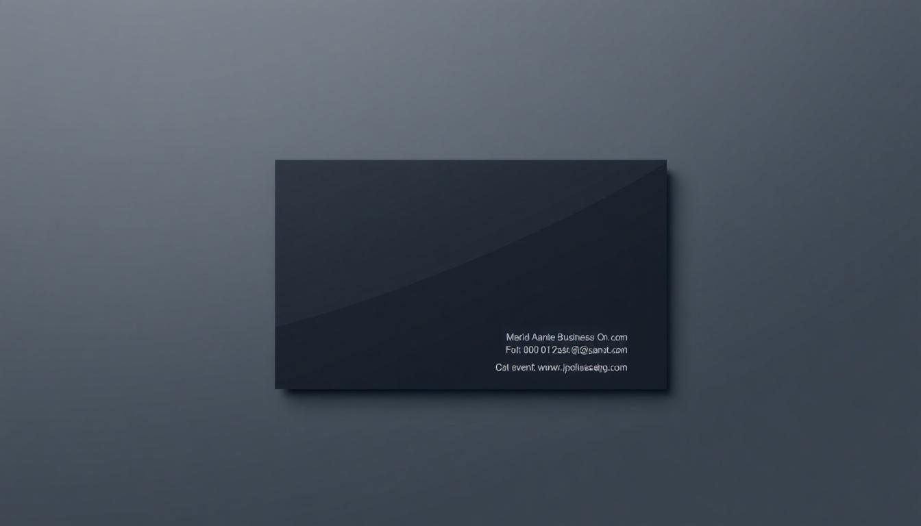
So what font size on business card is ideal? Some experts recommend that you go at least 8 points for details that may not be noteworthy (a point is a unit for font size in most design programs).
However, important details like your brand's name should be anything from 12 - 16 points. While this is a general guide, certain factors, such as your business card's dimension and design, will affect the size you choose. however, do not go for the smallest font size for business cards. Your business card text size must be readable and functional
You should consider these factors when determining the appropriate font size to use on a business card:
-
Amount of text: A smaller size will fit more information, but be careful to favor readability over volumes of text.
-
Typeface: Typefaces look larger or smaller than others at the same point size, so remember this when deciding.
-
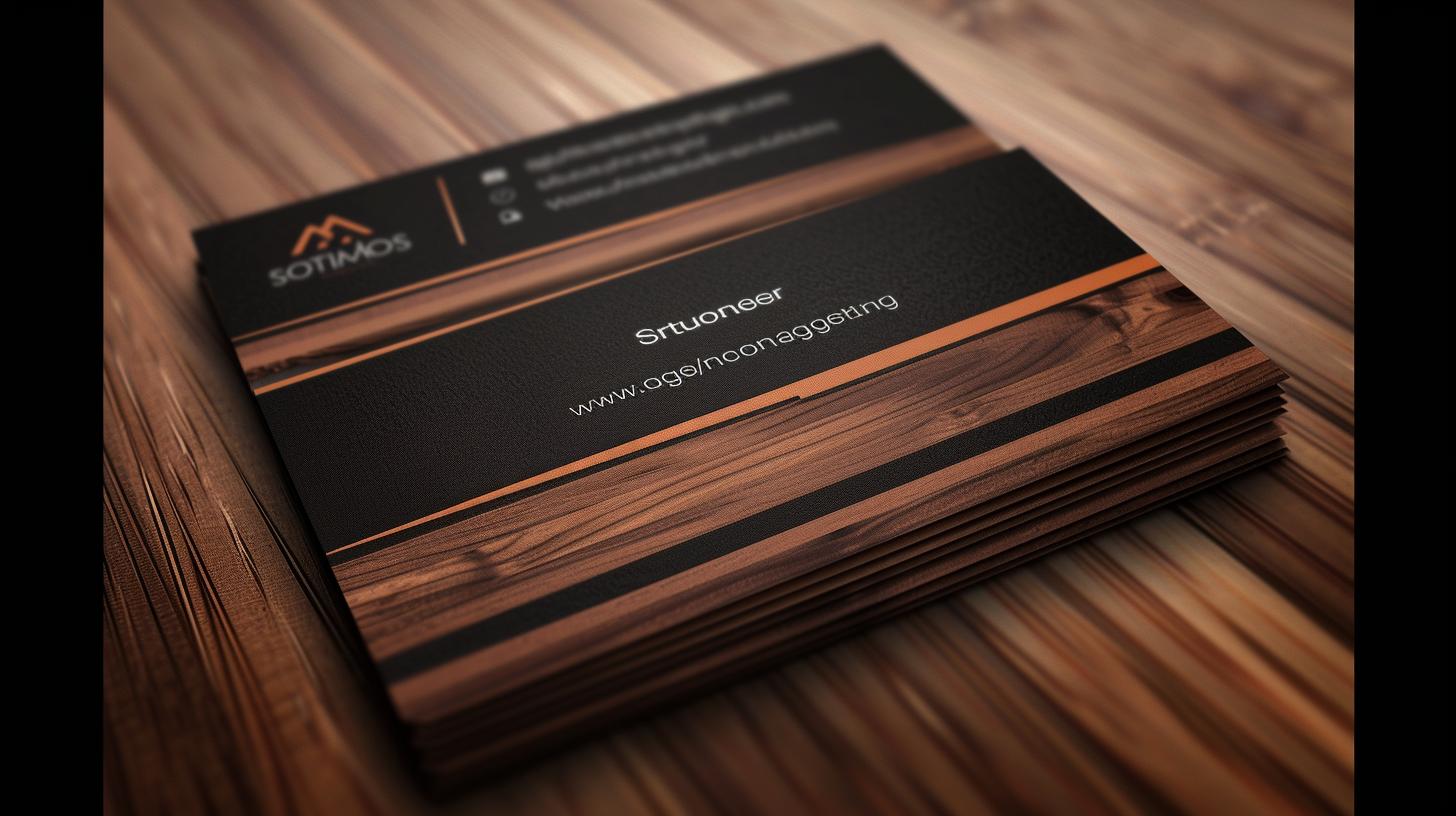
Design: A minimalist design includes white spaces, so you may want to use a larger font size to make the text more prominent. Conversely, a smaller font size may be more appropriate when you have a lot of graphics. In addition, unique card designs such as the Raised Foil require you to use a font size of 10 points or large.
Choosing the Right Font Size for Your Business Card
There are no fast rules for the business card size to use. But note that it's helpful to have a consistent brand image that's visually appealing and can be read even by individuals with visual impairments. Also, a popular font size choice ranges from 8 - 12 points.

Minimum Font Size Guidelines
Designing a card the size of a business card is no small feat. It helps you guarantee that the information is readable and looks sleek and professional. Finding the appropriate balance between esthetics and functionality can go a long way toward ensuring that your card is remembered, not tossed aside. Here’s a look at the rationale for the minimum font size and why it matters.
Secondary information, such as an address or business tagline, should be at least 7-8 point font on your card. This size should ensure your text is nice and clear. This helps to make sure that the text is easy to read without someone having to squint to see it. If you need to fit in a company slogan, this size is ideal. It’s also ideal, though, for a secondary phone number you don’t use as much. Keep in mind that not all fonts are created equal. For example, a 7-point serif font will appear smaller than a 7-point sans-serif font. It’s a great idea to test the printed version! More importantly, it gives you a true sense of what it looks like in the real world, digital screens can be deceiving.
Your most important details, such as your name and title, need to be a little bigger, typically around 10-12 points. This size guarantees that the most important information pops out at first glance. For example, an 11-point bold sans-serif font lets your name stand out while still keeping it from being the most prominent element on the card. If your design includes multiple text elements, keeping the primary information at least 2-3 points larger than the secondary details helps create a clear hierarchy. This gives the reader some guidance on how to read the card and where to find the most important information at a glance.
For smaller contact information including your phone number, email address, and website, 9-10 points is typically a good bet. It’s these specific, nitty-gritty finesses that people gravitate toward the most. Thus, they need to be large enough to read and short enough to be scanned. Most people err on the side of trying to fit too much information in too small of a font. This busy design also contributes to the card being difficult to read. To prevent this from happening, focus on the most crucial contact method and use plenty of white space around the text. If your web site already lists all your contact information, you can remove the street address. This decision allows us to keep the card clean and focused.
Maximum Font Size Recommendations
When creating a business card, font size is an important factor in achieving that perfect mix of readability and esthetics. This is useful to call attention to important information, but it can be tempting to enlarge the font. You do have to balance some practical limits, too. Your new professional card should have a neat, professional layout, so all of your information can be displayed without making the card feel crowded or cluttered. Choosing the right font size can spell the difference between a professional business card and one that looks cluttered and rushed.
On your business card, let your name take center stage. Don’t go below a font size of 10-14 points, whatever it takes to make sure it stands out. This size range allows your name to take center stage without overpowering the entire card. If your card design allows for more white space and less text, go with a 14-point font. Whatever your choice, just be sure it’s the one that’ll make your name pop best. For designs that have a bit more wording or complicated graphics, go for a 10- to 12-point font. This decision goes a long way in ensuring a clean, harmonious layout.

We recommend a font size of 8-10 pt for your contact information. This size is the ideal choice for putting your phone number, email, and mailing address front and center. This size balances keeping everything easily readable with having space for all the other key info you need to include. An email address printed in 9-point font on a typical 3.5 x 2-inch business card is still legible. It really hits that sweet spot, making sure it still doesn’t appear too big. If your card includes several ways to contact you—like social media usernames or additional phone numbers—stick with an 8-point font for this information. This method is the best way to ensure a cohesive and polished appearance.
For any taglines or other secondary text, a font size between 6 and 8 points should be sufficient. It’s a comfortable size and works well for personal or business slogans or titles. These pieces are not as important as your name or phone number, so a little smaller font is fine. At the same time, it’s important to make sure that at 6 points, the font is still going to be crisp and legible. At this small scale, steer clear of very decorative or thin typefaces. They can be difficult to read, particularly on paper.
Best Practices for Business Card Design
Here are some best practices for choosing your business card's typeface and font size:
-
Choose a font that is easy to read: Legible typefaces are easier to read, even at a small size. However, script or decorative fonts are difficult to read and should be used sparingly. Instead, stick to clear fonts like Arial, Helvetica, or Times New Roman. See our typeface guide for more information.
-
Use a maximum of two fonts: Too many will make your card look cluttered and unprofessional. Instead, stick to a maximum of two fonts for the heading and body text.
-
Ensure the font is consistent with your branding and personality: Your font choice should be consistent with other branding materials, such as your website and flyers. Using the same fonts and styles will help to create a brand identity that individuals recognize and trust. Also, a law firm should use a more traditional font, while a tech startup might choose something modern.
-
Consider font pairing: Ensure the font pair you choose is complimentary. Pairing similar or incompatible fonts will make your card look unprofessional. Instead, you can use a font pairing tool, follow a guide, or seek the advice of a design professional.
-
Test the font: Print a sample of your business card and test the font size. Show the sample to a friend or colleague to get their feedback on the readability and appeal.
You now know popular best practices and what size font on a business card is perfect.
Best Practices for Typography
When designing a business card, typography is one of the key factors that contributes to a business card’s overall polished and professional appearance.
How to Select a Font Size
The font size you select is not just about appearance. It impacts it all—from readability and layout balance, to how your audience perceives your information. Finding that sweet spot is key to making sure your card has the most impact without either intimidating or boring the recipient. Here’s some best practices to consider for picking the perfect business card font size. Throughout, we’ll show you some real examples that will inspire you.
Readability should be the ultimate goal, no matter the medium. For the body copy, use a font size no smaller than 10 point and no larger than 12 point. This is thought to be the ideal range for your name, title, and business name. This range is wide enough to provide legibility but not so wide that it overwhelms the layout. If your name is the main attraction, make it pop with a 12-point font. This helps it stand out without busying up the rest of the card. Font size for business cards should be 10-12 point for most text. Making this decision helps keep the overall layout well-balanced and allows everything to be read easily. Whatever you do, don’t go below 8 point font! Anything less might be uncomfortable for the reader, particularly with a long phone number or email address to read.
Hierarchy is perhaps the most important principle in typography. Larger font sizes for primary details, such as your name or company logo, help establish a clear structure for the information on your card. Your name may end up taking up 12 points. In contrast, your professional title might score 10 points, and your email address can earn 9 points. This slight size difference leads the viewer’s eye naturally from one side of the card to the other. It makes sure that they see the vital information first. Consistency in spacing and alignment helps to establish this hierarchy even more, so each piece looks like it belongs together.
One of the most important factors when it comes to readability is the actual font you use. A clean, sans-serif font, like Helvetica or Arial, really shines at the smaller sizes. Its simplicity and lack of decorative elements is what makes it so highly effective. If your go-to serif fonts are something like Times New Roman, go one size up. This will go a long way in preventing the compressed look that serif fonts are often prone to. We recommend you always test your font size and style by printing a physical sample of the card. Digital previews can often be misleading when it comes to how the type will appear in print. Doing a physical test ensures that something will be readable in the real world.
Conclusion
Best font for business card will impact your design’s readability and appeal. But you can go around making a choice when you use templates. We offer thousands of professional-looking templates for various industries. In addition, our templates can serve as a business card font size guide as they are easy to modify, and you can order printed cards online upon conclusion. In the meantime, browse our business card products to find the perfect design for your brand.
FAQs
Q: What are some tips for choosing the best font size for your business card design?
A: When choosing the best font size for your business card design, consider factors such as legibility, the amount of text you need to include, and the overall design aesthetic you want to achieve.
Q: How important is the business card font when designing a business card?
A: The business card font is crucial as it can convey your brand's identity, professionalism, and message. It is essential to choose a font that reflects your business's personality and values.
Q: What are some common types of fonts used for business card designs?
A: Common types of fonts used for business card designs include serif fonts, sans-serif fonts, and script fonts. Each font type has its own characteristics and can evoke different emotions.
Q: Is there a recommended font size for important information on a business card?
A: It is recommended to use a font size of at least 8pt for important information on a business card to ensure readability and visibility.
Q: How can I ensure that the font on my business card is legible?
A: To ensure that the font on your business card is legible, choose a font that is clear and easy to read, avoid using fonts with intricate designs, and ensure there is enough contrast between the font color and background.
Q: What role does typography play in designing business cards?
A: Typography plays a crucial role in designing business cards as it includes choosing the right font, font size, and text arrangement to create a visually appealing and effective design.
Q: Are there any specific font styles that are recommended for business cards?
A: Commonly recommended font styles for business cards include clean and modern sans-serif fonts for a professional look, and elegant script fonts for a more sophisticated feel.
Q: What is the importance of choosing the right font size for a business card design?
A: The font size on a business card plays a crucial role in ensuring that the information is legible and well-presented, making a good first impression on potential clients or contacts.
Q: How do I determine the best font size for my business card?
A: Consider factors such as the amount of text, the typeface chosen, and the overall design of your business card. Generally, font sizes between 8pt to 12pt are recommended for most business cards.
Q: What are some commonly used fonts for business cards?
A: Popular font choices for business cards include serif fonts, sans-serif fonts, and script fonts. These fonts offer different styles and can help convey the right tone for your business card design.
Q: How can I ensure that the text on my business card is legible?
A: To ensure legibility, opt for fonts with various weights and stick to standard business card font sizes. Avoid using fonts smaller than 6pt or overcrowding the card with text.
Q: Are there any specific font sizes that work best for company names on business cards?
A: Company names on business cards often look best when using larger font sizes, typically between 10pt to 12pt, depending on the typeface and design of the card.
Q: How can I choose a font that complements the overall design of my business card?
A: Consider the style and theme of your business card design when choosing a font. Make sure the font style aligns with your brand image and conveys the right message to recipients.
Q: Should I use multiple font sizes on my business card design?
A: Using multiple font sizes can add visual interest to your business card design. However, ensure that the different sizes are used purposefully and do not detract from the overall coherence of the card.
More from Printing Tips

9477
In the world of networking, a business card serves as more than just a piece of paper; it’s a vital tool for making lasting connections.
![]() Matthew Prince
Matthew Prince
Dec 28, 2023

7791
New digital features have been introduced to business cards, making business connections more effective than they used to be. Technology has r
![]() Matthew Prince
Matthew Prince
Dec 20, 2023

17074
First impression matters, especially when marketing your small business. An effective business card design will help you impress potential pro
![]() Matthew Prince
Matthew Prince
Dec 14, 2023

2770
Creative branding is critical for many businesses. After all, there’s nothing worse than just blending into the market. But brands can stand
![]() Matthew Prince
Matthew Prince
Dec 6, 2023

2920
Low-quality business cards will cost you money. One report published that
![]() Matthew Prince
Matthew Prince
Nov 28, 2023

12613
You can sell more goods or services with business card designs that start conversations. In contrast, clients forget bland card designs as soo
![]() Matthew Prince
Matthew Prince
Nov 22, 2023

2681
In today’s interconnected world, the importance of a well-crafted international business card can't be overstated. As we navigate di
![]() Matthew Prince
Matthew Prince
Nov 1, 2023

3136
Business cards are not as we know them anymore. For example, interactive business cards now combine the physical nature of traditional cards w
![]() Matthew Prince
Matthew Prince
Oct 4, 2023