

TABLE OF CONTENTS
Which Business Card Styles are Best for C Suite Executives?
Feb 9, 20206417 views
Feb 9, 20206417 views

We are edging towards a completely virtual world where physical elements are mostly non-existent. In spite of all such promises and challenges, business cards are consistently staying popular, and C-suite executives need them the most. What are the best business card examples?
A card that has an equal balance of white space, color, and contact information, along with a great logo, is the best business card design. Whether you are using the best inexpensive business cards or premium card stock creative business cards, the unstable business card ruins the first impression. 4OVER4.COM is the leading business card printing service online with the best knowledge of printing and designing high-quality business cards at all levels. Let’s learn the right business card styles for C Suite Executives.
Business Card Requisites for C Suite Executives
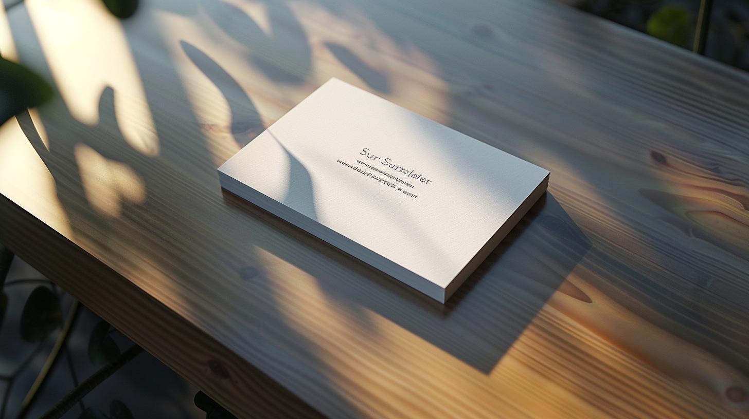
Add Personal Pitch Instead of Your Image on Business Card
The C Suite Executive cards are not the place to display your image. Although it helps to remember your face but also categorizes against you. So, a business card style with images is not preferred for executive cards. Instead, you may include a solid pitch that is more important to get your business. For instance, a confident tagline “Five Listed Skills that can Propel a Young Business into Profitability.”
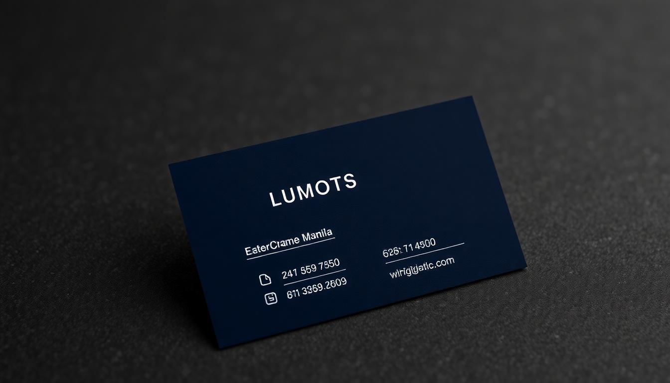
Avoid Slippery Shiny Visiting Cards Style

White business card template with blue borderline
You might consider the shiny paper printing distinct and compelling. But it doesn’t meet the purpose of the business cards near you. Moreover, the shiny business cards cheap quality makes it unattractive and distasteful. For example, extra information scribbled on the shiny slippery card can get smeared easily.
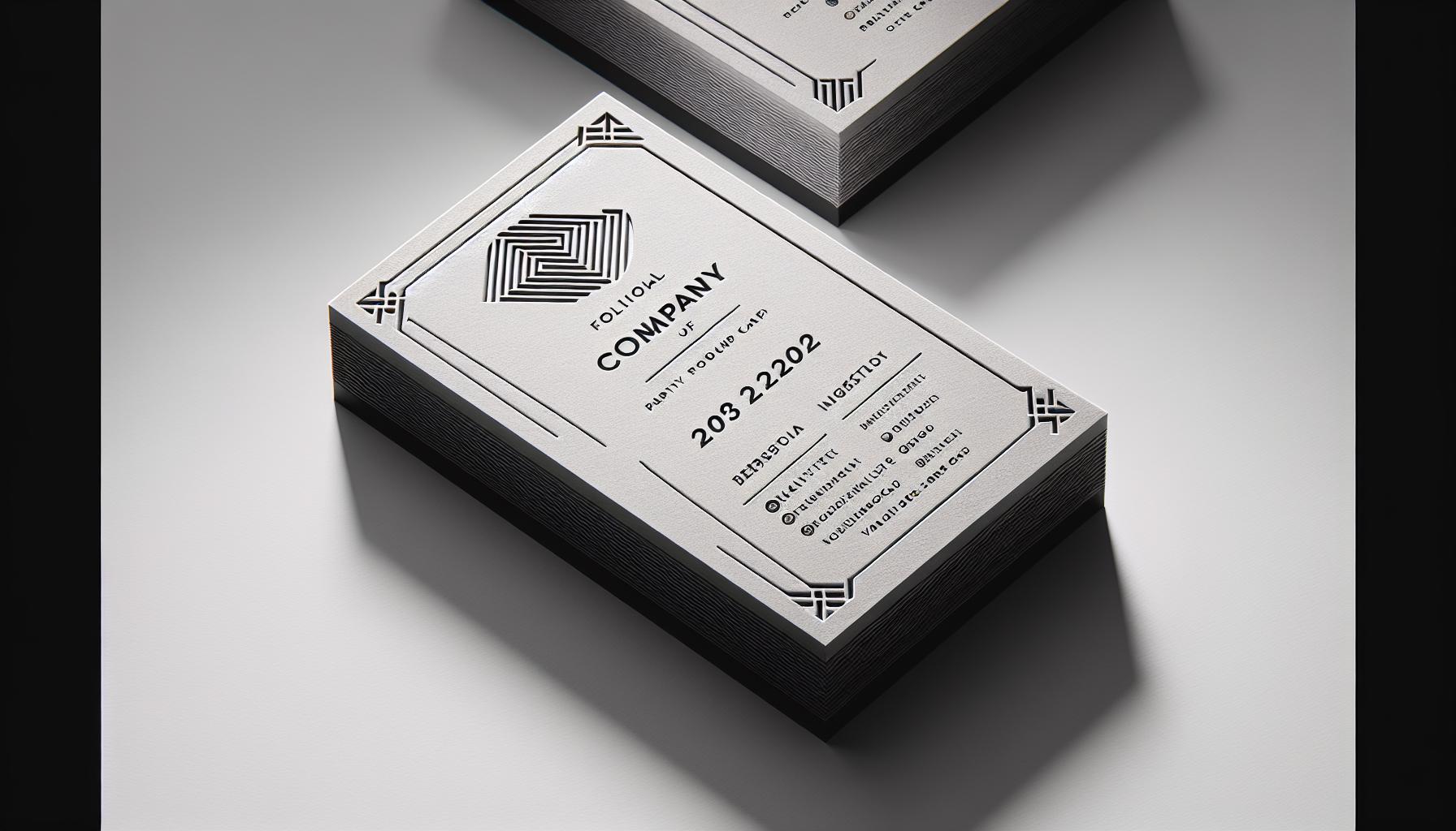
Use Elegant Design and Simple Typeface
The C-Suite Executive card style has to be elegant and classy. Any random color or shape can hamper the exclusivity of the card. Keep it minimal by choosing the right colors, and keep it to two or three shades. The colors should not be loud. The simple, the better is your card. Over saturating a card with unnecessary information can take simplicity away. Always take a minimalistic approach to business cards, creating a sophisticated feel. For the minimalist design, you may look out for out-of-the-box detailing template like graphic element offer an appealing layout.
Add Unique Elements
Working in creative components to your business card design will ensure you get noticed. Avoid generic designs and cookie cutter layouts to stand out and be unforgettable. Smart, creative design not only will help your card stand out, it will convey the personality of your brand while projecting a professional image. It’s the little things that count. Make your business card stand out. This will ensure that it remains user-friendly and engaging.
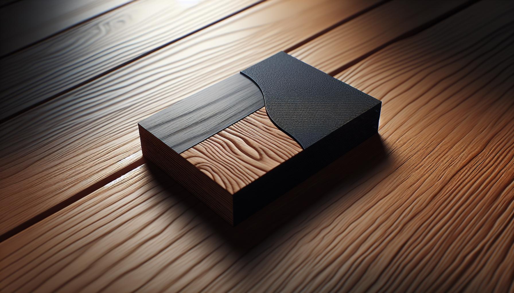
Another easy way to make your card stand out aesthetically is to play with textures. A special textured finish can provide visual appeal and a unique tactile experience that will entice recipients to pick up and interact with the card. For instance, embossed text or raised lettering adds a tactile, three-dimensional quality that looks and feels elegant. An optional matte finish with soft-touch coating adds a tactile, velvety feel that makes your card even more memorable. A glossy finish produces rich color and intensity. These options are easy to find with any professional printer and can be customized to fit your brand’s aesthetic.
A final thing to keep in mind is how you use color. Rather than defaulting to standard black and white, incorporate shades that convey your brand personality. For those in creative fields, vivid colors will reflect your out-of-the-box thinking and imagination. If your industry is more corporate or formal, consider using more muted colors, such as navy blue, gray, or burgundy, to communicate professionalism. Even just a few little pops of color, like a bright logo or a fun colored border, can help a card stand out. For those who want to go further, foil accents in gold, silver, or holographic shades can highlight specific elements, such as your name or company logo, giving them a premium look.
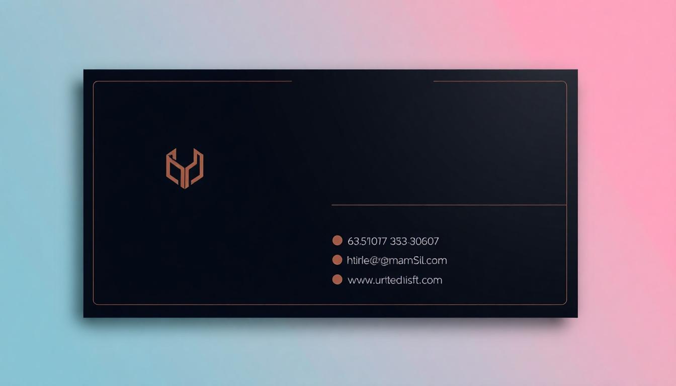
Adding functional elements is another way to increase your card’s value. Adding a QR code to your card connects them instantly to your website, online portfolio, or LinkedIn profile. This not only saves card space, but gives recipients quick access to more information. Some creative professionals prefer cards that do double duty. These include a foldable design that turns the card into a mini brochure or a magnetized backing that allows a card to affix to metal surfaces. These features make the card more effective and usable, while helping to double down on the card’s role as a tool for networking.
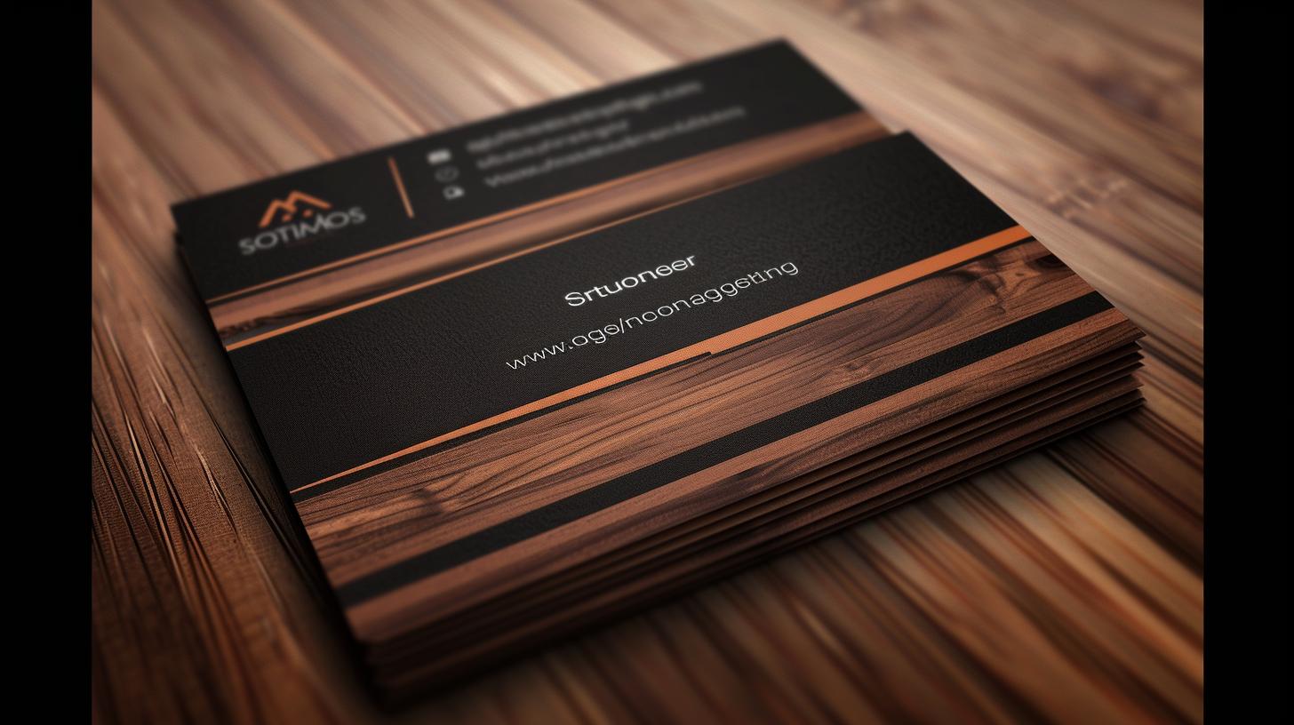
Finally, the importance of material cannot be overstated. While standard cardstock works well, upgrading to thicker paper or alternative materials like metal, wood, or plastic can create a memorable experience. Metal cards, in particular, leave a long-lasting impression of sturdiness and luxury, making them perfect for industries that project durability and exclusivity.
Avoid Common Design Mistakes
Your business card is more than just a piece of paper, it’s an extension of your brand and an indicator of your professionalism. Though it may seem like an easy thing to create, there are typical traps that can make it less powerful or even counterproductive. Steering clear of these pitfalls will allow you to create a card that delivers a big impact. It will do an excellent job of conveying your value to people.
One of the biggest mistakes is cluttering the card with too much detail. Trying to add every little bit of information about your business will leave the card overwhelmed and illegible. Instead, stick to the essentials: your name, title, business name, contact information, and perhaps a tagline or logo. As a graphic designer, your email, phone number, and website should all be in your contact information. Remove all non-essential information, like your complete mailing address, unless your work depends on it. The clarity and simplicity will go a long way toward making sure the card is quickly understood at a glance.
Using difficult to read typography, or using too much ornate typography will damage the card’s effectiveness. Clear communication needs to take priority. Stick to simple, professional typefaces like Arial, Helvetica, or Garamond. Stay away from ornate script fonts that might give an air of sophistication but will be hard to scan, particularly in smaller font sizes. A tech consultant would usually select a modern sans-serif font to express a sense of innovation and professionalism. Alternatively, a wedding planner might choose a more ornate serif font to convey an air of sophistication.
Another mistake is underestimating the role of color and contrast. Overly contrasting colors or text that disappears into the background will only serve to make the card ugly. Pick a color palette that fits your brand and makes it easy to read. Tip: A white background with black or dark gray text is classic for a reason. Don’t be afraid to play around with accent colors that complement your logo! For instance, a fitness trainer could lean into an energetic dark green or blue.
Finally, subpar materials and printing can spoil even the most stellar design. Poor quality such as thin paper stock or blurry printing will cheapen the look and feel of your card. Choose high-quality cardstock—the thicker the better, 14-point or above, and use commercial print services. A matte finish provides a beautiful, sleek and modern appearance. A glossy finish will make the colors pop and be more in line with a highly creative brand.
Use of Premium and High-Quality Card Stock
Using 20 pt or 28pt or 56pt premium card stock can make your custom business card design alluring and exciting. So, the C Suite executive must reflect class with premium card stocks. The premium range of paper stock from 4OVER4 helps you to create the best designs that people are sure to notice. It also lets the C Suite executives create interactive card designs or perforated business cards that can surely attract the attention of the recipients.
Ensure Quality Printing Standards
Your business card isn’t just a piece of paper, it’s an extension of your professionalism and brand. The quality of the printing has a huge impact on creating a memorable impression. Understanding what features make the best business card helps you to feel confident in your choices. That way, your card will accurately convey who you are in the best light possible.
Choosing a paper stock is an important and essential first step. The thicker the paper, the more it has a presence in your hands. It communicates a feeling of quality, permanence and craftsmanship. A 16-pt or 18-pt cardstock is a standard thickness. It’s the ideal combination of durability and cost, providing you with high quality card feel without breaking the bank. If you want to be the conversation starter at the next networking event and can afford to splurge, choose 32-pt cardstock. Its denser, quasi-stiff surface adds an air of luxury. Selecting the proper paper weight prevents your card from getting bent or torn too easily. This is the key to keeping it looking as good as new even after years of use.
Don’t forget about the finish on your card. Matte finishes provide a crisp, clean, non-reflective look. They’re great for people who are always jotting down additional info on the backs of their cards since they are super easy to write on. Glossy finishes deepen colors and provide a bright, reflective, clean effect that really pops. If you really want to stand out, soft-touch finishes provide a velvety touch that is unlike anything else. Now, each finish has a specific function. Make sure you think about the impression you are trying to leave people with and how realistic the design would be.
The quality of the print is an important consideration. Quality high-resolution printing guarantees clean lettering and clear graphics, both of which are key components to professional quality and readability. Nothing makes a worse first impression than blurry logos and pixelated fonts on business cards. Crisp, clean designs immediately have a more professional look. Offset printing, a more traditional method, offers the highest level of color accuracy and consistency, making it the best option for larger quantities. Digital printing, although a bit less precise, is perfect for smaller production runs and faster turnaround times. Understanding these categories allows you to pick the type that best suits your individual needs and budget.
Lastly, look into special options such as embossing, foil stamping or spot UV coating to give your cards an extra dose of sophistication. These features help highlight the most important things on your card, such as your name or company logo. They add dimension and keep the design interesting. Simply by investing in these small details, you can increase the overall impact of your card without cluttering its design.

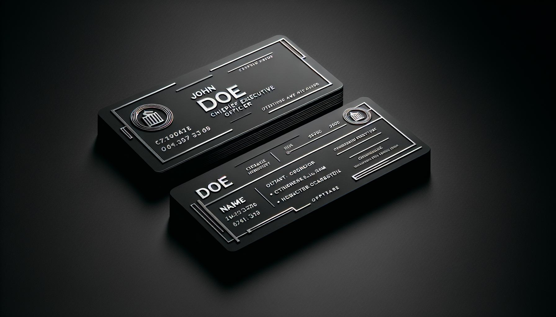
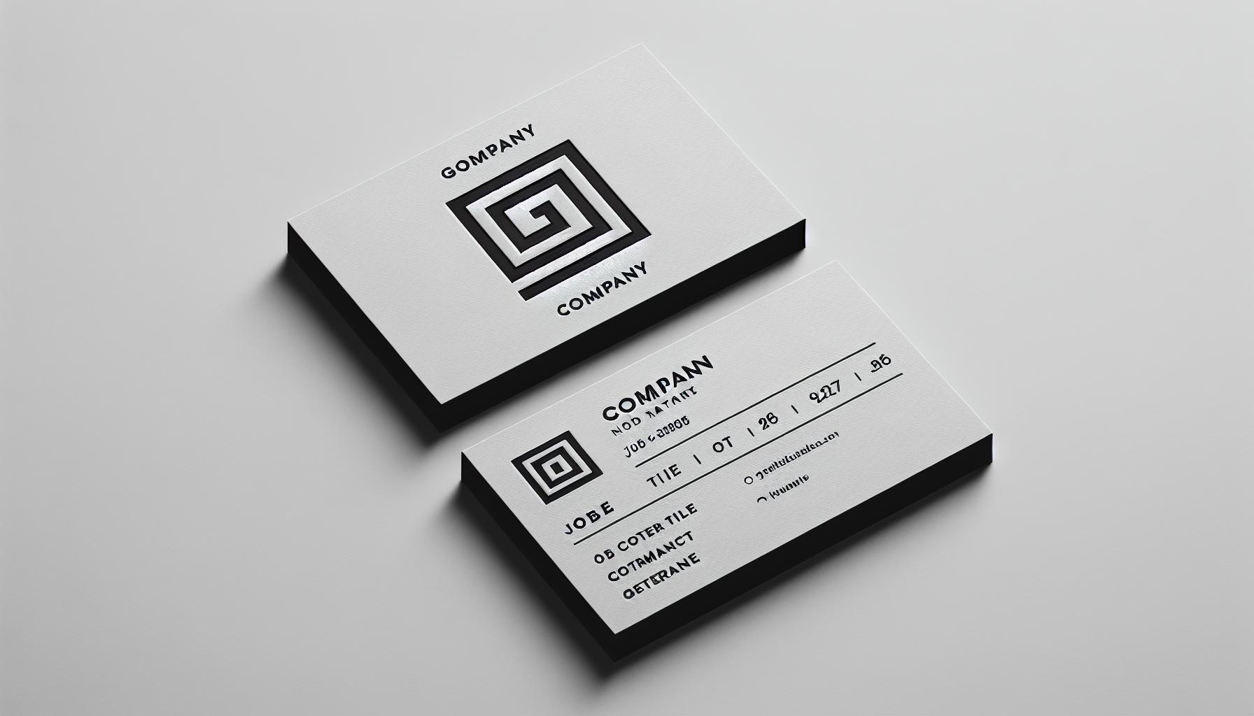
Highlight Your Logo Effectively
Your logo is the face of your brand. On a business card, it needs to do all that while cutting a memorable figure and leaving room for other design elements. Properly placed and intelligently designed, a logo catches the eye to build brand identity and create continuity. Designing for printing this right entails paying attention to size, positioning, and color to ensure that these elements are effective.
Logo size is important. Make it too small, and no one will see it. Too big, and it will compete with the other information on your card. A great rule of thumb is just to consider balance. For example, if your business card is 3.5 x 2 inches, you can plan to use roughly one-fourth of that area for the logo. Reduce or enlarge depending on how you want your text to fit on the card. This way, it can be eye-catching, but not overwhelming. Putting it in a corner or at the center is usually the best choice, but it really just depends on the design. A simple card really dazzles when it features a logo placed perfectly in the center to complete the tidy appearance. Conversely, a more vibrant design works best with the logo in the top-left corner.
How you position your card is just as crucial. Placing the logo in line with important text creates a balanced appearance. For example, if your name and title are in bottom right corner, put logo in top left. This overlapped layout spreads the visual weight around and allows for visual balance. This alignment leads the reader’s eye smoothly across the card. It allows them to digest the information in a more seamless way. If you’re going with a vertical card design, position the logo at the top-center. This approach helps establish a logical baseline for the reader.
Logo color choices can make a logo more visible and impactful. Strong colors such as red or blue will stand out just by themselves. You’ll find that you won’t need any additional flair to get your point across! To keep things more low-key, white or cream colours can be easily integrated into a more neutral colour palette within the business card. Consider the background as well! For example, a light logo on a white card would require an outline or shadow to make it pop. On the other hand, a black logo on a black card will stand out beautifully when printed on a metallic or glossy stock. A great looking example of this is a gold foil logo stamped on a matte black card. This mix results in a professional, unique, and eye-catching appearance.
Create Different Cards for Diverse Opportunities
If you are a multi-talented personality with several designations, you can create a different card for different opportunities. For instance, if you are great at product planning, strategic management, and contract negotiation, you should create multiple card designs to justify each role that you cater to in the business or office.
Examples of Business Card Design of the C Suite Executive’s
Aroma Corporate Card Style
Aroma corporate style visiting card in black and maroon color[/caption] It is one of the best C Suite Executive card styles with a natural and exclusive combination of colors. The right placement of the major elements on the card makes it appear exceptional, trustworthy, and professional.
Square C Suite Business Cards
Rounded edges, solid color square business card If you are looking for a minimalist visiting card with some change, square business cards or mini cards are the best way to go. The evolution of shape from a regular rectangle to the square can make it interesting as well as add some freshness to the concept of C Suite visiting cards. There’s no difference, other than the layout of the card. It is ideal for high-class executives.
Vintage Visiting Cards
Vintage black and golden premium-quality visiting card Ideal for executives, the vintage cards are the simplest of the lot. Choose from 4OVER4 premium recycled paper stock range and give your cards a classic twist. Our customer service team is always at your support to guide you in the best possible ways with your right card design and quality.
QR Code on Refreshing Green Card
Simple and elegant black, white, and green color card with QR code printed If you are looking for a modern touch to your C Suite executive business card, the refreshing green color along with white and black combination is the best bet. The QR code printed on the card makes you appear modern, stylish, and trendy.
Dark Theme With Green Business Card
Solid black color card with green border and QR code in the middle For a classy and sharp design, this shade of green is the right fit as it blends nicely with the dark theme used on the card. This is a unique corporate full color business card that consists of the QR code in the middle of the flip side on the card. The front of the card contains the contact information.
2D Pyramid Visiting Cards
Face to face colored pyramids printed on the card For all the corporate world executives, the 2D pyramid card is the best design of all. The colored 2D triangles on both side facing each other make this card look professional, reliable, and sharp. 4OVER4 can offer you the best quality along with a range of printing options like spot UV, die-cut, colored edges, metal business cards, and more. Please choose the right card stock for your professional C Suite executive business cards, and we will print and deliver them to you within a 4-5 days turnaround time. another option is to emboss CEO on business card for a sophisticated look.
Premium Distraction Free Visiting Cards
C Suite Executive visiting card and pen The simplicity of this card can never fool you. It reflects nothing but sheer elegance. There’s no space for distraction and has enough room for contact detail. For every C Suite Executive, this is the perfect design for its professional and elegant look.
Black/White Design Professional Cards

Black color clean logo premium quality card All black or all white card with a string of color element, makes it perfectly professional looking for the C Suite Executives. Select from our range of high-quality printing and design templates to make your visiting card perfect as per your designation.
Free Custom Samples and Templates
CEO business card examples are available for customization at our template gallery. Do not worry about best business card layout, dieline or all or other design terminology. With our template gallery and free design tool, you can easily customize and design sophisticated business cards with a drag-and-drop functionality.
Your custom design can be ready in just a few clicks.

Conclusion
4OVER4.COM is one of the most preferred trusted online printing platforms for the quality and range of printing options that we offer. You can be as creative as you want. Our graphic designers and printing professionals never fail to create exactly what you send, and you are looking for. If you cannot find your choice of business card free design from our templates, send us your specifications. Order your business cards quickly, our team is highly skilled in offering you the best at most affordable rates.
More from Business Cards

3499
Business cards are still important for marketing in 2024. For e
![]() Emma Davis
Emma Davis
Oct 10, 2024

9542
A well-designed business card is important for making a memorable first impression. It represents your brand
![]() Emma Davis
Emma Davis
Jan 10, 2024

22820
High-quality but best affordable business card design
![]() Matthew Prince
Matthew Prince
Nov 15, 2023

3065
The letterpress printing technique first emerged in the 15th century. Nearly 600 years after these designs surfaced, brands and professionals
![]() Matthew Prince
Matthew Prince
Oct 25, 2023

3775
Handing out memorable business cards at networking events and conferences is vital for building relationship
![]() Matthew Prince
Matthew Prince
Oct 11, 2023

5813
In a world where first impressions matter more than ever, clear business cards are revolutionizing how we present ourselves. These sleek, tran
![]() Matthew Prince
Matthew Prince
Aug 4, 2023

12987
In our fast-paced business world, you have very little time to stand out from the competition. However, we design
![]() Matthew Prince
Matthew Prince
Jul 21, 2023

15878
A business card is more than just a piece of paper—it’s often the first impression we leave with potential clients. For photograph
![]() Matthew Prince
Matthew Prince
Jul 21, 2023