

ÍNDICE
10 Best Fonts for Business Cards to Create a Lasting Impact
Sep 29, 20198442 Vistas
Sep 29, 20198442 Vistas

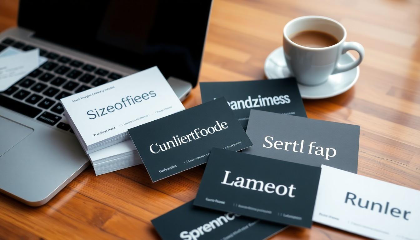
Choosing the right font for your business card can feel overwhelming. With so many options available, it’s easy to get lost in the details. Yet, the font you select plays a crucial role in how your brand is perceived. A well-chosen font not only enhances readability but also communicates your brand’s personality and values effectively.
In this article, we’ll guide you through the essentials of selecting the perfect font for your business cards. From understanding font sizes to exploring styles that resonate with your brand, we’ll provide insights that help you make an informed decision. Let’s dive into the world of typography and discover how the right font can elevate your business card from ordinary to extraordinary.
Why Font Choice Matters
Font choice plays a crucial role in the effectiveness of business cards. A selected font directly impacts readability, brand alignment, and memorability.
Readability
We prioritize legibility in our card designs. Contact details must be easy to read, even at smaller sizes. Overly decorative or complex fonts detract from the essential information on the card. Choosing a clean, professional font avoids confusion for potential clients.
Brand Alignment
Selecting a font that reflects our brand's personality can reinforce our message. Different font styles communicate distinct traits—serif fonts like Garamond and Baskerville represent tradition, while sans-serif fonts such as Futura and Avenir embody modernity. Aligning our font choice with our brand values ensures a cohesive brand image.
Professionalism
Using professional fonts enhances our business card design. Clean and straightforward fonts elevate the card's aesthetic, fostering trust with our audience. For instance, we can leverage premium prestige business cards that pair elegant fonts with quality materials for a sophisticated look.
Memorability
A unique yet readable font can set us apart in a competitive landscape. Memorable fonts attract attention and help potential clients recall our brand. By sticking to one or two complementary fonts—one for headings and another for the body text—we achieve a balance between uniqueness and readability.

Exploring various font options can guide us in selecting the best fit for our business cards. For additional assistance, we can utilize custom printing solutions tailored to elevate our brand presence through professional designs. We can also explore design templates to simplify the font selection process while ensuring our cards resonate with our audience.
For more insights on effective font choices, we can refer to the article on what font is best for business cards. Engaging images related to font styles can further enhance our understanding and application of these principles.
In our quest to create impactful business cards, careful attention to font choice plays an indispensable role.
Serif vs. Sans-Serif Fonts for Business Cards
Selecting a font for your business card requires understanding the unique qualities of serif and sans-serif fonts. Each type offers distinct advantages that influence the perception of your brand.
Serif Fonts
- Characteristics: Serif fonts feature small decorative strokes at the ends of letters, enhancing readability in printed materials. Their traditional appearance fosters an image of authority and sophistication.
- Uses: Ideal for businesses emphasizing tradition and professionalism. Law firms, consultants, and luxury brands often utilize serif fonts to convey reliability. These fonts also excel in publishing contexts, such as books and magazines, where readability is paramount.
- Examples: Common serif fonts include Times New Roman and Baskerville. These fonts are timeless choices that effectively communicate a sense of class and elegance, making them suitable for formal business cards.
Sans-Serif Fonts
- Characteristics: Sans-serif fonts lack decorative strokes, resulting in a cleaner, modern look. Typically, these fonts provide a consistent width for letters, increasing visual clarity.
- Uses: Excellent for businesses seeking a contemporary and approachable image. They are commonly used in design and technology sectors due to their simplicity and legibility, particularly on digital displays.
- Examples: Popular sans-serif fonts include Arial, Helvetica, and Myriad Pro. These fonts are versatile and can adapt to various business needs, from startups to established companies.
By prioritizing the right font style, business cards can effectively convey brand identity. We can maximize the impact of our chosen fonts through premium printing solutions, enhancing our overall brand presence. Utilizing services like business card printing from 4OVER4 can further elevate the design quality.
Key Considerations
- Readability: Ensuring that the contact information on the card is easily readable is crucial regardless of the font type chosen.
- Brand Identity: The font style should align with the overall personality of the brand. Serif fonts suggest tradition, while sans-serif fonts project modernity.
- Printing Quality: Using high-quality printing services enhances the visual appeal of the font on the card, making it more inviting to potential clients. Custom solutions from 4OVER4 provide exceptional results.
- Design Flexibility: Different fonts can be combined, offering creative ways to display crucial information. For inspiration, check out design templates that showcase a range of lettering styles.
Incorporating the appropriate font for business cards reflects a company’s values and helps create a memorable impression. Research indicates that the integration of well-designed typography can significantly influence a brand's perception, as highlighted in resources like what font is best for business cards.
Choosing the right typography, along with expert printing techniques from 4OVER4, allows us to present our brands compellingly and professionally.
Classic & Professional: Times New Roman
Times New Roman stands as a quintessential choice for business cards, emphasizing classic and professional aesthetics. This serif font combines readability and authority, making it ideal for conveying trust in traditional industries.
- Readability and Professionalism: Choosing a font demands a balance between readability and professionalism. Times New Roman’s clean lines enable easy reading, ensuring important information stands out.
- Font Type: Serif fonts like Times New Roman offer a traditional and sophisticated feel. This design choice conveys authority, making it suitable for businesses like law firms and academic institutions.
- Usage: Utilize Times New Roman primarily as body text on business cards. Combining it with a sans-serif font for headings or logos creates a visually appealing contrast.
- Legibility: It's vital the font size remains appropriate. A minimum size of 10-12 points enhances legibility, ensuring contact details are easily readable, even when printed in smaller formats.
In addition to font selection, high-quality printing plays a crucial role in the overall presentation of business cards. Leveraging the custom printing solutions from 4OVER4.COM significantly elevates our brand presence. Their focus on premium materials and precision printing brings our typography to life, ensuring it reflects our professionalism and brand identity effectively.
We can explore additional resources to refine our font choices. Understanding what font is best for business cards provides a foundation for enhancing our designs. Let's consider engaging design templates to streamline this process.
By selecting the right font and leveraging expert printing services, we create business cards that not only convey our brand's identity but also leave a lasting impression on potential clients. For more insights into crafting compelling business cards, we can utilize resources on business card printing.
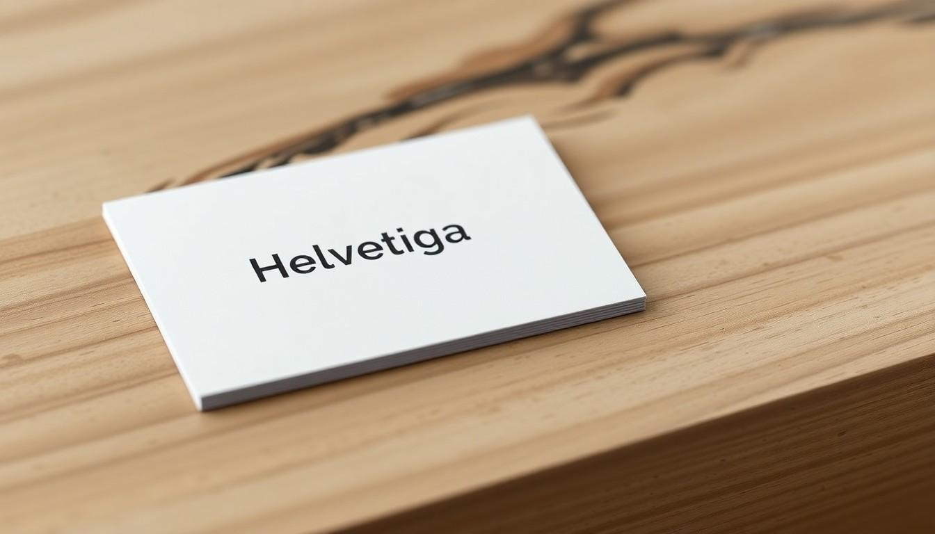
Modern & Minimalist: Helvetica
Helvetica stands out as a top choice for those seeking a modern and minimalist font for business cards. Its clean lines and professional appearance create an instant impact, making it highly legible even at smaller sizes. We appreciate that Helvetica boasts 51 diverse character weights, ensuring flexibility while maintaining a consistent look across various design elements.
Key Features of Helvetica
- Simplicity: Helvetica's uncluttered design ensures that key information, such as names and contact details, remains clear and accessible.
- Readability: Its sans-serif nature enhances readability, essential for communicating brand identity effectively.
- Versatility: Helvetica adapts well to different weights, allowing us to highlight important details while keeping the overall design balanced.
Incorporating Helvetica into your business card design can elevate the brand's presence significantly. Many businesses leverage Helvetica for its timeless style and professional look. For instance, using a bolder weight for the company name creates emphasis, while lighter weights can maintain a sleek appearance for secondary text.
Font Size Matters
Selecting the right font size is crucial. For standout information, such as our company name, a size ranging from 10pt to 16pt ensures prominence. Secondary text, including contact details, should remain legible but slightly smaller, ideally no less than 8pt. This balance enhances the card's effectiveness in conveying our message.
Custom Printing Solutions
At 4OVER4.COM, we can effectively leverage modern typography and custom printing solutions to enhance our business cards. High-quality printing techniques significantly improve the perception of any card. Custom finishes and premium materials available at 4OVER4.COM take Helvetica's inherent elegance to the next level, ensuring that our business cards stand out.
Choosing Helvetica aligns seamlessly with a modern aesthetic, appealing to potential clients. Its straightforward, no-nonsense style fosters trust, making it a go-to choice for personal branding. Our decision to use Helvetica reflects a commitment to professionalism, helping us connect with our audience effectively.
Utilizing design templates from 4OVER4.COM, we can experiment with various layouts and styles to complement Helvetica. This approach not only ensures adherence to branding guidelines but also optimizes the visual impact of our cards.
In a competitive landscape, Helvetica's modern flare combined with 4OVER4.COM’s custom printing capabilities positions us to make memorable impressions. This strategic choice in typography enhances our brand's visibility and communicates our values clearly to clients.
Elegant & Sophisticated: Garamond
Garamond stands out as a premier choice for businesses seeking an elegant and sophisticated appearance. This serif font offers timeless appeal and refinement, making it particularly suitable for industries such as law, finance, and luxury goods. Its high legibility in small font sizes proves essential for business cards, where clarity is paramount.
Characteristics of Garamond
- Timeless Appeal: Garamond's design remains relevant across decades, making it a safe choice for branding.
- Sophisticated Style: The font's delicate curves and balanced letterforms project professionalism and prestige.
- Versatile Usage: Ideal for various applications, Garamond works well in both headers and body text on business cards.
Incorporating Garamond into our business card designs enhances the perception of our brand. Its elegance aligns perfectly with sophisticated branding needs.
Readability & Font Size
When using Garamond, selecting the right font size is crucial for readability. Recommended font sizes range from 10pt to 16pt for primary information, ensuring our contact details remain legible. For secondary information, avoid sizes smaller than 8pt. Maintaining readability establishes a connection with potential clients.
Elevating Brand Presence with Custom Printing
Partnering with a trusted printer like 4OVER4.COM maximizes the impact of our business card designs. Their custom printing solutions enhance the overall quality and aesthetic of Garamond, aligning with our branding goals. By utilizing premium printing options, we can achieve a polished and professional look that reflects our brand's essence.
Additional Design Resources
Exploring design templates can simplify the process of creating outstanding business cards. We recommend visiting 4OVER4's design templates to discover options that pair beautifully with Garamond and enhance our branding.
By choosing Garamond for our business cards and collaborating with 4OVER4.COM for printing, we reinforce our brand's position in a competitive landscape. The combination of an elegant font and high-quality printing serves to engage our audience effectively.
Bold & Eye-Catching: Futura
Futura stands out as a top choice for business cards due to its geometric sans-serif design. Its modern aesthetic offers clarity and strength, making it well-suited for various industries such as technology, design, and fashion. Futura's clean, minimal lines lend a sophisticated touch, drawing attention to essential information.
Futura features a range of styles and weights, which allows for versatility in design. For instance, using bold variations emphasizes key elements, while lighter weights create a subtle background for less critical text. This adaptability enhances the overall appearance of our business cards while ensuring vital details remain easily readable.
For brands seeking to project a confident image, Futura proves effective. Its strong angles and eye-catching characteristics capture attention. Each letterform contributes to the card's visual impact, effectively conveying our brand's personality and values.
Utilizing Futura in our designs alongside high-quality custom printing services at 4OVER4.COM elevates our brand presence. The premium printing options from 4OVER4.COM ensure that the vibrant and precise lines of Futura remain sharp and clear, enhancing legibility and reinforcing professionalism.
When designing with Futura, be mindful of font sizes. We recommend using sizes between 10pt to 16pt for significant text to stand out while ensuring secondary text remains no less than 8pt. The impact of well-crafted business cards fosters memorability, enabling potential clients to associate our brand with quality and sophistication.
To explore how Futura can transform our business cards, we can review best font choices for business cards and discover relevant design templates that complement this dynamic font.
Incorporating Futura with the tailored printing solutions from 4OVER4.COM not only enhances our card's aesthetics but also strengthens our outreach, leaving a lasting impression on potential clients.
Creative & Unique: Bebas Neue
Bebas Neue stands out as a striking font choice for business cards. Its tall, bold, and clean lines make it highly legible, making a strong impression. This sans-serif font is versatile, suitable for various industries, particularly in creative fields like design, fashion, and entertainment.
Using Bebas Neue for headings grabs attention while allowing for secondary text in a simpler font, ensuring readability. This combination not only elevates visual appeal but also enhances brand personality.
The font's modern aesthetic resonates with contemporary audiences, reflecting innovation and freshness. As a display font, it draws attention without overwhelming the design. Proper sizing plays a crucial role here; we recommend maintaining character heights in the range of 10pt to 16pt for prominent elements while keeping subsidiary text at a minimum of 8pt. This ensures clarity across different viewing distances.
4OVER4's custom printing solutions significantly enhance the impact of Bebas Neue on business cards. With high-quality finishes and precise color reproduction, our printing options elevate brand presence, making a memorable impression. Choosing premium printing further amplifies the sophistication of the font and the overall design.
To explore various templates incorporating Bebas Neue and other creative font options, we recommend visiting our design templates page. Discover how expert printing can transform your business cards into marketing tools that communicate your values effectively.
Luxury & High-End: Baskerville
Baskerville stands out as an excellent serif font for luxury and high-end business cards. This font combines traditional elegance with authority, perfectly aligning with the aesthetics of formal industries. Originally developed in 1757, Baskerville features tapered serifs and a vertical letter axis, enhancing readability even at smaller sizes.
Using Baskerville can effectively communicate your brand’s sophistication, making it a suitable choice for fields such as finance, law, and high-end retail. When selecting this font, consistency in application across all branding materials maintains a cohesive image.
Key Characteristics of Baskerville
- Readability: Baskerville ensures contact information remains legible, enhancing professionalism.
- Tradition: The font evokes a sense of historical value, suitable for brands emphasizing heritage.
- Elegance: The design conveys luxury, making it an ideal choice for businesses targeting upscale markets.
Utilizing high-quality printing solutions is essential to maximize the appearance of Baskerville on business cards. We recommend partnering with a reputable provider like 4OVER4 for premium printing services. Their custom printing capabilities can elevate your brand presence, ensuring that your business cards reflect the elegance of the Baskerville font..
Font Pairing Suggestions
While Baskerville stands strong on its own, pairing it with a modern sans-serif font can create visual balance. For headings, a clean sans-serif option can enhance contrast, ensuring key information captures attention while maintaining readability.
Printing Techniques
Incorporating techniques such as foil stamping or embossing adds a tactile quality to your business cards, further emphasizing luxury. 4OVER4 offers various premium options, including Prestige Business Cards, which can complement the regal feel of Baskerville.
Design Considerations
For optimal design, ensure sufficient white space around the text. This clarity allows the elegance of Baskerville font to shine through. Consider using design templates that align with your brand's identity, providing a polished and sophisticated look.
Elevate your business representations by choosing Baskerville and leveraging the superior printing services from 4OVER4. With the right font and quality finishes, we can create memorable impressions that resonate with clients in luxury markets.

Readable & Versatile: Montserrat
Montserrat stands out as an exceptional choice for business card fonts due to its clean lines and modern appeal. Montserrat offers high readability, making it suitable for various business applications. We recommend this sans-serif font for its versatility, allowing it to align seamlessly with numerous branding styles.
Characteristics of Montserrat
- Legibility: Montserrat ensures clear reading from a distance, with rounded letters that contribute to a friendly and approachable demeanor.
- Modern Aesthetic: The geometric structure gives a contemporary look, making it ideal for businesses aiming for a modern identity.
- Flexibility: Available in multiple weights, Montserrat allows for creative layouts, enabling us to emphasize key information effectively.
Font Size Suggestions
Appropriate font size plays a crucial role in maintaining readability. We recommend using the following sizes for Montserrat on business cards:
- Primary Text: 10pt to 16pt. Choose sizes that contribute to clear and effective communication.
- Secondary Text: A minimum of 8pt. This ensures that contact details and additional information remain legible without compromising design aesthetics.
Integrating Montserrat with Custom Print Solutions
Partnering with 4OVER4 for custom printing significantly elevates the presentation of business cards featuring Montserrat. Offering premium publishing options, 4OVER4 enhances the visual impact of this font, ensuring that colors and details are vividly reproduced.
Additional Resources
Utilizing Montserrat can elevate our branding efforts. For further information about selecting the right font for business cards, we encourage exploring resources like What Font is Best for Business Cards and reviewing our diverse design templates.
Incorporating Montserrat into our business cards, combined with 4OVER4's exceptional printing services, positions our brand effectively within a competitive landscape, enabling us to leave a memorable impression on clients and prospects alike.
Conclusion
Choosing the right font for our business cards is more than just a design choice; it's a vital element of our brand identity. By selecting fonts that reflect our values and enhance readability, we can create a lasting impression on potential clients. Whether we opt for the timeless elegance of Garamond or the modern clarity of Montserrat, each font tells a story about who we are.
As we move forward with our designs, let's remember the importance of legibility and professionalism. Partnering with high-quality printing services like 4OVER4 can elevate our business cards, ensuring they stand out in a crowded marketplace. With the right font and printing, we can confidently showcase our brand and make meaningful connections.
Frequently Asked Questions
Why is font choice important for business cards?
Font choice is crucial for business cards as it greatly influences brand perception, readability, and professionalism. The right font communicates your brand's personality and values while ensuring that essential information is easy to read. A well-chosen font can make your card memorable, ultimately helping you stand out in a competitive landscape.
What types of fonts are best for business cards?
Serif fonts, like Times New Roman and Garamond, convey tradition and sophistication, suitable for formal industries. Sans-serif fonts, like Helvetica and Futura, offer a modern, clean look ideal for contemporary businesses. Pairing a serif font for text with a sans-serif for headings can create a balanced and effective visual contrast.
What font size should I use on my business card?
For essential information, font sizes between 10pt to 16pt are recommended for easy readability. For secondary text, avoid going below 8pt to ensure that all contact details remain legible. Proper sizing contributes significantly to the overall impact of your business card design.
How can I ensure my business card is readable?
To enhance readability, choose clear and legible fonts, avoid overly decorative styles, and ensure adequate contrast between the text and background. Use appropriate font sizes, maintain sufficient spacing, and consider accessing high-quality printing services to elevate the overall appearance and clarity of your card.
What are some recommended fonts for creative industries?
For creative fields, bold sans-serif fonts like Bebas Neue and modern options like Montserrat are excellent choices, ensuring legibility while making a strong impact. These fonts enhance visual appeal and convey creativity effectively, making them perfect for design and fashion industries.
How can printing quality affect my business card design?
High-quality printing elevates the overall design of your business cards by enhancing color accuracy, detail, and texture. Partnering with a reputable printer, like 4OVER4.COM, ensures that your chosen fonts and designs are reproduced beautifully, leaving a lasting impression on potential clients.
Más de Business Cards

3306
Business cards are still important for marketing in 2024. For e
![]() Emma Davis
Emma Davis
Oct 10, 2024

9451
A well-designed business card is important for making a memorable first impression. It represents your brand
![]() Emma Davis
Emma Davis
Jan 10, 2024

22755
High-quality but best affordable business card design
![]() Matthew Prince
Matthew Prince
Nov 15, 2023

2991
The letterpress printing technique first emerged in the 15th century. Nearly 600 years after these designs surfaced, brands and professionals
![]() Matthew Prince
Matthew Prince
Oct 25, 2023

3706
Handing out memorable business cards at networking events and conferences is vital for building relationship
![]() Matthew Prince
Matthew Prince
Oct 11, 2023

5646
In a world where first impressions matter more than ever, clear business cards are revolutionizing how we present ourselves. These sleek, tran
![]() Matthew Prince
Matthew Prince
Aug 4, 2023

12910
In our fast-paced business world, you have very little time to stand out from the competition. However, we design
![]() Matthew Prince
Matthew Prince
Jul 21, 2023

15751
A business card is more than just a piece of paper—it’s often the first impression we leave with potential clients. For photograph
![]() Matthew Prince
Matthew Prince
Jul 21, 2023