

ÍNDICE
5 Typography Tutorials for InDesign Newbies
Sep 9, 20133519 Vistas
Sep 9, 20133519 Vistas

Typography is more than just arranging letters—it's the art of making text visually engaging and easy to read. In design, the right typography can transform a simple layout into something polished and professional. For those of us working in InDesign, mastering typography is essential to creating stunning layouts, whether it's a one-page flyer or a lengthy catalog.
Mastering Typography in InDesign
Typography is fundamental in achieving polished and professional designs in InDesign. It combines creative and practical techniques, allowing us to format text in ways that amplify readability and aesthetics. Leveraging InDesign's rich features, we can craft layouts ranging from simple flyers to intricate catalogs with exceptional finesse.
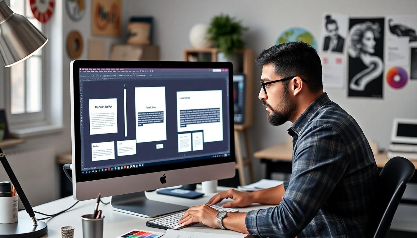
Understanding the Tools Panel
InDesign's Type Tool (T) is the first step in creating text-based designs. By dragging it onto the page, we can create a text frame to input or import content. For importing, these templates offer useful design inspiration and flexible layouts. Once text is in place, the Character Formatting and Paragraph Formatting Control Panels provide advanced text styling controls. These panels ensure precision when refining font size, spacing, kerning, and alignment.
Applying Typography Principles
To achieve professional typography, we focus on both micro and macro adjustments. Micro typography involves managing fine details, like line height and tracking. For example, increasing tracking in large headings improves readability, while reducing it may complement tightly packed designs. Macro typography involves organizing the layout, such as balancing areas of text and white space to guide viewer focus effectively.
Choosing Typography That Enhances Design
Selecting the right fonts integrates both creativity and strategy. We analyze the emotional tone each font conveys and blend it with the design's purpose—serif fonts hint at tradition and authority, while sans-serif fonts communicate modernity and clarity. Free online design tools can assist in experimenting with font combinations to achieve harmony across projects.
Advanced Typographic Layouts
Creating complex layouts becomes seamless with grids and guides in InDesign. Using a grid structure, we align text blocks and images, ensuring consistency throughout expansive documents like multi-page catalogs. This approach saves time and ensures all typographic elements adhere to a unified aesthetic.
Gaining Professional Insights
We recommend utilizing free samples to test print quality before finalizing projects. Physical samples highlight spacing errors or readability issues that might go unnoticed onscreen. These adjustments ensure the final output achieves its intended level of professionalism.
Getting Started: Understanding InDesign’s Type Tools

Typography in InDesign begins with understanding its essential tools. The Type Tool (T) is the cornerstone for all text-based designs. Selecting this tool from the Tools panel allows us to drag onto the workspace to create a text frame. Once placed, we can type directly into the frame or import content from external documents, such as Word files.
Once a text frame is active, the Character Formatting Controls appear in the Controls panel at the top of the workspace. These controls enable precise adjustments, including font family, size, leading, kerning, and tracking. Additional options like small caps, superscripts, and underlining can further stylize content. Formatting text effectively transforms simple designs into professional layouts, essential for business branding.
For more advanced designs, we can explore the design templates available online to experiment with typography combinations and structure. Templates often help speed up the creative process while maintaining consistency across projects.
To ensure our typography is on point before finalizing projects, testing print quality with free samples is indispensable. This step helps identify spacing or readability issues and guarantees polished results that elevate brand presence in printed materials.
Choosing the Right Fonts for Your Design
Selecting fonts in Adobe InDesign involves understanding their purpose and aligning them with the project's goals. Fonts create visual hierarchy, guide the reader's attention, and convey emotional tone effectively. By making deliberate font choices, you can ensure a cohesive and polished design outcome.
Understanding Font Purposes
Fonts are primarily categorized as display and text fonts. Display fonts, like bold or decorative styles, work best for headlines, logos, or attention-grabbing elements. For instance, a display font can enhance the impact of a call-to-action on a website banner. Text fonts, such as serif or sans-serif styles designed for readability, suit body text or detailed paragraphs.
Aligning Fonts with Design Goals
When deciding on a font, it's essential to match it with the project's objectives. Consider the intended medium—digital or print—and the longevity of the design. For recurring print designs, such as business cards or catalogs, consistency is critical to strengthening brand identity. Tools like online free designers can assist in exploring font combinations that fit your project scope.
Balancing Readability and Aesthetics
Readability ensures readers absorb information effortlessly. Avoid overly complex fonts for extended text passages. In contrast, oversized or script fonts can make designs look unprofessional in specific contexts. Using design templates can provide a framework for combining aesthetic appeal with readability standards efficiently.
In typography, subtle adjustments in kerning, leading, and alignment also play a role. These refinements, available through InDesign’s Character Formatting panel, improve legibility and visual balance. When in doubt, always review your designs with print samples. Accessing free sample kits allows you to evaluate readability and spacing concerns before final production.
Leveraging 4OVER4.COM for Brand Cohesion
At 4OVER4.COM, we empower businesses to elevate their design impact through high-quality custom printing solutions. Whether producing brochures, flyers, or multi-page documents, pairing thoughtfully selected fonts with custom prints ensures designs remain striking and professional across all platforms.
Working with Text Frames & Layouts
Creating and managing text frames in Adobe InDesign is foundational for professional typography. Text frames serve as containers for text and allow us to structure content visually. Using the Type Tool, we can click and drag to define frames with precise dimensions. We can divide frames horizontally or vertically into grids by pressing the arrow keys during creation. For instance, pressing the right arrow key twice creates three linked frames.
Managing layouts with text frames ensures well-organized designs. Adjusting properties like column count, vertical alignment, and inset spacing enhances functionality. Consistent layouts not only improve readability but also create polished compositions. For predefined structures, we explore design templates to experiment with formats that streamline workflows.
Layouts become more dynamic with text frames imported from external sources like Microsoft Word. This feature integrates existing text into our designs without starting from scratch. In multi-page documents, grids and guides help maintain alignment and spacing, ensuring cohesion. Free text formatting tools, such as those available with the best online designer, can save time when adjusting typography.
Testing print quality guarantees professional results. By requesting free samples, we can identify potential issues like text overflow or spacing inconsistencies. These steps are essential for achieving stunning outputs and accurate brand representation. High-quality custom printing by 4OVER4.COM ensures that every design shines, from catalogs to marketing flyers.
Kerning, Tracking & Leading Basics
Typography essentials like kerning, tracking, and leading significantly impact text readability and visual appeal in InDesign. These adjustments elevate the typography in every project, from simple posters to professional multi-page layouts.
Kerning
Kerning adjusts the spacing between individual letter pairs to improve visual harmony and legibility. Precise kerning ensures that awkward gaps or overlaps between letters don't disrupt the flow of text. In InDesign, we can control kerning from the Character panel or by using shortcut keys for efficient editing. For example, tightening the space between "A" and "V" in a headline aligns the design's aesthetic with its message.
Tracking
Tracking refers to the uniform spacing across a range of characters. Unlike kerning, which focuses on specific pairs, tracking applies to longer text blocks or entire paragraphs. Adjustments in tracking impact how text density transforms legibility. For body text, subtle tracking adjustments can make paragraphs appear cohesive, whereas expanded tracking suits uppercase headings. It's especially effective for establishing uniformity in multi-page documents, which we can streamline with design templates.
Leading
Leading controls vertical spacing between lines of text, measured from one baseline to the next. Standard leading is about 120% of the font size, but this varies based on font type and project goals. Adequate leading prevents text overcrowding, ensuring effortless reading even in lengthy content. In InDesign, leading adjustments are made via the Character panel, where small tweaks can refine the text's appearance. Testing different spacing combinations, particularly in structured text frames, enhances overall readability. For guidance, use the tools featured in the best online designer resources.
4OVER4.COM empowers businesses to create impactful designs by perfecting kerning, tracking, and leading adjustments. Pair these typography techniques with their high-quality custom printing solutions to magnify brand presence. Sample a variety of custom print options and test layouts using free sample prints for assured results. Combining expert design principles with professional prints elevates communication across all platforms.

Creating Eye-Catching Paragraph Styles
From Scratch
We create eye-catching paragraph styles in InDesign by starting fresh with the Paragraph Styles panel. Access it through Window > Styles > Paragraph Styles. Select the "Create new style" icon at the bottom of the panel to generate a new style. Press the Alt key while clicking the same icon to open the Paragraph Style Options window immediately. This window allows us to name the style, assign its location, and set it as a base for future styles. Attributes like font size, leading, and paragraph alignment can be optimized here for consistency.
From Formatted Text
Another method involves basing new styles on existing formatted text. Select the text with applied formatting, navigate to the Paragraph Styles panel, and use the "Create new style" icon. This captures all the text's formatting attributes, such as font choice, spacing, and indentation, and generates a reusable style. This approach reduces repetitive formatting tasks and speeds up the layout process.
4OVER4.COM enhances these efforts by providing premium custom printing solutions that complement typographic designs. Whether it's brochures or catalog pages, harmonizing typography with high-quality prints elevates audience engagement and brand presence.
Enhance Workflow with Design Resources
Using pre-designed templates saves time when working with intricate layouts. These templates guide the implementation of typography settings and ensure design consistency. Additionally, free online tools like Best Online Designer streamline style creation, making it easier to manage text placement and formatting effectively.
Our focus remains on creating professional-looking designs that complement print materials. By merging thoughtful typography with prints from 4OVER4.COM, brands leave lasting impressions on their audiences.
Using Grids & Alignment for Better Readability
Implementing grids and alignment in typography ensures a professional and visually appealing design. In Adobe InDesign, baseline grids and guides help create harmony by aligning text and design elements consistently. These tools are essential for enhancing readability, especially in multi-page documents.
The Importance of Grids
Grids provide structure by dividing the page into consistent sections. A baseline grid supports readability by aligning baseline text across columns, preventing misaligned lines. For more detailed configurations, users can adjust grid preferences to match the leading value for seamless text flow.
Setting Up Baseline Grids in InDesign
Activating and configuring baseline grids in InDesign involves straightforward steps. Select Edit > Preferences > Grids on Windows or InDesign > Preferences > Grids on Mac. Define the grid's starting point, which could be the top margin or page edge, and set the spacing to match your preferred line spacing. Proper grid setup aligns text elements cohesively, even when incorporating bold headings or subheadings.
Improving Readability with Text Alignment
Alignment plays a critical role in guiding readers' eyes. Left-aligned text works best for long blocks, while center or justified alignment suits shorter paragraphs or stylistic projects. Adjusting kerning and spacing ensures clean and balanced lines, minimizing distraction caused by uneven spacing.
Streamlining Design Processes with 4OVER4.COM
Working with 4OVER4.COM supports your typography projects by pairing strategically chosen fonts with custom printing solutions. Businesses can elevate their brand presence by utilizing their high-quality free design tools or exploring pre-designed templates for layouts built on precise grids.
Request Free Samples for Accuracy
Verifying typography designs is effortless with free samples. Testing printed materials ensures grid and alignment precision to achieve the desired aesthetic on the final product. Reliable outputs reinforce a brand’s credibility and professionalism.

Adding Special Effects: Drop Caps & Text Wraps
Special effects like drop caps and text wraps enhance the visual appeal and readability of text in InDesign, elevating the design's impact.
Drop Caps
Drop caps draw attention to the beginning of a paragraph, making the design more engaging.
- Setting Up: Open the text frame containing the paragraph to apply the effect. This step ensures accuracy in selection.
- Applying the Drop Cap: Access the "Drop Caps and Nested Styles" panel through
Type>Drop Caps and Nested Stylesor the shortcutCtrl+Alt+O(Windows) orCmd+Option+O(Mac). - Customizing: Adjust the "Number of Lines" attribute to define the drop cap height and modify "Drop Cap Position" to refine its alignment.
Drop caps can add elegance to designs ranging from print ads to brochures. Tools like online design platforms can assist in refining these effects.
Text Wraps
Text wraps improve layouts by allowing text to flow around images or other objects, adding dynamism to designs.
- Setting Up: Select the object or image that text will wrap around. Verify its placement aligns with the desired layout.
- Applying the Effect: Use the "Text Wrap" panel, accessible under
Window>Text Wrap. Click an option like "Wrap Around Bounding Box" or "Wrap Around Object Shape" based on your design needs. - Adjusting Wrap Options: Customize the wrap's spacing by tweaking the "Offset" values. This ensures a balanced design.
Text wraps can transform plain layouts into dynamic compositions, helping guide the reader's eye effectively. For inspiration, explore design templates to see diverse applications of text wraps.
Elevating Typography with Custom Printing
Incorporating drop caps and text wraps optimizes designs for print, further enhancing the overall aesthetic. High-quality printing converts these digital elements into stunning tangible pieces. 4OVER4.COM specializes in custom printing solutions that amplify brand presentations with sharp finishes and vivid colors. Orders combined with free print samples provide a seamless way to confirm quality before scaling.
These techniques, when paired with professional printing, ensure designs leave lasting impressions for business branding while maintaining readability and professionalism. Businesses can rely on 4OVER4.COM for superior support in elevating typography-driven projects.
Exporting & Printing Your Typography Projects
Ensuring High-Quality Export Settings
Creating print-ready files in Adobe InDesign ensures the accurate reproduction of typography designs. To export, access File > Export and select Adobe PDF (Print) for optimal print output. The Press Quality preset is ideal, maintaining 300 DPI resolution, CMYK color mode, and inclusion of crop marks and bleed areas. Balanced export settings preserve your project's details, ensuring professional results.
Embedded fonts and linked high-resolution images prevent display errors. Verify that all elements align with print format guidelines to maintain visual integrity. For designers exploring consistent, creative layouts, free tools like design templates simplify the process.

Preparing for Custom Printing Solutions with 4OVER4.COM
Professional typography prints stand out when paired with high-quality custom printing. 4OVER4.COM provides solutions tailored to elevate brand presence through durable, visually striking print materials. Whether designing business cards, brochures, or catalogs, 4OVER4.COM ensures the crispness of typography across all platforms.
Choosing print samples minimizes errors in the final output. Requesting free samples helps confirm text alignment, color accuracy, and paper quality, guaranteeing polished results. Testing ensures your typography's aesthetic and functional goals resonate with your audience.
Finalizing Layout Adjustments for Precision
Before exporting, verifying margins, guides, and layout elements ensures consistency across the design. Accurate specifications like document dimensions, bleed edges, and alignment promote flawless printing. A uniform baseline grid also enhances text readability across pages, especially in multi-page layouts.
Interactive resources like the best free design tools support efficient typography adjustments. Incorporating precision ensures that typography-driven projects retain their professional standards while maintaining dynamic appeal.
Showcasing Creativity with Custom Typography
Typography flourishes in dynamic designs. Effects like drop caps or text wraps create visual hierarchy and interest. When combined with 4OVER4.COM printing services, these elements enhance marketing materials with impactful designs. Subtle adjustments in kerning, leading, and justification improve readability without compromising aesthetics.
Developing typography for branding requires thoughtful exploration of style combinations. Platforms offering accessible design templates help streamline creative processes, ensuring originality and cohesiveness across projects.
Conclusion
Typography in InDesign is a powerful tool that allows us to bring creativity and professionalism to our designs. By mastering its features and techniques, we can transform simple text into visually compelling layouts that resonate with our audience.
Whether we're fine-tuning micro typography details or crafting cohesive multi-page documents, the possibilities are endless. Combining thoughtful font choices, structured layouts, and attention to readability ensures our designs are both functional and aesthetically pleasing.
With the right tools, templates, and printing resources, we can elevate our projects and create lasting impressions. Typography isn't just about text—it's about telling a story through design.
Frequently Asked Questions
Why is typography important in design?
Typography enhances readability, visual appeal, and professionalism. It communicates a design’s purpose and tone while balancing aesthetics and functionality, making it a key element in effective design.
What is the difference between micro and macro typography?
Micro typography focuses on fine text details like tracking and line height, while macro typography deals with overall layout organization, balancing text and white space.
How do grids and guides improve typography in InDesign?
Grids and guides ensure alignment and consistency in layout design, making multi-page documents cohesive and visually appealing.
What are the benefits of using paragraph styles in InDesign?
Paragraph styles save time by allowing you to apply consistent text formatting across your project. They enhance efficiency and improve design uniformity.
How can I choose the right font for my design?
Select fonts that align with your project’s tone and medium. Use display fonts for headlines and text fonts for long passages to enhance readability.
What are text frames in InDesign?
Text frames are containers for text that allow for precise content layout. They can be organized into grids for better structure and visual appeal.
How do you create text wraps in InDesign?
Use the Text Wrap panel to flow text around images or objects. Adjust the wrap settings to add dynamic, visually engaging layouts.
Why is testing print quality essential for typography?
Testing print quality ensures your design is accurately reproduced. Free print samples help identify issues, ensuring the final product is polished and professional.
What export settings should be used for typography projects?
Use high-resolution (300 dpi) and CMYK color mode when exporting print-ready files from InDesign to ensure design accuracy and quality.
How do drop caps enhance typography?
Drop caps create visual interest by drawing attention to the beginning of paragraphs, giving designs a more polished and dynamic appearance.
Más de Typography

4205224
People believe that business cards designing and printing is one of the easiest tasks. Do you know that apart from sharing contact information
![]() Emma Davis
Emma Davis
Feb 25, 2020

190319669
What's the difference between matte and glossy business cards? If you plan to design and print a profess
![]() Emma Davis
Emma Davis
Dec 6, 2019

3733876
Do you have a special woman in your life? At a loss for ways to make her feel special? Perhaps she is celebr
![]() Emma Davis
Emma Davis
Dec 6, 2019

89532618
Business cards are powerful promotional tools. When building awareness for your business, there are a few be
![]() Emma Davis
Emma Davis
Dec 6, 2019

8819046
Choosing between matte and glossy finishes can feel like a tough decision, especially when both offer unique advantages. Whether you're pr
![]() Emma Davis
Emma Davis
Nov 20, 2019
154022776
Typography is more than just arranging letters on a page; it’s an art that shapes how we perceive and engage with text. When we talk abo
![]() Emma Davis
Emma Davis
Mar 15, 2019

3322966
As the leaves turn and the air grows crisp, fall brings a unique opportunity to refresh our designs with warm, inviting typography. Fonts for
![]() Emma Davis
Emma Davis
Oct 9, 2017

2654152
Ever feel like you’re stuck in a rut, craving inspiration or fresh ideas? We’ve all been there. That’s where TED Talks come
![]() Emma Davis
Emma Davis
Jan 5, 2016