

ÍNDICE
How to Design a Greeting Card Using InDesign [FREE Tutorials]
Feb 11, 20144749 Vistas
Feb 11, 20144749 Vistas
![How to Design a Greeting Card Using InDesign [FREE Tutorials]](https://cdn.4over4.com/assets/images/content-hub/how-to-design-a-greeting-card-using-indesign-free-tutorials/11:36_b76d2163-77d0-4a51-bebd-3257074b973c-RBvAWEL1hLSz1TxjZdyj5.jpeg?auto=format&fit=max&w=3840)
Designing a greeting card is more than just putting pen to paper—it's about creating a heartfelt message that brings joy to someone’s day. Whether it’s for a birthday, wedding, or just to say “thinking of you,” a well-designed card can leave a lasting impression. But let’s face it, choosing the right words, fonts, and visuals can feel overwhelming.
Why Use InDesign for Greeting Cards
InDesign offers powerful tools for designing professional greeting cards tailored to both personal and business needs. Its precision layout capabilities ensure your content, from text to visuals, is perfectly aligned. When creating custom greeting cards, this accuracy enhances the recipient's experience by delivering a polished, visually stunning product.
Advanced Typography Options
With InDesign, text customization options are vast, allowing us to select ideal fonts like Windsong or Coquette and adjust spacing to balance readability and design. These tools are essential when crafting impactful messages for occasions like weddings or birthdays.
Visual and Creative Control
InDesign simplifies adding images, illustrations, and graphic elements, enabling seamless integration of photos with vibrant text. This flexibility is crucial in designing cards that resonate emotionally or professionally, such as through branded visuals for businesses. The ability to create layered effects makes cards with bold colors or minimalist layouts more appealing.
Tailored Customization
InDesign supports various card sizes, from traditional A5 to unique square formats, offering creative freedom for different preferences. This adaptability is ideal for businesses aiming to elevate their brand presence through unique greeting card printing solutions.
Efficiency and Scalability
InDesign is perfect for managing multiple projects simultaneously, thanks to its reusable templates and intuitive workflow. These benefits make it a go-to platform for both individuals and brands producing custom designs.
![How to Design a Greeting Card Using InDesign [FREE Tutorials]](https://app.cuppa.ai/images/agen/b76d2163-77d0-4a51-bebd-3257074b973c:hDAkOU__DNN2fnWU2zkug.jpeg)
Setting Up Your Greeting Card Project
Creating a greeting card requires proper planning to ensure every element aligns with the occasion and reflects your intent. Start by defining the purpose of the card—whether it’s a birthday, wedding, or thank-you card—as this helps guide design decisions.
1. Choose the Right Format and Size
Select an appropriate size such as 4”x6” or 5”x7”, based on its purpose and delivery method (e.g., mailed or hand-delivered). Keep in mind standard sizes for envelopes to avoid additional costs. If you're customizing a card, this guide can help.
2. Select a Color Palette
Decide on a harmonious color theme that matches the tone of the occasion. Use complementary colors for cheerful cards like birthdays or bold, elegant tones for more formal events like anniversaries.
3. Plan Design Elements
Thumbnail sketches help map out the layout. Focus on the placement of text, images, and filler graphics. Incorporate imagery like florals or seasonal decor, depending on the theme. For ideas, explore design templates crafted for cards.
4. Use Consistent Typography
Opt for inviting and legible fonts like Windsong or Chunkfive. Combine no more than two font styles to maintain clarity and coherence. Avoid using all caps unless it's for highlights.
5. Select Printing Options
Choose professional printing to enhance your design’s quality. Custom finishes like raised UV or metallic foil add a premium look. View various greeting card printing solutions that can help elevate your project.
6. Opt for Customization
If you aim to personalize each card, electronic tools simplify adding specific messages, photos, or logos. Custom cards reflect thoughtfulness and attention to detail, making them memorable for recipients.
7. Evaluate and Finalize
Review your design after stepping away to ensure it meets overall expectations. Adjust colors, spacing, or elements based on feedback or fresh perspectives before proceeding to print.
![How to Design a Greeting Card Using InDesign [FREE Tutorials]](https://cdn.4over4.com/assets/images/product_story_image/86/11:27__-visualselection1.svg)
Choosing the Right Card Dimensions
Selecting the proper card dimensions defines both the functionality and aesthetic appeal of a greeting card. Standard sizes streamline production, ensure compatibility with envelopes, and provide a pleasing user experience. Below, we outline key dimensions and their unique attributes to help you make the best choice.
A2 Size (4.25" x 5.5")
A2 cards are compact and versatile, ideal for simpler designs such as postcards, wedding invitations, or quick notes. Their manageable size satisfies mailing requirements, making them an efficient option.
A6 Size (4.5" x 6.25")
A6 cards strike a balance between space and portability. Appropriate for most occasions, such as birthdays or holidays, they offer more design flexibility while maintaining a sleek, convenient form.
A7 Size (5" x 7")
A7 cards are the most common greeting card size, favored for their visual appeal and proportion close to the Golden Ratio. Their additional space accommodates elaborate designs, rich visuals, or extended messages.
4 Bar Size (3.5" x 4.875")
The smallest standard greeting card size, 4 Bar cards are frequently used for RSVP inserts or brief messages. They are cost-efficient and meet USPS mailing guidelines.
Other Options
Alternative dimensions like square cards (e.g., 5.5" x 5.5") and DL size cards offer a unique aesthetic. These options work well for modern, minimalistic designs but may involve extra postage or specialized envelopes.
Factors for Choosing Dimensions
- Purpose: Match the card's size with its desired use. Postcards need more compact dimensions, while event invitations typically demand larger designs with ample space for details.
- Design Content: Ensure dimensions provide sufficient room for text and graphics without overcrowding the layout. Larger formats like A7 or Signature sizes work well for elaborate visuals.
- Printing Choices: Keep the final look consistent with your brand by selecting appropriate colors, fonts, and finishes. Partnering with 4OVER4.COM simplifies this process through premium printing solutions that elevate any design.
- Mailing Needs: Choose postal-friendly sizes to avoid additional costs. For example, square cards often require higher postage rates.
Importance of Larger Canvases
When creating a greeting card, starting with a larger canvas offers flexibility for resizing without losing quality. Maintaining at least 300 DPI ensures sharp, professional results. CMYK color profiles are recommended for printing, though RGB formats are also supported by select services.
By tailoring dimensions to your card's purpose, aesthetic goals, and mailing requirements, you maximize its impact and usability. Whether you're designing for clients or personal use, this process simplifies decision-making and yields polished results through alignment with expert printing standards.![How to Design a Greeting Card Using InDesign [FREE Tutorials]](https://app.cuppa.ai/images/agen/b76d2163-77d0-4a51-bebd-3257074b973c:UZ6soAJ74v3sGacuHTCzw.jpeg)
Adding Text and Typography Tips
Effective text and typography elevate a greeting card's design and convey its message with clarity and style. Paying close attention to typography ensures that the card not only looks appealing but also connects with the recipient.
Balancing Font Styles
Font style combinations enhance visual appeal. Pair bold headline fonts with simple, clean body fonts to create balance. For instance, use an elegant script font for "Congratulations" and a readable sans-serif font for the supporting text. Avoid overcrowding the design with too many fonts, as this can disrupt the card’s cohesiveness.
Prioritizing Legibility
Legibility matters, especially when there's a heartfelt message. Choose fonts and sizes that are easy to read on the selected card dimensions. For smaller cards like A2 or 4 Bar, keep font size above 10 points for readability. Align the text properly to maintain organization and visual flow.
Aligning Text with the Theme
Typography should complement the card's theme. For custom greeting cards, festive themes might use playful fonts and bright colors, while elegant designs benefit from serif fonts in muted tones. Matching the text style to the occasion strengthens emotional resonance.
Leveraging Typography Tools
Platforms like 4OVER4.COM provide exceptional support for custom greeting card printing. Advanced printing tools allow us to customize typography and ensure perfect alignment. Embossing or foil stamping techniques can add texture and sophistication to fonts.
Typography defines a greeting card's identity. By carefully choosing fonts, ensuring legibility, and aligning text with the card's theme, we achieve polished, professional results that make lasting impressions. Explore design templates to bring ideas to life efficiently.
Incorporating Images and Graphics
Choosing and Adding Images/Graphics
Incorporating the right visuals enhances a greeting card’s appeal. Select images or graphics that align with the card's emotion and theme. For example, for birthday cards, use cheerful visuals like cakes, balloons, or confetti. For messages of sympathy or gratitude, subtle designs like flowers or soft patterns work best.
Ensure all images are high-resolution for quality output. Images with a resolution of at least 300 dpi are ideal for clear and professional printing. Visit custom greeting cards for inspiration on how graphics amplify designs.
Integrating Images with Design Elements
Combining graphics with text and illustration creates balance in the design. If your card has a lot of text, incorporate small graphics like stars, borders, or confetti in empty spaces. When the text is minimal, use large illustrations or photos to maintain visual interest while filling space.
Keep graphics complementary to text by avoiding visuals that overpower the message. A harmonious design ensures the recipient’s attention remains balanced between both elements. Explore design templates for greeting cards to view examples of effective image integration.
Optimizing Quality with 4OVER4.COM
4OVER4.COM empowers businesses and individuals to achieve professional greeting card designs through custom printing solutions. Their tools allow seamless image integration, delivering sharp, vibrant visuals that elevate any card. High-quality printing ensures every graphic detail stands out, leaving a lasting brand impression. Discover more at greeting card printing.
Leverage these insights when designing cards to seamlessly incorporate visuals while maintaining a polished, engaging layout. Properly chosen and integrated graphics enhance aesthetics and communicate themes more effectively.
![How to Design a Greeting Card Using InDesign [FREE Tutorials]](https://app.cuppa.ai/images/agen/b76d2163-77d0-4a51-bebd-3257074b973c:_48umWWQNkDNC4N4nTe-g.jpeg)
Using Layers for an Organized Design
Layering provides depth and structure to a greeting card design, enhancing its visual appeal and overall impact. Here's how to use layers effectively in creating a professional, polished card.
Using Multiple Layers of Cardstock
Layering starts with selecting quality cardstock as the base. This layer forms the card's foundation, providing stability and setting the tone for the design. Choose a solid color or a subtle patterned paper to complement the card's theme.
Additional layers involve decorative cardstock or specialty paper. Use contrasting colors, shapes, or textures to create dimension. For example, a floral patterned layer can contrast beautifully with a solid-colored base for a spring greeting card.
Stack and arrange layers before securing them. Utilize thick double-stick tape between layers to create depth. Multiple layers stand out better when slightly raised, adding a tangible 3D effect.
Integrating Graphics and Text
Blend text with graphics across layers for both balance and clarity. Place text on semi-transparent overlays or within frame shapes, ensuring it remains readable. For example, a thank-you card can combine elegant calligraphy on the top layer with a patterned design beneath.
Use textured materials like embossed paper below printed elements to add tactility. Layer with die-cut shapes for an appealing interplay of textures and colors.
Achieving Professional Results
Custom printing significantly enhances designs by creating vibrant, professional visuals. At 4OVER4.COM, our custom greeting card printing services bring exceptional results without compromising on details. With high-quality cardstock options and precise layer-cutting techniques, we elevate designs to perfectly reflect your unique vision.
Pairing advanced printing tools with layered designs ensures both style and durability. Laminated surface finishes, foil stamping, or embossed features amplify the card's aesthetic impact while preserving its structure. Collaborate with 4OVER4.COM for unmatched craftsmanship that distinguishes your designs.
Customizing Colors and Backgrounds
Customizing colors and backgrounds sets the foundation for an engaging greeting card design. By selecting cohesive colors and creating harmonious backgrounds, we can elevate the card's visual appeal and ensure it connects with its intended audience.
Choosing Colors
Selecting a balanced color palette creates a unified and professional design. We advise limiting the palette to 3-5 colors to prevent overstimulation or monotony. For example, vibrant reds and whites work effectively for Valentine's designs, while softer pastels suit baby announcements. Matching colors with the card's theme enhances its message, ensuring consistency throughout the design.
Pre-designed color schemes simplify this process, and tools like hover-to-preview options make it easier to visualize combinations. To explore creative palettes or ready-to-edit templates, visit greeting card design templates.
Background Design
Attractive backgrounds strengthen the card’s overall aesthetics without overpowering its message. Solid fills, gradients, or subtle patterns often work best for greeting cards. Simple designs leave room for text and images to shine. We can use design tools to match background colors with elements like photos or graphics, creating cohesion between all design layers.
In professional card-making platforms, customizations like shape modifications and textured overlays provide added dimension to the background. For premium projects, tailor backgrounds with refined printing options available at custom greeting cards.
The Role of Professional Printing
Every design choice, from color to background, benefits from high-quality finishing. 4OVER4.COM specializes in custom greeting card printing, ensuring designs are produced with precise color matching and flawless execution. Whether it's a festive holiday card or a branding campaign, 4OVER4.COM's services enhance creativity and bring designs to life. Check out how professional greeting card printing transforms your projects into stunning final products.
Visual Representation of Customization
Images play an integral role in showcasing thoughtfully designed cards. Include visuals that demonstrate harmonious color schemes, well-crafted backgrounds, and the final output of professionally printed cards. Highlighting real-life design success can inspire and communicate the impact of customization effectively.
Exporting for Print or Digital Use
Exporting greeting card designs requires precision to ensure professional results. For print, saving files in CMYK color mode guarantees accurate color reproduction. When designing for digital, RGB mode with optimized resolution maintains sharpness across screens. Always export files in formats like PDF for print and PNG or JPEG for digital use.
Preparing Files for Printing
Perfectly formatted print files result in exceptional finishes. Use a 300 DPI resolution to maintain clarity and add a 0.125-inch bleed to avoid trimming errors. Use vector formats to keep designs scalable during printing. For personalized custom greeting card printing, 4OVER4.COM offers tailored options suitable for any design.
Optimal Settings for Digital Cards
Digital cards should load quickly and display high-quality visuals. Limit the file size to under 5MB without compromising resolution by compressing images effectively. Choose RGB colors since they align better with screen displays. Hosting resources, such as greeting card templates, provide modern layouts for digital greeting cards.
Leveraging 4OVER4.COM’s Expertise
4OVER4.COM enhances branding with advanced printing capabilities. It delivers premium materials, finish options like gloss or matte, and precise color matching. Their greeting card printing solutions ensure that every final card aligns with its original digital design, creating impactful impressions for all occasions.
![How to Design a Greeting Card Using InDesign [FREE Tutorials]](https://cdn.4over4.com/assets/images/product_story_image/86/11:26__-visualselection.svg)
Common Mistakes to Avoid in InDesign
Incorrect Template Setup
Improper setup of the greeting card template can lead to design flaws during production. Ensuring that the correct InDesign template is downloaded and used for your project is essential for alignment and dimension accuracy. Use templates specifically tailored to your card type to avoid resizing issues. For guidance, explore these custom greeting card options. Misaligned layers or incorrect dimensions can affect the final print result.
Mismanagement of Layers
Placing all elements on a single layer makes editing and organization difficult. Create separate layers for the cover, text, and inside content to simplify adjustments. Ensure all design components intended for print are positioned on the “Your Design” layer. Adjustments outside this structure can compromise the final quality.
Ignoring Bleed and Safe Zones
Not extending design elements to the bleed line risks visible gaps after trimming. All design components that reach the edge of the card should extend slightly beyond it. Designs placed too close to the edges within the safe zone may get cut during production. Using InDesign’s guidelines can prevent errors; however, maintaining proper bleed and trim margins is key.
Overcrowding or Misaligning Elements
Overloading the card with text and visuals often reduces readability and impact. Limit the number of design elements and ensure alignment guidelines are followed for balance. Crowded designs tend to look unorganized, diminishing their professional appeal. Choose templates from our design selection to create balanced compositions with clear guidance.
Saving Files Improperly
Exporting files without proper settings can undermine the effort put into designing. Always set colors to CMYK for print or RGB for digital formats. Incorrect file resolution, especially below 300 dpi, results in poor-quality prints. To ensure optimal results for your greeting cards, follow these greeting card printing standards.
Overlooking Professional Printing Options
Using low-quality printing techniques affects the durability and appearance of the card. Opt for trusted providers like 4OVER4.COM, which offers cutting-edge technology and premium cardstock materials. With 4OVER4.COM’s custom printing solutions, designs retain vibrancy, ensuring consistency from screen to print.
Failing to Proofread
Designs with spelling and grammar errors harm a greeting card's appeal. Always proofread both content and alignment before finalizing your file. Spotting errors early avoids costly reprints and creates a more polished final product.
Conclusion
Designing a greeting card is an opportunity to combine creativity, thoughtfulness, and technical skill to craft something truly special. By focusing on elements like typography, visuals, and custom dimensions, we can create cards that resonate with their recipients and leave lasting impressions.
With tools like InDesign and professional printing services, we have the resources to bring our ideas to life with precision and quality. Whether it’s for personal use or business purposes, a well-designed greeting card has the power to communicate emotions and celebrate meaningful moments in a way that words alone cannot.
Frequently Asked Questions
What is the significance of thoughtful greeting card design?
Thoughtful design transforms a simple greeting card into a meaningful keepsake. It ensures the message, visuals, and theme connect with the recipient’s emotions and occasion, enhancing its impact.
Why is InDesign recommended for greeting card design?
InDesign offers professional tools for precision layouts, advanced typography, and seamless integration of visuals. Its versatility makes it perfect for creating polished, customized greeting cards for personal or business purposes.
How do you select the right size for a greeting card?
Choose a card size based on its purpose, content, and mailing needs. Standard sizes like A2 and A7 work well for most occasions, offering functionality and aesthetic appeal.
What role does typography play in greeting card design?
Typography ensures readability and visual harmony. Pair bold headers with simple body fonts, align text with the card’s theme, and use custom techniques like embossing for added elegance.
Why is high-quality printing important for greeting cards?
High-quality printing enhances design details, ensures accurate color reproduction, and elevates the card's overall presentation, leaving a lasting impression on recipients.
How can images and graphics enhance greeting card designs?
Strategic visuals add emotion and appeal. Use high-resolution images aligned with the card’s theme, balancing graphics and text for a polished, professional look.
What should you consider when customizing greeting card colors?
Choose a harmonious palette of 3-5 colors that complement the card’s theme. Avoid overpowering tones and ensure precise color matching for professional results.
How does layering improve greeting card design?
Layering adds depth and dimension, enhancing visual appeal. Combining quality cardstock with decorative layers creates a professional and striking final design.
What are common mistakes to avoid in greeting card design?
Avoid incorrect template setup, misaligned elements, overcrowded designs, and skipping bleed lines. Proofread thoroughly and ensure proper file exports for high-quality results.
How do you prepare a greeting card design for printing?
Optimize files by using correct resolutions, bleed settings, and CMYK color mode. Choose professional printing services for precise, high-quality results.
Más de Graphic Design
29214
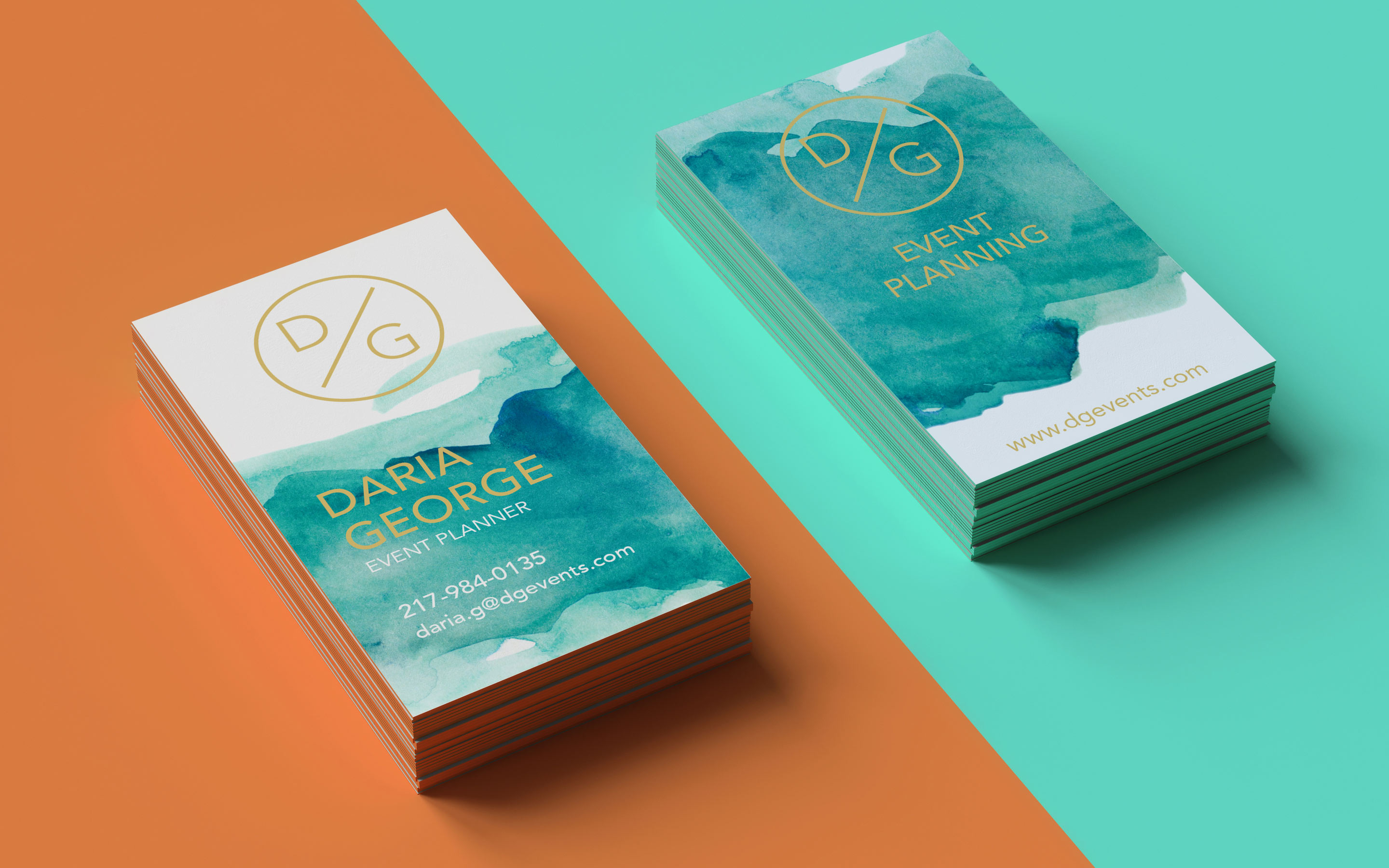
In today’s fast-paced business world, a well-designed business card can be your secret weapon. It’s more than just a piece of pape
![]() Matthew Prince
Matthew Prince
Feb 3, 2023

5253893
If you had to choose between a plain colored or bold colored custom envelopes, which one would you choose? Color influences a person to open a
![]() Emma Davis
Emma Davis
Jul 18, 2020

5323905
Are you aware that
![]() Emma Davis
Emma Davis
Jun 17, 2020

3504437
So, you've decided to take the leap and print flyers
![]() Emma Davis
Emma Davis
Jun 4, 2020

3904166
One of the most perfect ways to showcase your company brand is by use of custom hang tags. These serve as a brilliant opportunity to have cust
![]() Emma Davis
Emma Davis
May 28, 2020

4824103
Marketing allows a vast window for business creativity in today’s world. One of those creative marketing gimmicks is the use of perforated w
![]() Emma Davis
Emma Davis
May 21, 2020

3453374
Have you ever received a postcard? If you have, you must know how warmth-inducing and thought-provoking they are. Now how would you feel if yo
![]() Emma Davis
Emma Davis
May 14, 2020

6063454
If you have been in any business; big or small, you know that it takes a lot of small efforts to make a big milestone. You also understand how
![]() Emma Davis
Emma Davis
May 14, 2020