TABLE OF CONTENTS
Key Takeaways
-
Understand Historical Context: Knowing the history of advertising posters can inspire and inform your designs, making them more impactful.
-
Apply Design Principles: Use balance, contrast, and hierarchy to create visually appealing and effective posters.
-
Craft Compelling Copy: Write clear, concise, and persuasive text to engage your target audience quickly.
-
Select Strong Images: Choose high-quality, relevant images that complement your message and capture attention.
-
Explore Printing Options: Consider different printing techniques and materials to enhance the final look and feel of your posters.
-
Leverage Online Tools: Utilize online design tools for creating professional-quality posters without needing advanced design skills.
History and Background
Evolution of Posters
Posters have evolved significantly over time. Early handbills were the first form of posters used in the 15th century. These hand-printed notices were simple but effective for communication, unlike poster printing online.
In the 19th century, lithography revolutionized poster design. This technique allowed for colorful and detailed prints. Artists like Henri de Toulouse-Lautrec created iconic posters during this period.
Offset printing emerged in the early 20th century. It made mass production of posters easier and more affordable. This led to a boom in advertising posters.
Cultural and technological shifts have greatly impacted poster design. The rise of digital technology introduced new possibilities. Modern digital posters can be animated and interactive.
Role in Advertising
Posters play a crucial role in advertising. They capture attention in busy public spaces like streets and subways. Bold colors and striking images make them stand out.
They are highly effective for brand promotion. Companies use posters to introduce new products or services. Event announcements also rely heavily on posters for visibility.
Posters help reinforce marketing messages. Repeated exposure to a well-designed poster can leave a lasting impression. This makes them valuable tools in advertising campaigns.
Technological Advancements
Traditional printing techniques have given way to digital methods. Digital printing is faster and more cost-effective. It allows for high-quality and stunning custom poster design with intricate details.
Software tools have expanded design capabilities. Programs like Adobe Photoshop and Illustrator enable complex designs. Designers can experiment with various styles easily.
Innovations like augmented reality (AR) are changing the game. AR posters offer interactive experiences through smartphones. Users can see animations or additional information by scanning the poster.
Design Principles
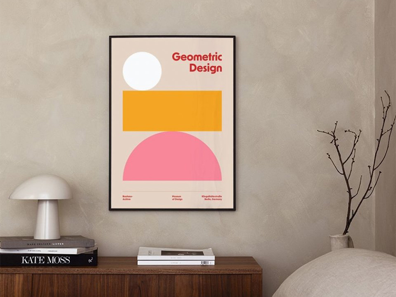
Visual Hierarchy
Visual hierarchy is the arrangement of elements to show their importance. It helps guide the viewer's eye through the poster. Size, color, and placement are key tools.
Large text or images grab attention first. Bold colors can highlight important information. Placing elements strategically directs the viewer's path.
The "We Can Do It!" poster from 1943 is a great example. The large text and strong image in the stunning custom poster design draw you in immediately. The bright yellow background makes it stand out.
Color Theory
Colors have psychological effects on people. Red can evoke excitement or urgency. Blue often feels calm and trustworthy.
Using color to evoke emotions is crucial in poster design. For instance, green can suggest nature or health. Black might convey elegance or mystery.
Color contrast is vital for readability. Light text on a dark background is easy to read. Dark text on a light background works well too. Poor contrast makes text hard to see.
Typography Basics
Typography involves the style and appearance of text. Key terms include kerning, leading, and tracking. Kerning adjusts space between individual letters. Leading sets the space between lines of text. Tracking changes the spacing across a whole word or line.
Font choice affects tone and readability. Serif fonts feel traditional and formal. Sans-serif fonts look modern and clean.
Combining fonts effectively can enhance a poster's design:
-
Use no more than two or three fonts.
-
Pair contrasting styles like serif with sans-serif.
-
Ensure one font is dominant to maintain clarity.
Crafting Effective Copy
Engaging Headlines
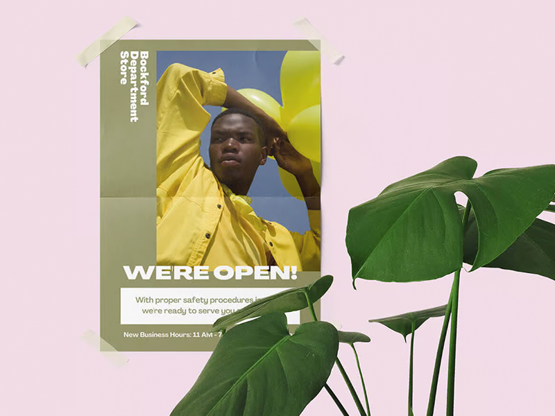
Headlines play a crucial role in grabbing attention. They are the first thing people notice on an advertising poster. A strong headline can make someone stop and read more.
Crafting compelling headlines involves being concise. Use powerful words that evoke curiosity or excitement. Keep it short, ideally under ten words.
Font size and placement are also important. Large, bold fonts make headlines stand out. Place the headline at the top or center for maximum visibility.
Persuasive Text
Persuasive writing is key in advertising. It convinces people to take action or believe in an idea. Good persuasive text includes clear benefits and emotional appeal.
To write compelling copy, focus on clarity. Avoid jargon and complex sentences. Use simple language that everyone can understand.
Addressing the audience's needs and desires is vital. Understand what they want or need. Then, show how your product or service meets those needs.
Call to Action
A call to action (CTA) tells people what to do next. It guides them to take a specific step, like buying a product or visiting a website.
Effective CTAs are clear and direct. Examples include "Buy Now," "Sign Up Today," and "Learn More." These phrases tell the audience exactly what to do.
Clarity and urgency are important in CTAs. People need to know why they should act now rather than later. Words like "limited time" or "exclusive offer" create urgency.
Choosing Images
Quality Matters
High-resolution images and graphics are essential. They ensure your poster looks professional. Low-quality images can make a poster look amateurish.
Print quality affects how people perceive your brand. Crisp, clear images show that you care about details. This builds trust with your audience.
Ensure your files are print-ready. Use the correct resolution, usually 300 dpi for posters. Check colors and alignment before printing. This avoids costly mistakes.
Brand Consistency
Maintaining brand identity is crucial. Your posters should reflect your brand's colors, logos, and fonts. This helps in building recognition.
Use the same color palette across all materials. This includes posters, flyers, and digital ads. It creates a cohesive look.
Incorporate your logo prominently but not overpoweringly. It should be visible but not distract from the main message.
Successful brands maintain consistency in their posters. For example, Coca-Cola always uses its iconic red and white colors. Apple’s posters often feature minimalistic designs with their logo.
Emotional Appeal
Imagery and text can evoke emotions. Emotions drive actions. Happy images can make people feel positive about your product.
Fear can motivate action too. Posters warning about health risks use fear to prompt behavior change.
Nostalgia is another powerful trigger. Images from past decades can evoke fond memories and connect emotionally with older audiences.
Align emotional appeal with your brand values. If your brand stands for joy, use happy imagery. If it stands for safety, use reassuring images.
Printing Options
Paper Types
Posters can be printed on various types of paper. Glossy paper is shiny and vibrant. It makes colors pop, which is great for eye-catching designs. However, it can glare under bright lights.
Matte paper has a non-reflective finish. It provides a sophisticated look and is easier to read under different lighting conditions. But, colors may appear less vivid compared to glossy paper.
Choosing the right paper depends on the poster's purpose. For outdoor posters, consider durable materials like synthetic paper. For indoor displays, glossy or matte paper works well. Always think about the environment where the diy posters for business will be displayed.
Print Finishes
Print finishes add a layer of protection and enhance appearance in large format poster printing. Gloss finishes make posters look shiny and vibrant. They are ideal for colorful designs but can reflect light.
Matte finishes provide a smooth, non-glare surface. They give massive large format prints a professional look and are easy to read in any light.
UV coating adds a protective layer that resists scratches and fading. It's perfect for massive large format prints that need to last longer or be displayed outdoors.
Use gloss finishes for marketing events to grab attention. Matte finishes suit educational posters or art prints due to their readability. According to the banner and poster printing guide, UV coating in large format poster printing is best for long-term displays or high-traffic areas.
Cost Considerations
Several factors influence poster production costs. The type of paper and finish affect the price. Glossy and UV-coated papers used in poster printing for advertising tend to be more expensive than matte options.
Printing in bulk can reduce costs significantly. Ordering large quantities often comes with discounts from printing services.
Digital posters are another cost-saving option. They eliminate printing costs entirely and allow for easy updates and distribution.
To balance quality and budget:
-
Choose standard paper types if high durability isn't needed.
-
Opt for matte finishes to save on costs.
-
Print in bulk to take advantage of discounts.
Online Design Tools
Free Tools
Free design tools like Canva and GIMP are popular choices for creating advertising posters. Canva offers a user-friendly interface with drag-and-drop features. It includes a vast library of images, fonts, and templates. GIMP, on the other hand, is more advanced and resembles Photoshop in its capabilities.
However, free tools have limitations. Canva's free version has fewer templates and elements compared to its paid plan. GIMP can be complex for beginners due to its extensive features.
To maximize free resources:
-
Use high-quality images from free stock photo websites.
-
Experiment with different fonts and color schemes.
-
Save your work frequently to avoid losing progress.
Paid Tools
Paid tools like Adobe Illustrator and Photoshop are industry standards for professional design. Adobe Illustrator excels at vector graphics, making it ideal for scalable poster designs. Photoshop offers advanced photo editing and manipulation capabilities.
Advanced features in paid tools include:
-
Custom brushes and textures.
-
Layer styles and effects.
-
Integration with other Adobe Creative Cloud apps.
Investing in professional design software can be beneficial. Paid tools provide more flexibility and control over your designs, especially with the increase in poster printing services. They also offer regular updates and customer support.
Templates
Using design templates has several advantages. Templates save time by providing a ready-made structure. They also ensure consistency in design, which is crucial for branding.
To customize templates:
-
Adjust colors to match your brand palette.
-
Replace the placeholder text with your own content.
-
Add your logo and other branding elements.
Sources for high-quality poster templates include:
-
Canva's template library.
-
Adobe Stock for premium templates.
-
Freepik for a variety of free and paid options.
Adapting for Digital
Web Optimization
Optimizing posters for online use is essential. Large images can slow down websites. This affects user experience and search engine rankings.
Resize images to fit the website layout. Use tools like Photoshop or free online resizers. Compress images without losing quality. Tools like TinyPNG can help.
Make sure your posters are mobile-friendly. Most people browse the web on their phones. Use responsive design techniques to ensure images scale properly.
Mobile-Friendly Design
Designing posters for mobile devices is crucial. Small screens require clear and readable text. Avoid cluttered designs.
Use larger fonts and high-contrast colors. This ensures readability on small screens. Simplify your message to capture attention quickly.
Responsive design is key. Create flexible layouts that adjust to different screen sizes. CSS media queries can help with this.
Social Media Formats
Different social media platforms have unique requirements. Optimal dimensions vary by platform:
-
Facebook: 1200 x 630 pixels
-
Instagram: 1080 x 1080 pixels
-
Twitter: 1024 x 512 pixels
-
LinkedIn: 1200 x 627 pixels
Adapting designs for each platform is important. A poster that looks good on Instagram might not work well on Twitter.
Create shareable and engaging content. Use eye-catching visuals and concise text. Include a call-to-action to encourage sharing and interaction with online poster ideas.
Measuring Success
Campaign Metrics
Key metrics help measure the success of poster campaigns. Reach shows how many people see the posters. Engagement measures how people interact with them.
Tools like Google Analytics and social media insights track these metrics. QR codes on posters can also provide data on customer interactions.
Data helps refine future campaigns. If a poster gets high engagement, similar designs can be used again.
Audience Feedback
Gathering feedback from the target audience is crucial. It shows what works and what doesn't.
Surveys and focus groups are common methods for collecting feedback. Online polls and social media comments also provide valuable insights.
Incorporating this feedback into design improvements ensures the posters resonate better with the audience.
ROI Analysis
Return on Investment (ROI) in poster advertising measures the profit earned compared to the money spent. A high ROI indicates a successful campaign.
Calculate ROI by subtracting the cost of the campaign from the revenue it generated, then dividing by the cost of the campaign.
Improving ROI involves strategic design and placement. Placing posters in high-traffic areas can increase visibility and engagement.
Case Studies
Successful Campaigns
One notable example is the "Got Milk?" campaign, launched in 1993 as part of marketing poster campaigns. The posters featured celebrities with milk mustaches. This simple and memorable design helped increase milk sales by 7% within a year.
Another successful campaign is Apple's "Think Different" posters. These showcased famous personalities like Albert Einstein and Mahatma Gandhi. The minimalist design and strong message resonated with viewers.
The Coca-Cola 'Share a Coke' marketing poster campaigns also stand out. Posters replaced the brand name with popular first names. This personalized approach boosted sales by over 2%.
Lessons Learned
Common pitfalls in poster advertising and diy posters for business include cluttered designs and unclear messages. Overloading a poster with too much information confuses viewers. It's essential to keep the design clean and focused.
Another challenge is poor placement. Posters need to be located where the target audience will see them. For example, placing a teen-focused ad near schools or malls.
To avoid these mistakes:
-
Use clear, bold fonts.
-
Keep text minimal.
-
Test different locations for maximum visibility.
Continuous learning is crucial. Trends change, so staying updated helps maintain relevance. Analyzing past campaigns can provide valuable insights.
Best Practices
Here are some best practices for designing effective advertising posters:
-
Focus on one main message: Avoid clutter by highlighting a single key point.
-
Use high-quality images: Clear visuals attract attention.
-
Ensure readability: Choose legible fonts and contrasting colors.
-
Include a call-to-action: Guide viewers on what to do next.
-
Test different designs: Experiment to see what works best.
Staying updated with design trends is important. Trends like minimalism and bold typography can make posters more appealing.
Resources for further learning include:
-
Design blogs like Smashing Magazine
-
Online courses on platforms like Coursera
-
Books such as "The Art of Poster Design"
Related Guides
189
Create eye-catching posters with our ultimate design guide. Learn how to make a poster that stands out from the competition.
214
Discover a treasure trove of poster design inspiration to fuel your creativity. Explore unique ideas, tips, and examples for stunning posters.