TABLE OF CONTENTS
Key Takeaways
-
Plan Before You Design: Start with clear goals and understand your audience. This planning will guide your design choices.
-
Follow Initial Steps: Begin with a rough sketch and gather all your materials before diving into the design process.
-
Apply Design Principles: Use balance, contrast, and alignment to create a visually appealing poster that communicates effectively.
-
Make It Impactful: Focus on a strong headline and use high-quality images to grab attention and convey your message quickly.
-
Use Elements Strategically: Incorporate colors, fonts, and spacing thoughtfully to enhance readability and visual appeal.
-
Consider Printing Options: Choose the right paper and printing method to ensure your poster looks professional and meets your needs.
Pre-Design Considerations
Define Your Brand
Identify core values and mission of your brand. These elements shape how your audience perceives you. They guide the visual and textual content.
Determine the visual style that represents your brand. This includes colors, fonts, and imagery. Consistency in visuals builds recognition.
Establish a consistent tone and voice for your messaging. Whether formal or casual, the tone should reflect your brand’s personality. Consistency strengthens brand identity.
Identify Your Audience
Analyze demographic information such as age, gender, and location. This helps tailor your custom made posters to those who will see them.
Understand audience interests and preferences. Knowing what they like ensures your content resonates with them.
Determine the best channels to reach your audience. This could be social media, community boards, or other platforms where they are active.
Clarify Your Message
Define the primary message you want to convey. It should be clear and direct.
Ensure the message aligns with your brand's goals. Your poster should support your overall objectives.
Simplify the message for easy comprehension. A straightforward message is more effective.
Set Success Metrics
Identify key performance indicators (KPIs) for your poster. These could include views, clicks, or shares.
Set measurable goals such as engagement or conversion rates. Having specific targets helps measure success.
Plan how to track and analyze these metrics. Use tools like Google Analytics or social media insights.
Initial Steps
Research and Inspiration
Look at successful posters in your industry. Analyze what makes them stand out. Pay attention to color schemes, typography, and imagery.
Gather design inspiration from various sources like Pinterest or Behance. These platforms offer a wide range of creative ideas. Explore different styles and see what fits your brand.
Note trends and elements that resonate with your brand. Trends can help make your poster more relevant. Elements like shapes, fonts, and colors should align with your graphic design poster ideas and message.
Choose the Right Tools
Select graphic design software like Adobe Illustrator or Canva. Adobe Illustrator offers advanced features for detailed designs. Canva is user-friendly and great for beginners.
Consider using templates for efficiency. Templates save time and provide a solid starting point. They also ensure consistency in design.
Ensure tools are compatible with your skill level. If you are new to design, start with simpler tools. As you gain experience, move on to more complex software.
Plan Your Layout
Sketch a rough draft of your poster layout. This helps visualize the final product. Use pencil and paper or digital tools for sketching.
Decide on the placement of text, images, and other elements. Text should be readable and images should support the message. Balance is key to an effective layout.
Ensure the layout guides the viewer’s eye effectively. Use visual hierarchy to highlight important information. Elements should lead the viewer through the poster naturally.
Design Principles
Balance and Alignment
Use grids to maintain symmetry and balance. Grids help in organizing elements neatly. Aligning elements creates a cohesive look. This makes the poster visually appealing. Avoid overcrowding by leaving sufficient white space. White space prevents the design from looking cluttered.
Color Theory Basics
Understand the color wheel and relationships between colors. Colors can evoke emotions and set the tone. Choose a color scheme that aligns with your brand. Consistency in colors strengthens brand identity. Use contrasting colors to highlight important information. Contrast helps in drawing attention to key details.
Typography Choices
Select fonts that are legible and appropriate for your message. Legibility is crucial for conveying information effectively. Limit the number of different fonts to maintain consistency. Too many fonts can make the poster look chaotic. Ensure font sizes are readable from a distance. Large fonts enhance visibility.
Visual Hierarchy
Prioritize elements based on their importance. Important information should be more prominent. Use size, color, and placement to guide the viewer’s attention. Larger and bolder elements attract more attention. Make the most critical information stand out. Highlighting key points ensures they are noticed first.
Creating Impactful Posters
Ensure Readability
Use high-contrast text and background combinations. Dark text on a light background works well. Light text on a dark background is also effective.
Avoid overly complex fonts or excessive text. Stick to simple, clear fonts like Arial or Helvetica. Limit the amount of text to keep it readable.
Test readability from various distances. View your poster from close up and far away. Ensure that important information is legible at all distances.
Create a Focal Point
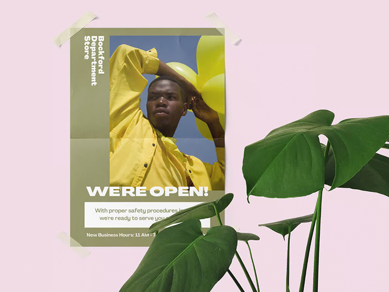
Identify the main element you want viewers to notice first. This could be an image, a headline, or an important piece of information.
Use size, color, or unique shapes to draw attention. A larger font size for the headline can make your beautiful poster design stand out. Bright colors can also attract the eye.
Ensure the focal point supports your primary message. If your poster advertises an event, make sure the event name and date are prominent.
Use Space Effectively
Avoid clutter by spacing out elements appropriately. Too many elements close together can confuse viewers.
Use margins and padding to separate sections. Margins create breathing room around the edges of your custom made posters. Padding helps to separate different sections within the poster.
Balance negative space to enhance readability. Negative space, or blank space, prevents the poster from feeling too crowded. It makes key elements stand out more.
Include a Call to Action
Clearly state what action you want the viewer to take. This could be "Visit our website," "Join us," or "Buy now."
Use compelling language to encourage engagement. Words like "exclusive," "limited time," and "free" can motivate viewers to act.
Place the call to action prominently on the poster. Make sure it's easy to find and read. Consider using bold fonts or bright colors to highlight graphic design poster ideas.
Strategic Use of Elements
Colors and Fonts
Colors should complement each other. This creates harmony in the design. Choose colors that fit the theme of your poster. Avoid using too many colors.
Fonts need to match the tone of your message. For a formal event, use serif fonts. For a fun event, use playful fonts. Ensure all text is readable from a distance.
Consistency is key in color and font usage. Stick to a few colors and fonts when designing and printing high quality posters. This helps in maintaining a cohesive look.
Images and Graphics
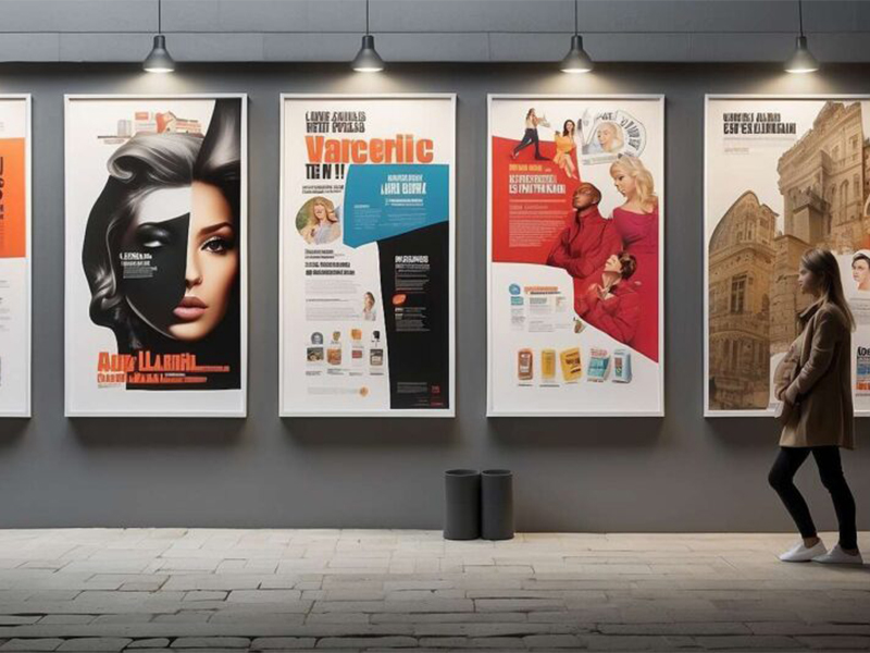
High-quality images are essential. They should align with your message. Blurry or low-resolution images can ruin the overall appearance.
Graphics enhance visual appeal. Use icons or illustrations to highlight important points. They make the poster more engaging.
Relevance is crucial for images. They should support your message, not distract from it. Avoid cluttering the poster with unnecessary visuals.
Brand Consistency
Brand colors, fonts, and logos must be used consistently. This reinforces brand identity. People recognize your brand through these elements.
Align the poster design with other marketing materials. This includes brochures, websites, and social media posts. Consistent design builds trust.
Uniform brand identity across all platforms is vital. It ensures that your message is clear and recognizable everywhere.
Printing Options
Choose the Right Paper
Select paper type based on the poster’s purpose and location. If the poster will be outside, choose a more durable paper. For indoor use, standard paper will suffice.
Consider durability and finish. Glossy paper gives a vibrant look but can glare under lights. Matte paper reduces glare and looks professional.
Ensure the paper quality enhances the overall design. High-quality paper makes colors pop and details sharp. Cheap paper can ruin even the best designs.
Understand Printing Techniques
Learn about different printing methods. Digital printing is quick and cost-effective for small quantities. Offset printing is better for large runs and offers higher quality.
Choose the best technique for your budget and needs. Digital printing suits small projects with tight deadlines. Offset printing works well for big events needing many posters.
Understand the impact of printing techniques on color and quality. Digital printing may not match colors perfectly but is faster. Offset printing provides consistent color accuracy but takes longer.
Prepare Files for Print
Use the correct file format. PDF is widely accepted and preserves design elements. TIFF files ensure high quality without compression loss.
Check resolution and color settings. Use at least 300 DPI for clear images in professional printing services. Set colors to CMYK mode, which is standard for printing.
Include bleed and crop marks if necessary. Bleed ensures no white edges appear after trimming. Crop marks guide where to cut the poster accurately.
Practical Tips and Examples
Case Studies
Successful poster campaigns offer valuable insights. One example is Apple's "Think Different" campaign launched in 1997. The posters featured black-and-white portraits of famous personalities with minimal text. This simplicity made the message clear and impactful.
Another case is the "We Can Do It!" poster from World War II. The bold colors, strong imagery, and empowering message of the beautiful poster design made it memorable. These elements contributed to its success.
To apply these strategies, focus on a clear message. Use powerful images and limit text. Ensure your design aligns with your brand identity.
Common Mistakes to Avoid
Using too many fonts can confuse viewers. Stick to one or two fonts for a clean look. Too many colors can also be distracting. Choose a simple color scheme that matches your theme.
Overcrowding a poster with information is another common error. Prioritize key details and use white space effectively. This makes the poster more readable.
Ensure all text is legible from a distance. Avoid small fonts and check for typos. A well-proofed poster looks professional and trustworthy.
Expert Tips
Feedback from design professionals can improve your work. They offer valuable perspectives and suggestions you might miss.
Stay updated with current design trends. Trends can inspire fresh ideas and keep your work relevant.
Continuous practice helps refine your skills. Experiment with different styles and techniques. Learn from each project to improve your future designs.
Related Guides
204
Discover the secrets of creating captivating advertising posters that engage and attract audiences. Master the art of poster design today!
211
Discover a treasure trove of poster design inspiration to fuel your creativity. Explore unique ideas, tips, and examples for stunning posters.