TABLE OF CONTENTS
Key Takeaways
-
Understand the Basics: Mastering poster design starts with a solid understanding of fundamental principles. Study layout, typography, and color theory to create visually appealing designs.
-
Seek Inspiration: Look for inspiration in various sources such as art, nature, and other designers' work. Use platforms like Pinterest and Behance to gather ideas.
-
Apply Effective Techniques: Utilize design techniques like contrast, hierarchy, and balance to make your posters stand out. Experiment with different styles to find what works best for your message.
-
Learn from Success: Analyze case studies of successful posters to identify what makes them effective. Pay attention to elements like composition, use of space, and visual impact.
-
Be Practical and Unique: Incorporate practical tips to ensure your posters are unique. Experiment with textures, materials, and unconventional layouts to catch the viewer's eye.
-
Use the Right Tools: Leverage tools and resources like Adobe Illustrator, Canva, and online tutorials to refine your skills and streamline your design process.
Understanding Poster Design
History of Poster Design
Poster design has evolved significantly. Early posters were lithographs, a printing method invented in 1796. These lithographs featured detailed illustrations and bold text.
In the late 19th century, the Art Nouveau movement began. Artists like Henri de Toulouse-Lautrec created posters with flowing lines and vibrant colors. This style was popular for advertising events and products.
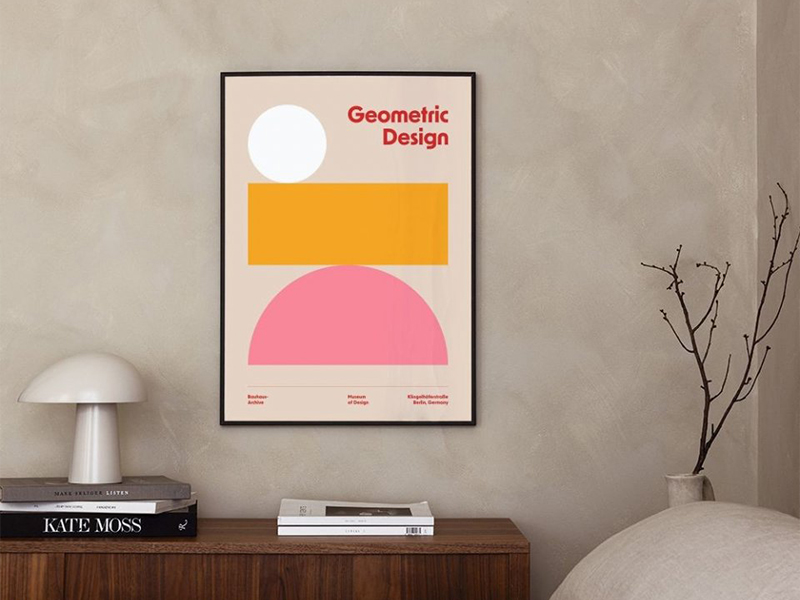
The Bauhaus movement emerged in the early 20th century. It emphasized simplicity and function. Designers used geometric shapes and minimal text. Bauhaus posters influenced modern graphic design.
The Psychedelic movement of the 1960s brought bold colors and intricate patterns. Posters from this era often promoted music concerts. They captured the spirit of the counterculture movement.
Technological advancements have also shaped poster design. The introduction of digital tools in the late 20th century revolutionized the field. Designers now use software to create complex designs quickly.
Importance of Posters
Posters play a crucial role in communication and advertising. They can convey messages quickly and effectively. A well-designed poster grabs attention immediately.
Visual elements are key to a poster's impact. Bold colors, striking images, and clear text draw viewers in for 4th of July ads. Posters can communicate ideas at a glance.
They are widely used for various purposes:
-
Advertising products or services
-
Promoting events like concerts or festivals
-
Providing information on social issues
Their ability to reach a broad audience makes them valuable tools for marketers and activists alike.
Types of Poster Designs
There are several categories of poster designs:
Promotional posters advertise products or services. Companies use them to attract customers.
Event posters promote specific events such as concerts, plays, or festivals. They often include dates, locations, and key details about the event.
Informational posters provide facts or instructions. They are used in educational settings or public spaces, such as classroom posters or a custom covid-19 poster, to share important information.
Artistic posters focus on visual appeal. These designs may not have a commercial purpose but aim to inspire or provoke thought.
Commercial posters serve business needs. They combine artistic elements with marketing goals to sell products or services.
Niche types include educational posters that teach concepts or motivational posters that inspire action or positivity.
Sources of Inspiration
Art and Culture
Posters often mirror cultural trends and movements. They capture the essence of different eras. For example, the 1960s saw psychedelic art in posters. This reflected the counterculture movement.
Both traditional and contemporary art styles influence poster design. Traditional styles include Art Nouveau and Art Deco. These styles use intricate details and bold colors. Contemporary styles are more varied. They include abstract and minimalistic designs.
Famous artists like Henri de Toulouse-Lautrec made iconic posters. His work showcased the vibrant nightlife of Paris. Another notable artist is Shepard Fairey. He created the famous "Hope" poster for Barack Obama's 2008 campaign.
Nature and Environment
Posters promoting environmental awareness use nature as a key element. An example is the World No Tobacco Day campaign. They often feature trees, animals, and landscapes. These visuals remind people of the beauty of nature.
Natural elements and eco-friendly themes are common in these posters. Designers use leaves, water, and mountains to create impactful images. Such elements emphasize the need to protect our planet.
Green color schemes and organic shapes are crucial in these designs. Green symbolizes growth and renewal. Organic shapes mimic natural forms, making the design feel more connected to nature.
Everyday Objects
Mundane objects can transform into compelling visuals in posters. Items like chairs, cups, and books become focal points. They can convey powerful messages through simple imagery.
Minimalism plays a significant role in poster design. It focuses on simplicity and clarity. By using fewer elements, designers create a strong visual impact.
Everyday items make posters relatable to the audience. People connect with familiar objects easily. This connection makes the message more memorable.
Design Techniques
Color Schemes
Colors play a crucial role in poster design. They can evoke emotions and set the mood. For instance, blue often conveys calmness, while red can signal urgency or excitement.
Complementary color combinations are effective. These colors are opposite each other on the color wheel. Examples include blue and orange or red and green. Such pairings create vibrant and eye-catching designs.
Contrasting color schemes also work well. They help highlight important information. Yellow text on a black background is one example. This combination ensures readability and grabs attention.
Effective color palettes often use three to four colors. The 60-30-10 rule is a good guideline:
-
60% dominant color
-
30% secondary color
-
10% accent color
This approach creates balance and harmony in the design.
Font Combinations
Typography is essential in poster design. It affects readability and overall aesthetic. Choosing the right fonts can make your message clear and engaging.
Pairing serif and sans-serif fonts enhances readability. Serif fonts have small lines at the end of characters, making them suitable for headlines. Sans-serif fonts lack these lines, making them ideal for body text.
Fonts should match the poster's theme. For a modern look, choose clean, sans-serif fonts like Helvetica or Arial. For a vintage feel, consider serif fonts like Times New Roman or Georgia.
Here are some tips for choosing fonts:
-
Limit the number of fonts to two or three.
-
Ensure font sizes vary to create hierarchy.
-
Use bold or italic styles sparingly for emphasis.
Graphic and Text Synergy
Balancing graphics and text is key to effective poster design. Both elements should complement each other without overwhelming the viewer.
Hierarchy in design is crucial. It guides the viewer’s eye through the information. Important elements should be larger or bolder than less critical ones.
Examples of successful synergy include movie posters. The title often stands out with bold typography, while visuals support the theme in the best poster designs. A poster for an action film might use dynamic images and bold, sharp fonts.
Case Studies of Successful Posters
Iconic Movie Posters
Classic movie posters have a lasting impact. The 1975 "Jaws" poster is one example. It uses a simple yet powerful design. The large shark and small swimmer create tension. This imagery makes it memorable.
Typography also plays a key role. The bold, sans-serif font in the "Star Wars" poster from 1977 is reminiscent of vintage campaign posters. It’s easy to read and instantly recognizable. These elements help in promoting films effectively.
Effective Advertising Posters
Successful advertising posters share common features. A strong call-to-action (CTA) is essential. It motivates viewers to take action. For example, the "Got Milk?" campaign used a direct CTA that was easy to remember.
Imagery and text must work together. Apple's "Think Different" campaign combined striking images with simple text. This made the message clear and compelling.
Impactful Event Posters
Designing event posters requires attention to detail. Vibrant colors attract attention quickly. Bold text helps convey the message clearly.
Clear information and dates are crucial. Without them, potential attendees might overlook the event. For instance, music festival posters often feature the date prominently at the top. 4OVER4.COM offers a lot of unique poster ideas in templates to customers with little design skills. Explore our page for the design template that suits your brand identity.
Practical Tips for Unique Posters
Balancing Elements
Symmetry and asymmetry play a crucial role in poster design. Symmetry creates a sense of balance and order. Asymmetry, on the other hand, adds dynamism and interest.
To achieve visual harmony, use a grid system. This helps align elements neatly. Also, ensure that text and images are proportionate.
Negative space is equally important. It prevents clutter and allows the main elements to stand out. Effective use of negative space can make classroom posters more appealing.
Using Layers Effectively
Layering is a key concept in graphic design. It involves placing elements on top of each other to create depth.
To create dimension, use shadows and gradients. These techniques add realism and texture to the design.
Examples of effective layering include movie posters. They often use multiple layers to highlight characters and scenes. Layering can make a simple design look complex and engaging.
Incorporating Personal Flair
Adding unique elements makes designs stand out. Personal flair reflects the designer's personality and style.
Signature design elements could be a specific color palette or font choice. These elements make your work recognizable.
To incorporate personal style, experiment with different techniques. Use hand-drawn illustrations or custom typography. Unique touches can set your poster apart from others.
Creating Text-Heavy Posters
Simplifying Information
Clarity and conciseness are crucial for text-heavy posters. Long blocks of text can overwhelm viewers. Simplify information by breaking it down into key points. Use bullet points to make the content more digestible.
Distill complex information by focusing on the most important details. Avoid jargon and technical terms that may confuse your audience. Instead, use plain language that everyone can understand.
For example, a poster about healthy eating might list:
-
Eat more fruits and vegetables
-
Choose whole grains over refined grains
-
Limit sugary drinks
These simple messages are easy to read and remember.
Enhancing Readability
Font size and spacing play a big role in readability. Large fonts make it easier for people to read from a distance. Use at least a 24-point font for the main text. Headings should be even larger.
Spacing between lines, known as leading, also matters. Adequate spacing prevents text from looking cramped. Aim for 1.5 to 2 times the font size for line spacing.
Contrast is another key factor. Dark text on a light background is easier to read than light text on a dark background. High contrast ensures your message stands out.
To ensure legibility from a distance:
-
Use bold fonts for headings
-
Avoid intricate or script fonts
-
Stick to one or two font styles
Strategic Text Placement
Text alignment and placement guide the viewer's eye through the poster. Center-aligned text works well for titles but can be hard to read in large blocks. Left-aligned text is generally easier to follow.
Place the most important information at the top. Viewers' eyes naturally start there. Use headings and subheadings to break up sections and create a visual hierarchy.
Effective text placement examples include:
-
A movie poster with the title at the top, followed by key actors' names
-
An event poster with date and location prominently displayed
Infographic Posters
Showcasing Data Visually
Visual data representation is crucial. It helps people understand complex information quickly. Charts and graphs make data more accessible.
There are various types of charts. Bar charts compare different categories. Line graphs show trends over time. Pie charts display proportions. Scatter plots reveal correlations.
Effective infographic posters use these tools well. For example, a health poster might use bar charts to show disease statistics. A business poster could use line graphs to illustrate market trends. These visuals make the data clear and engaging.
Designing Engaging Infographics
Infographics simplify information. They turn complex data into easy-to-understand visuals. This makes them powerful communication tools.
Visual appeal and clarity are essential. Bright colors catch the eye. Clear labels help people understand the data. Consistent design elements create a cohesive look.
To create engaging infographics:
-
Use contrasting colors for readability.
-
Keep text minimal and to the point.
-
Ensure all elements align properly.
-
Include icons to represent key points.
These tips help make infographics both informative and attractive.
Examples of Infographic Posters
Successful infographic posters stand out. They present data clearly and attractively. One example is a climate change poster using vivid colors and clear icons. It shows temperature changes with line graphs and uses pie charts for emission sources.
Another example is an educational poster about nutrition. It uses bar charts to compare food groups and icons to indicate vitamins and minerals.
These examples are effective because:
-
They use consistent color schemes.
-
They include easy-to-read fonts.
-
They balance visual elements with text.
Different styles work for different topics. Some posters use bold graphics, while others rely on minimalist designs. The key is to match the style to the content.
Creative Collage Techniques
Layering Images and Text
Layering images and text can make a poster visually appealing. Start by choosing a background image that complements the overall theme. Overlay text in a way that ensures readability. Use contrasting colors to make the text stand out against the image.
Maintain clarity by using bold fonts for headings and simpler fonts for body text. Adjust the opacity of images to create depth without overwhelming the viewer. Effective layering keeps the focus on key information while enhancing visual interest.
Examples include music festival posters where band names overlay vibrant backgrounds. Another example is movie posters blending actor images with titles seamlessly.
Combining Different Styles
Experimenting with different design styles can lead to unique posters. Mix traditional elements like hand-drawn illustrations with modern digital effects. This combination can create a dynamic and engaging composition.
Benefits include attracting diverse audiences and showcasing creativity. Mixing styles can highlight different aspects of the message, making it more memorable. Posters for art exhibits often blend classical art with contemporary designs to draw attention.
Successful examples include promotional materials for cultural events, combining vintage typography with modern graphics and famous poster designs. These posters stand out by effectively merging old and new aesthetics.
Real-World Collage Examples
Real-world collage examples demonstrate the versatility of this technique. Posters using collage often combine photographs, drawings, and textures to create a cohesive piece. The creative potential lies in the ability to merge various media into one artwork.
To create cohesive collages, start by selecting a unifying color palette. Balance different elements by varying their sizes and positions. Ensure that each component adds value to the overall design without cluttering it.
Examples include fashion show posters using magazine cutouts and fabric swatches. Music album covers also use collages to convey the artist's style and theme effectively.
Tools and Resources
Design Software Options
The 4over4 online designer tool, Adobe Photoshop and Illustrator are popular choices for the best poster designs. Photoshop is great for photo editing and creating detailed graphics. Illustrator excels in vector graphics and illustrations.
The 4over4 online designer tool includes several features like drag-and-drop elements, color selection, and font choices. One major benefit of the 4over4 online designer tool is real-time previews. You can see adjustments instantly, making it easier to perfect your design before finalizing it.
Pros of Adobe software include a wide range of tools and professional quality. Cons are the high cost and steep learning curve. Canva is another option, offering user-friendly templates but limited customization.
Choose software based on your needs and skill level. Beginners might prefer Canva for its simplicity. Professionals often choose Adobe products for their advanced features.
Online Inspiration Sources
Websites like Behance and Pinterest offer endless design inspiration. Behance showcases work from designers worldwide, providing diverse styles. Pinterest allows users to save and organize ideas.
Following design blogs and forums keeps you updated with trends. Blogs like Smashing Magazine offer poster design tips, tutorials and insights. Forums like Reddit's r/Design give community feedback.
Staying current with trends helps create modern, appealing posters. Regularly check these platforms to keep your designs fresh.
Printing Services
Choosing a printing service requires careful consideration. Look at factors like print quality, material options, and customer reviews. High-quality prints ensure your design looks professional.
Print quality is crucial. Materials like glossy or matte paper affect the final look. Some services offer eco-friendly options, which can be a plus.
Ensure the final product matches your digital design by requesting print samples. This step helps avoid surprises and ensures satisfaction.
Related Guides
188
Create eye-catching posters with our ultimate design guide. Learn how to make a poster that stands out from the competition.
204
Discover the secrets of creating captivating advertising posters that engage and attract audiences. Master the art of poster design today!